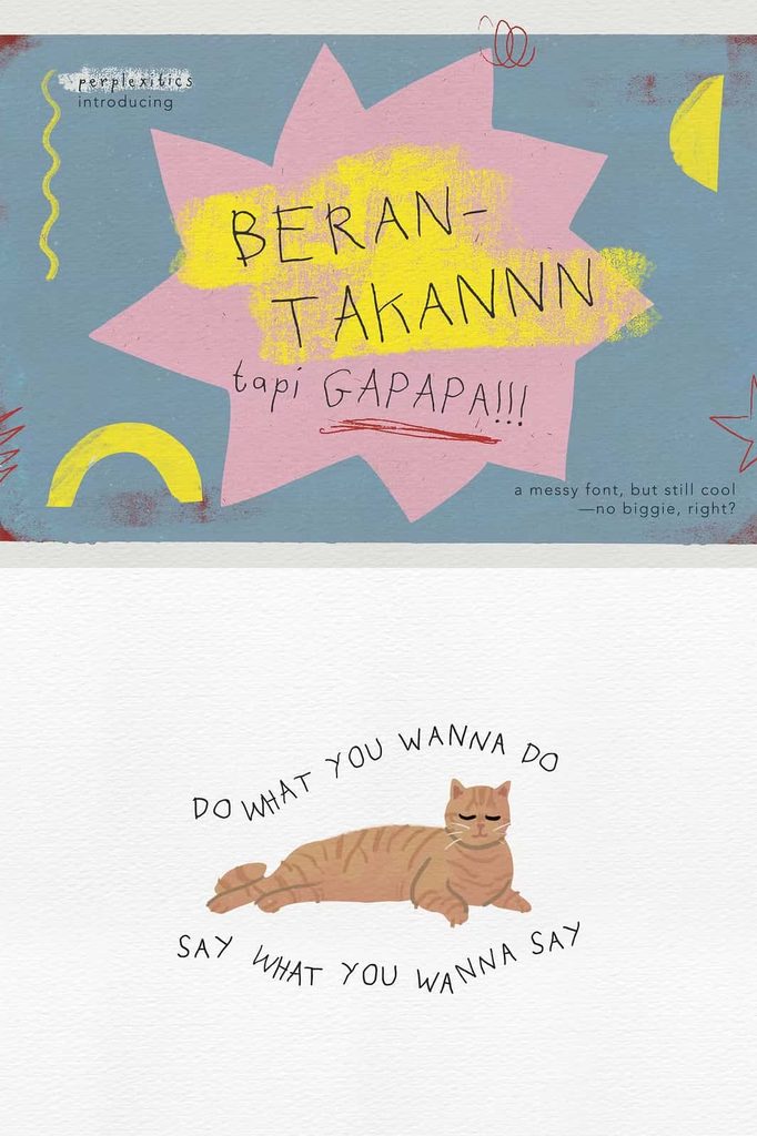
Berantakan Tapi Gapapa Font – Quirky Messy Handwritten Typeface
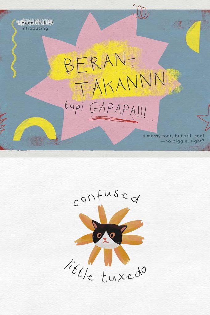
Berantakan Tapi Gapapa Font brings a playful, imperfect, and wonderfully expressive personality to your typography. Designed with a messy handwritten appearance and quirky organic doodle feelings, this font captures the spontaneous charm of casual handwriting. Instead of aiming for perfectly polished letterforms, it embraces irregular shapes, natural movement, and a carefree visual style that makes every word feel more personal.
The name itself reflects the character of the typeface: sometimes things look messy, but that is perfectly okay. Berantakan Tapi Gapapa Font turns that idea into a creative design approach. Its loose handwritten forms can make your projects feel friendly, youthful, humorous, artistic, and authentic. If you want to move away from rigid typography and create designs with more personality, this font gives you an expressive tool to do exactly that.
What Makes Berantakan Tapi Gapapa Font Unique?
Berantakan Tapi Gapapa Font stands out through its deliberately messy handwritten construction. The characters create a relaxed visual rhythm that resembles quick notes, spontaneous doodles, and casual hand lettering. This organic quality allows the font to communicate emotion without relying on complicated decorative elements.
Rather than making every letter perfectly uniform, the design embraces the unpredictable qualities that make handwriting interesting. The quirky forms can add humor and energy to headlines, titles, quotes, posters, packaging, social media graphics, and other creative projects.
This typeface works particularly well when you want your audience to notice the human side of your design. Its informal appearance can make a project feel less corporate and more approachable, allowing your typography to communicate personality from the first glance.
A Messy Handwritten Style with Personality
The handwritten style gives Berantakan Tapi Gapapa Font a strong sense of character. Its irregular appearance creates a handcrafted impression, while the doodle-inspired details add an artistic quality. You can use it to create designs that feel spontaneous rather than overly calculated.
This makes the font especially useful for creative brands, independent artists, content creators, stationery designers, and anyone who wants to build a visual identity around authenticity. The typeface can transform simple words into expressive design elements that immediately attract attention.
Quirky Organic Doodle Feeling
One of the strongest characteristics of this font is its quirky doodle-inspired personality. The organic forms create an impression of casual creativity, similar to the marks someone might make while sketching ideas in a notebook.
Use this quality to add energy to posters, illustrations, journal pages, stickers, merchandise, social media artwork, and creative campaigns. The font can complement hand-drawn graphics particularly well because both styles share an informal and organic visual language.
Embrace Imperfect Typography
Berantakan Tapi Gapapa Font demonstrates how imperfections can strengthen a design. Its messy appearance does not try to hide irregularity. Instead, it uses that quality as a defining visual feature.
This approach works beautifully for projects that need a relaxed, youthful, rebellious, humorous, or artistic tone. When you combine the font with simple illustrations, rough textures, or playful layouts, you can create a cohesive handmade aesthetic.
Complete Character Set for Flexible Design
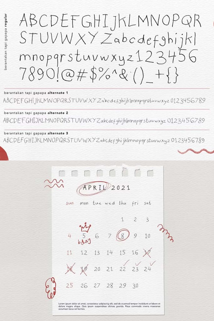
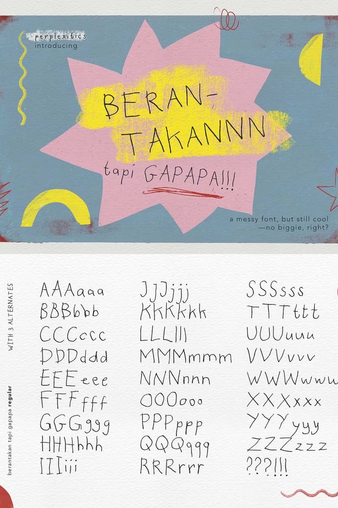
Berantakan Tapi Gapapa Font includes the essential characters you need to create a wide variety of designs. The font features uppercase letters, lowercase letters, numbers, punctuation, and alternate characters, giving you greater flexibility when developing different typographic compositions.
The combination of uppercase and lowercase characters allows you to create visual contrast within the same design. Use uppercase lettering for bold titles or short statements, then introduce lowercase characters for a more relaxed and conversational appearance.
Numbers and punctuation also make the font more practical for real-world projects. You can create dates, prices, product information, captions, short messages, and other text without switching to a different typeface for every element.
Explore Creative Alternate Characters
The included alternates provide another way to customize your typography. Alternate characters can help you introduce variation and prevent your lettering from appearing repetitive. They also allow you to experiment with different combinations until you discover a composition that matches your creative direction.
Use alternate characters strategically to enhance logos, headlines, names, quotes, packaging designs, and decorative lettering. Depending on your design software, you can access these characters through OpenType features or the application’s glyph panel.
Perfect for Social Media Designs
Berantakan Tapi Gapapa Font can give social media graphics an instantly recognizable personality. Use it for Instagram posts, story graphics, quote cards, promotional artwork, reels covers, thumbnails, and other digital content.
Its informal appearance works especially well for short phrases and attention-grabbing messages. Combine the font with colorful illustrations, simple doodles, photographs, or textured backgrounds to build engaging compositions.
The font can also help personal content feel more authentic. Instead of presenting a message in a formal typeface, use handwritten lettering to create the impression of a personal note or spontaneous thought.
Great for Posters and Promotional Artwork
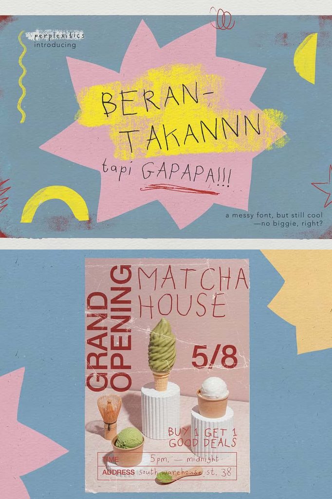
Designers can use Berantakan Tapi Gapapa Font to create playful posters and promotional graphics. Its unusual handwritten character helps headlines stand apart from conventional typography.
Try using the font for event posters, creative workshops, music artwork, art markets, pop-up events, youth campaigns, and independent brand promotions. Pair it with clean supporting typography to maintain readability while allowing the handwritten style to become the visual focus.
Use Berantakan Tapi Gapapa Font for Branding
Brands that want to appear friendly, creative, independent, or unconventional can use this font to develop a memorable visual identity. Its quirky personality can make a logo or brand message feel more human.
Use the typeface for logo concepts, packaging labels, stickers, merchandise, promotional cards, social media branding, and campaign graphics. It can work particularly well for creative businesses that want to avoid a generic corporate appearance.
Packaging and Product Labels
The messy handwritten aesthetic can make packaging feel approachable and handcrafted. Apply it to product names, short descriptions, labels, stickers, thank-you cards, or decorative packaging elements.
It can work especially well for products that emphasize creativity, handmade production, youth culture, art, stationery, lifestyle, or playful experiences. Combine the font with simple illustrations to create packaging that feels personal and distinctive.
Merchandise and Apparel
Berantakan Tapi Gapapa Font also offers strong potential for merchandise. Use it on T-shirts, tote bags, caps, stickers, posters, notebooks, mugs, and other promotional products.
Short phrases work particularly well because the expressive lettering can become the primary graphic element. Experiment with oversized words, stacked lines, curved compositions, and combinations of uppercase and lowercase letters to create eye-catching merchandise artwork.
Ideal for Creative and Personal Projects
Beyond commercial applications, Berantakan Tapi Gapapa Font works beautifully for personal creative projects. Use it for journals, scrapbooks, greeting cards, invitations, digital illustrations, personal websites, printable artwork, planners, and craft projects.
The handwritten appearance helps create a sense of individuality. You can use it whenever you want your design to feel less formal and more spontaneous.
Why Choose Berantakan Tapi Gapapa Font?
- Quirky and expressive handwritten appearance
- Messy, organic, and doodle-inspired character
- Authentic casual handwriting aesthetic
- Includes uppercase and lowercase letters
- Includes numbers and punctuation
- Features alternate characters for creative variation
- Works well for logos and branding
- Ideal for social media graphics and quotes
- Suitable for posters, merchandise, and packaging
- Excellent for artistic and personal design projects
How to Get the Best Results
To make the most of Berantakan Tapi Gapapa Font, let its personality lead the composition. Avoid overcrowding your design with too many decorative elements. Instead, give the lettering enough space to communicate its quirky character.
Pair the font with a simple sans serif or clean display typeface when you need additional information. This contrast can help preserve readability while allowing the handwritten lettering to attract attention. You can also experiment with different sizes, line arrangements, and alternate characters to create a more dynamic result.
For logos and short headlines, consider using larger lettering so the irregular details remain visible. For longer text, use the font selectively because its decorative handwritten style works best when it highlights rather than overwhelms your content.
Bring a Carefree Handwritten Touch to Your Designs
Berantakan Tapi Gapapa Font gives designers a fun way to embrace imperfect, expressive typography. Its messy handwritten forms, quirky doodle character, and organic visual rhythm create an identity that feels genuine and approachable.
With uppercase and lowercase letters, numbers, punctuation, and alternate characters, the font provides the flexibility needed for many creative applications. Use it to build playful logos, social media graphics, posters, packaging, merchandise, editorial artwork, stationery, illustrations, and branding projects.
If your design needs more personality, spontaneity, and human character, Berantakan Tapi Gapapa Font offers a refreshing alternative to conventional typefaces. Let the imperfect lettering become part of your creative story, experiment with its alternate characters, and create designs that prove that sometimes being a little messy is exactly what makes typography interesting.