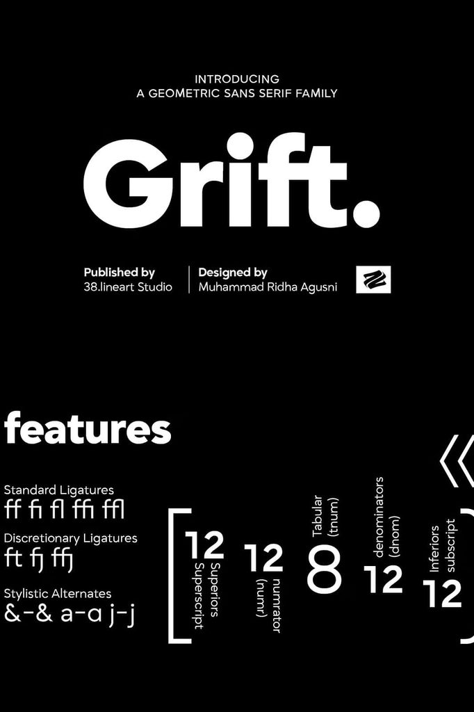
Grift Geometric Sans Serif Font Family
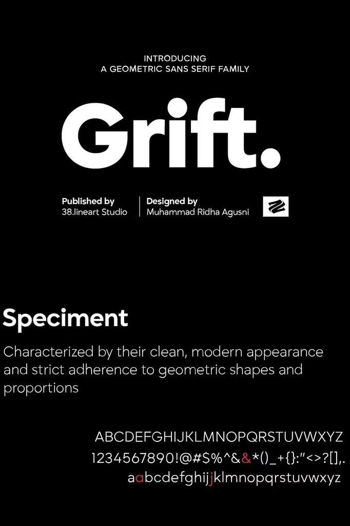
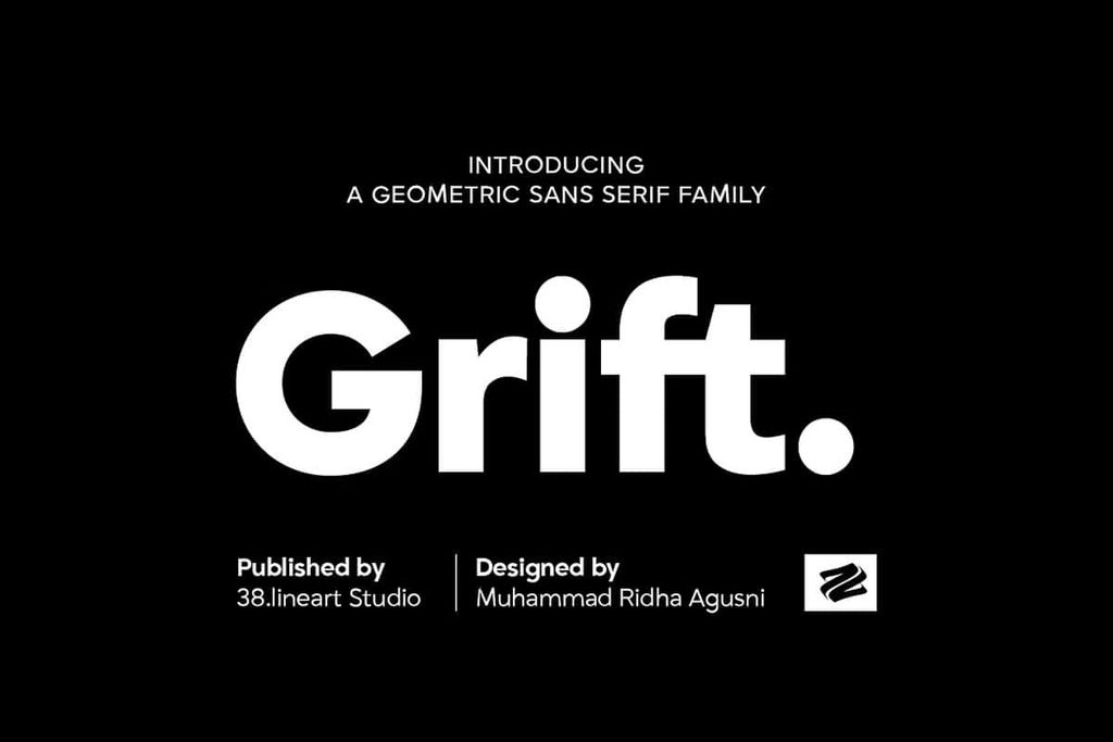
Grift Geometric Sans Serif Font Family delivers a modern typographic experience built around clean geometry, balanced proportions, and exceptional versatility. Designed for contemporary creative work, Grift gives designers a complete toolkit for developing polished visual identities across print and digital platforms. With nine carefully crafted weights, this font family adapts easily to bold headlines, refined body copy, professional branding, editorial layouts, websites, and digital interfaces.
Grift combines geometric precision with practical readability. Its clean lines create a structured appearance, while its carefully balanced proportions keep text comfortable to read across different sizes. This combination allows designers to create sophisticated compositions without sacrificing clarity. Whether you need an impactful display style or a dependable typeface for longer passages, Grift provides the flexibility to handle both roles.
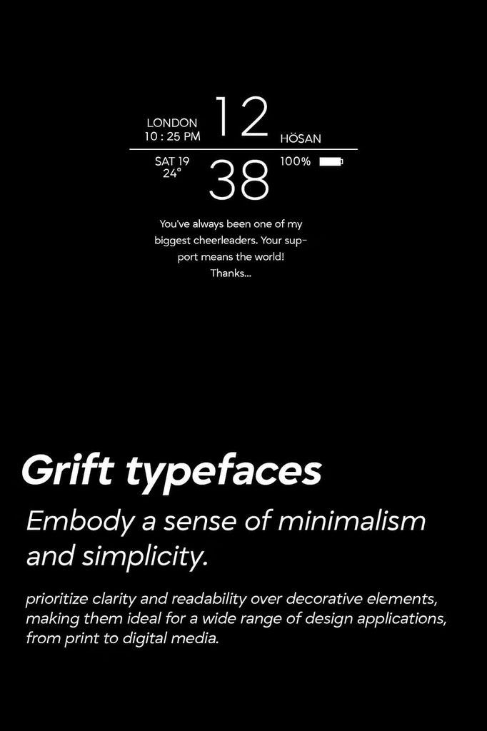
The family also introduces distinctive italic styles that add movement and personality to your typography. These italics maintain the geometric character of the main styles while introducing a subtle sense of energy. As a result, designers can create contrast and emphasis without breaking the visual consistency of a project.
A Modern Geometric Sans Serif Typeface
Grift embraces the principles of modern geometric typography while maintaining a practical approach to everyday design. Its letterforms use clean structures and controlled curves to create a polished visual rhythm. This gives the typeface a contemporary appearance that works naturally in professional and creative environments.
Geometric sans serif fonts often communicate simplicity, efficiency, and modernity. Grift builds on these qualities while adding enough character to prevent designs from feeling generic. Its carefully constructed forms establish a strong visual foundation for brands, publications, websites, applications, and marketing materials.
The balanced construction also helps Grift maintain consistency across different weights. You can move from lighter styles to heavier options while preserving the same overall typographic personality. This makes it easier to establish hierarchy within a single project.
Nine Weights for Complete Typographic Flexibility
One of Grift’s strongest features is its collection of nine weights. This extensive range gives designers greater control over hierarchy, emphasis, contrast, and layout. Instead of switching between unrelated fonts to create different levels of importance, you can build a cohesive system using the Grift family.
Use lighter weights to create elegant headlines, captions, secondary information, or spacious editorial compositions. Medium and regular styles can support paragraphs, descriptions, navigation, and general communication. Heavier weights can create strong titles, promotional messages, section headings, and brand statements that demand attention.
This range makes Grift particularly valuable for projects that require a consistent visual language across multiple applications. Designers can establish clear typographic relationships while keeping every element connected to the same family.
Create Strong Typographic Hierarchy
A well-defined hierarchy helps readers understand information quickly. Grift makes this process easier by providing multiple weights that work together naturally. Combine different styles to separate headlines from supporting text, highlight important information, and guide the reader through complex layouts.
For example, a bold weight can establish the main headline, a medium weight can introduce supporting information, and a lighter weight can handle secondary details. This simple approach creates structure while maintaining a unified appearance.
Designed for Branding and Identity
Grift provides a strong foundation for contemporary branding projects. Its clean geometric forms can help businesses communicate professionalism, confidence, innovation, and clarity. Use the family to develop logos, wordmarks, brand guidelines, packaging, advertising materials, business cards, presentations, and promotional graphics.
The different weights also allow brands to create flexible identity systems. A heavier style can establish a powerful logo or campaign headline, while lighter styles can support brochures, websites, and corporate communications. This flexibility helps maintain consistency as a brand expands across different platforms.
Grift can work particularly well for technology companies, creative agencies, architecture studios, modern retailers, media brands, startups, and businesses that want a clean and contemporary visual identity.
Ideal for Editorial Design
Editorial designers can use Grift to create polished magazines, books, newspapers, catalogs, brochures, reports, and digital publications. Its emphasis on readability allows it to perform effectively in both headlines and supporting text.
Use bold weights to establish strong editorial headlines and section titles. Introduce lighter styles for subtitles, captions, pull quotes, and supporting information. The italic styles can add emphasis to selected phrases while preserving the overall geometric aesthetic.
Grift can also help create consistent typographic systems across large publications. Its range of weights allows designers to establish distinct levels of information without introducing unnecessary visual complexity.
Grift for Websites and Digital Interfaces
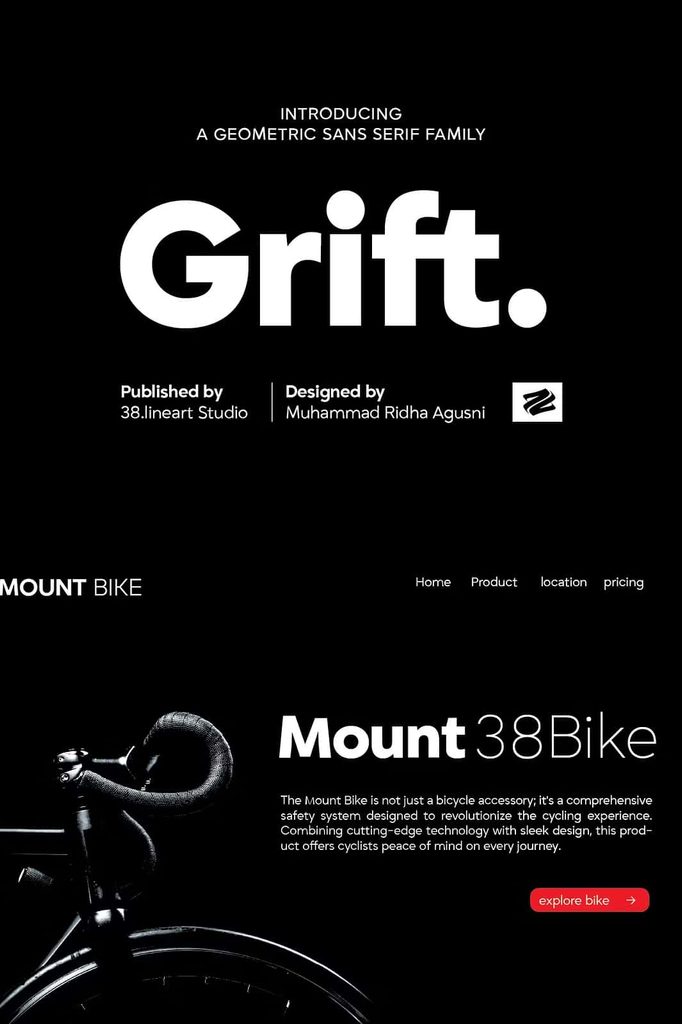
Modern digital design demands typography that communicates quickly and clearly. Grift addresses this need with its clean construction and balanced proportions. Use the family for website headlines, navigation menus, interface labels, buttons, product descriptions, landing pages, dashboards, and application interfaces.
Its straightforward appearance helps users scan information efficiently. Designers can use different weights to distinguish navigation from content, highlight calls to action, or organize large amounts of information into understandable sections.
Build Consistent Digital Experiences
A strong digital interface needs a consistent typographic system. Grift allows designers to create that system within one coordinated family. Assign specific weights to headings, subheadings, body copy, labels, and supporting information to create a predictable visual structure.
The italic styles can also introduce subtle emphasis for announcements, highlighted statements, or selected interface content. Because they retain the family’s geometric character, they add variety without disrupting the overall design.
Distinctive Italics with Geometric Integrity
Grift’s italic styles provide another layer of creative flexibility. Rather than simply changing the angle of the letters, the italics introduce a sense of movement while preserving the family’s underlying structure.
This makes them useful for highlighting important words, creating editorial emphasis, designing expressive headlines, or adding contrast to branding compositions. The result feels energetic without becoming disconnected from the clean visual language of the regular styles.
Applications for Grift Geometric Sans Serif Font
The versatility of Grift makes it suitable for a wide range of creative and professional applications. Consider using the family for:
- Brand identities and logo design
- Corporate communications
- Editorial layouts and magazines
- Books and publications
- Website design
- Mobile and desktop interfaces
- Advertising campaigns
- Packaging design
- Posters and promotional materials
- Business cards and stationery
- Presentations and reports
- Social media graphics
- Digital products and applications
- Creative agency projects
Create Clean and Impactful Typography
Grift gives designers the tools to create typography that feels modern without becoming overly complicated. Its geometric foundation establishes order, while its nine weights provide enough variation to create expressive layouts. This balance allows you to build designs that look professional, organized, and visually engaging.
Experiment with scale, spacing, weight, and alignment to explore the full potential of the family. Use large bold typography for dramatic statements or introduce lighter styles for a more refined appearance. Combine multiple weights within the same composition to create contrast and guide attention.
Why Choose Grift?
Choose Grift Geometric Sans Serif Font Family when you need a flexible type system that can support both creative and professional design work. Its nine weights provide extensive flexibility, while its clean geometry maintains a polished and cohesive appearance.
Grift performs equally well across branding, editorial design, and digital interfaces. Its strong readability makes it practical for communication, while its distinctive construction gives it enough personality to stand out in modern visual systems.
Final Thoughts on Grift Geometric Sans Serif Font
Grift Geometric Sans Serif Font combines modern geometric construction, balanced proportions, clear readability, and extensive weight options into a versatile type family. With nine weights and distinctive italics, it gives designers everything they need to build consistent typographic systems across print and digital projects.
From bold branding and editorial headlines to polished websites and intuitive digital interfaces, Grift adapts to the demands of contemporary design. Its clean lines create clarity, its varied weights establish hierarchy, and its italic styles introduce personality without compromising the family’s geometric integrity.
If you want a modern sans serif family that gives you both structure and creative freedom, Grift offers a dependable solution. Use its extensive range of weights to build cohesive layouts, establish strong visual hierarchy, and communicate your message with confidence.