Mont – A Versatile Geometric Sans Serif Font Family
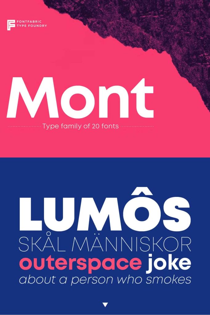
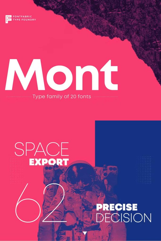
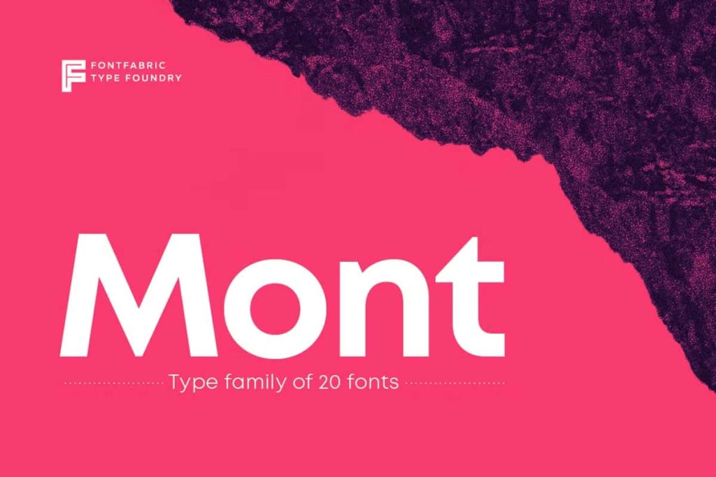
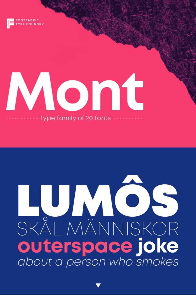
Mont is a refined geometric sans serif typeface designed to deliver clarity, balance, and versatility across a wide range of creative and professional projects. With 10 weights ranging from Hairline to Black and matching italics, Mont gives designers a complete typographic system for building everything from delicate layouts to powerful headlines.
Its carefully balanced construction combines geometric simplicity with distinctive letterform details. Features such as the pointed “t” and prominent x-height give Mont a recognizable personality while maintaining the clean, functional qualities expected from a contemporary sans serif. This combination allows the typeface to perform confidently in display typography while remaining comfortable and effective in longer passages of text.
Mont also offers extensive multilingual support, covering Extended Latin, Cyrillic, and Greek. With support for more than 130 languages, the family provides designers with a practical solution for international branding, editorial design, digital products, advertising, packaging, and other multilingual projects.
A Complete 10-Weight Sans Serif Family
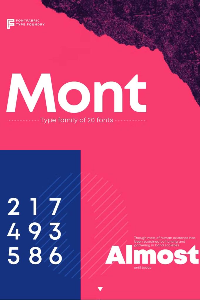
Mont gives you a broad range of weights that makes typographic hierarchy simple to build. The family moves from an extremely delicate Hairline weight through progressively stronger styles to a powerful Black weight. Each step provides a useful level of visual emphasis, allowing designers to create contrast without leaving the family.
Use the lighter weights for elegant captions, subtle supporting information, minimalist layouts, and refined editorial details. Move toward Medium or Semibold when you need stronger emphasis, and choose Bold or Black when a headline, logo, or key message needs immediate attention.
This range makes Mont particularly useful for complete design systems. Rather than combining several unrelated typefaces, you can use the Mont family to establish hierarchy throughout an entire project. Its consistent construction keeps the visual identity unified while its extensive weight range adds flexibility.
Matching Italics for Greater Typographic Control
Every Mont weight comes with a matching italic, giving designers additional tools for emphasis and visual contrast. Italics can highlight important phrases, create secondary headlines, introduce editorial variation, or provide a more dynamic alternative to upright text.
Use the regular styles for primary communication and introduce italics when you need to distinguish supporting information or create a different visual rhythm. Because the italic family matches the corresponding upright weights, you can create contrast without disrupting the overall typographic system.
Distinctive Details with a Geometric Foundation
Mont takes the clean structure of geometric sans serif typography and adds carefully considered details that give the family its own identity. The pointed “t” creates a recognizable feature that can make headlines and logos feel more distinctive.
The prominent x-height also contributes to Mont’s strong visual presence. A generous x-height can help lowercase text maintain clarity and impact, particularly when used in digital interfaces, headlines, and compact text blocks. This characteristic supports the typeface’s ability to transition between display and text applications.
These details prevent Mont from feeling generic. While the family maintains a disciplined geometric foundation, its individual letterforms introduce enough personality to help your designs stand apart.
Designed for Strong Headlines
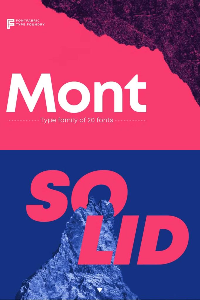
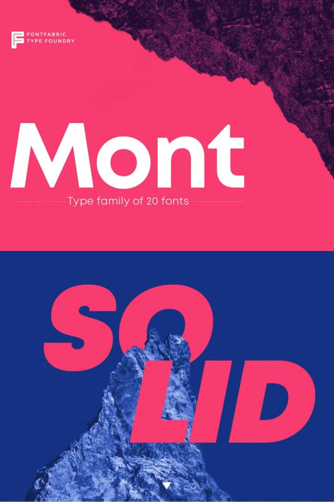
Mont performs exceptionally well when typography needs to attract attention. Its geometric construction, extensive weight range, and distinctive letterforms allow designers to create headlines that feel modern, confident, and structured.
Use the heavier weights for website hero sections, advertising headlines, magazine titles, campaign graphics, posters, and presentation covers. Black and Bold can create powerful statements, while Medium and Semibold provide a more controlled level of emphasis.
The family also works well when you combine multiple weights within the same composition. For example, pair a Black headline with a Light supporting line to create strong contrast while maintaining a cohesive visual identity.
Excellent for Logo and Brand Design
Mont’s geometric foundation makes it a strong candidate for contemporary branding and logo design. Its clean structure provides a professional appearance, while details such as the pointed “t” can introduce a recognizable signature.
Use Mont to create wordmarks, business names, brand headlines, packaging identities, campaign titles, and corporate communications. The range of weights lets you test different visual directions without changing the fundamental character of the typography.
For minimalist logos, explore the lighter or regular weights. For bold lifestyle brands, technology companies, fashion projects, or creative businesses, experiment with Semibold, Bold, or Black. The matching italics can also introduce a secondary visual language for campaigns and supporting materials.
Ideal for Long-Form Text
Although Mont excels in headlines and logos, its balanced construction also makes it suitable for longer text. The family maintains a clear and organized appearance across paragraphs, making it useful for editorial layouts, websites, brochures, presentations, and other communication-focused designs.
The prominent x-height helps maintain a strong presence at smaller sizes, while the clean geometric structure keeps the overall appearance contemporary. Designers can use lighter or regular weights for body copy and stronger weights for headings, subheadings, and highlighted information.
This flexibility makes Mont a practical choice for projects that require both display typography and readable text. You can establish a complete hierarchy using one coordinated font family.
Multilingual Typography for More Than 130 Languages
Mont expands its usefulness with extensive language support. The family supports Extended Latin, Cyrillic, and Greek, covering more than 130 languages altogether.
This multilingual capability makes Mont particularly valuable for international branding and communication. Designers can maintain a consistent typographic identity across different languages instead of relying on unrelated fonts for regional versions of a project.
Use Mont for global websites, international campaigns, packaging, publications, corporate identities, digital products, and multilingual marketing materials. Its broad character support helps creative teams maintain visual consistency across markets.
Built for Global Design Systems
When a brand operates across multiple regions, typography needs to remain recognizable and reliable. Mont provides a cohesive family that can support diverse language requirements while preserving a consistent geometric character.
This makes the typeface a useful option for designers working on international identities, multilingual websites, product interfaces, advertising campaigns, and editorial publications.
Creative Applications for Mont
- Logo and wordmark design
- Corporate branding and identity systems
- Website headlines and body text
- Mobile and digital interfaces
- Editorial layouts and magazines
- Books and brochures
- Advertising campaigns
- Posters and promotional graphics
- Packaging and product branding
- International and multilingual branding
- Presentations and corporate documents
- Social media graphics
- Fashion and lifestyle branding
- Technology and startup identities
- Long-form editorial content
Create a Consistent Typographic Hierarchy
One of Mont’s biggest advantages is its ability to handle an entire hierarchy within a single family. Start with Black or Bold for your primary headline, use Semibold or Medium for secondary headings, and select Regular or Light for supporting information.
You can also introduce italics to emphasize key phrases or create visual separation between different content types. This approach keeps your typography consistent while giving each level of information a clear role.
For minimalist layouts, experiment with generous spacing and lighter weights. For more energetic compositions, combine heavier weights with tighter arrangements. Mont adapts to both approaches without losing its recognizable identity.
Mont – Geometric Simplicity with Distinctive Character
Mont combines geometric precision with subtle typographic personality, creating a versatile sans serif family for modern design. Its 10 weights, matching italics, distinctive pointed “t,” prominent x-height, and extensive multilingual support give designers a powerful system for both display and text applications.
From strong headlines and outstanding logos to long-form text and international communication, Mont adapts to the demands of contemporary design. Its wide range of weights allows you to create clear hierarchy, while its multilingual character set helps maintain a consistent visual identity across more than 130 languages.
Choose Mont when you need a geometric sans serif that offers more than a clean appearance. Its balanced proportions, distinctive details, broad weight range, and global language support make it a reliable choice for branding, editorial design, digital products, packaging, advertising, and many other creative applications.