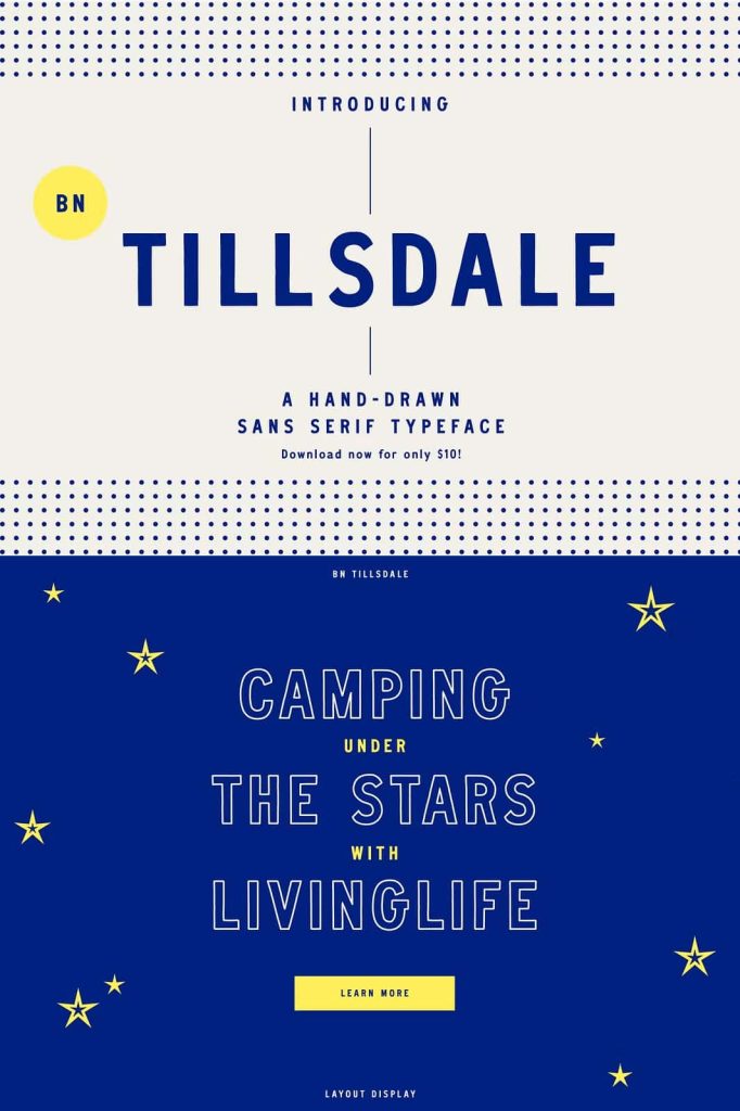
BN Tillsdale Hand-Drawn Sans Serif Font
BN Tillsdale is a versatile hand-drawn sans serif typeface designed to bring personality, balance, and handcrafted character to modern graphic design. With three carefully developed weights and a well-balanced semi-condensed structure, BN Tillsdale gives designers the flexibility to create everything from distinctive display layouts and quirky logos to editorial compositions and long-form content.
The typeface combines the clean foundation of a sans serif with the natural imperfections of hand-drawn lettering. This combination creates a friendly and approachable appearance without sacrificing structure or readability. BN Tillsdale can support expressive headlines when you need to make a strong statement, while its balanced proportions also allow it to handle smaller text and longer passages with confidence.
A Hand-Drawn Sans Serif with Character
BN Tillsdale stands apart through its handcrafted construction. Rather than presenting perfectly uniform digital letterforms, the typeface introduces subtle human qualities that make the lettering feel more personal and visually engaging. These details add warmth while preserving the clarity expected from a functional sans serif.
The result is a typeface that can move comfortably between playful and professional design environments. Use it when you want a layout to feel approachable, creative, and slightly unconventional without making the typography difficult to read.
Three Useful Font Weights
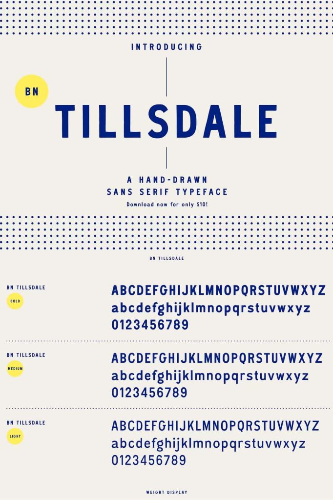
BN Tillsdale comes in three weights, giving designers greater control over hierarchy and emphasis. Multiple weights allow you to build complete typographic systems while maintaining the distinctive personality of the family.
Use a heavier weight for prominent headlines, titles, logos, and display text. Choose a medium treatment for subheadings, supporting statements, and highlighted information. A lighter weight can provide a more restrained appearance for paragraphs, captions, descriptions, and other secondary content.
Create Clear Typographic Hierarchy
Strong typography depends on clear relationships between different levels of information. BN Tillsdale makes it easier to establish those relationships because you can use different weights while keeping the same underlying letterform style.
For example, place a bold BN Tillsdale headline at the top of a poster, use a medium weight for supporting details, and apply the lighter weight to additional information. This approach creates contrast without introducing unrelated typefaces into the composition.
Balanced Semi-Condensed Form
The semi-condensed structure gives BN Tillsdale a practical balance between character and space efficiency. Its proportions allow designers to create strong headlines without requiring excessive horizontal space. This makes the typeface particularly useful for posters, packaging, editorial layouts, website headers, and other designs where available space matters.
The condensed influence also creates a distinctive visual rhythm. Words can sit comfortably within narrow layouts while maintaining enough openness for comfortable reading. This balance allows BN Tillsdale to perform well at both display sizes and smaller applications.
Perfect for Display Layouts
BN Tillsdale can create strong visual impact in display typography. Use it for posters, advertisements, banners, campaign graphics, event materials, presentation covers, magazine headlines, and promotional artwork.
The hand-drawn personality helps headlines feel less generic, while the semi-condensed structure allows you to fit longer phrases into compact compositions. Experiment with large-scale lettering, stacked words, centered layouts, or asymmetric arrangements to emphasize the font’s expressive qualities.
Create Quirky and Memorable Logos
Logo design benefits from typography that feels distinctive and recognizable. BN Tillsdale provides a handcrafted quality that can help a wordmark stand apart from conventional sans serif identities. Its playful details make it particularly effective for brands that want to communicate creativity, friendliness, and individuality.
Use the heavier weights for strong wordmarks and experiment with spacing to create a custom logo treatment. BN Tillsdale can suit creative studios, independent businesses, lifestyle brands, cafés, boutiques, publishers, restaurants, makers, and other businesses that want a more approachable identity.
Build a Friendly Brand Personality
The combination of hand-drawn details and clean sans serif structure gives BN Tillsdale a human personality. This makes it useful for brands that want to appear accessible rather than overly corporate.
Use the font consistently across logos, packaging, social media graphics, promotional materials, and website headings. Different weights allow you to create variation while preserving the same recognizable visual language throughout the brand.
Excellent for Editorial Design
BN Tillsdale can add personality to editorial projects without overwhelming the content. Use it for magazine headlines, article titles, section headings, pull quotes, captions, brochures, catalogs, newsletters, and creative publications.
The semi-condensed structure helps designers manage space efficiently, while the hand-drawn qualities add a unique editorial voice. Combine BN Tillsdale with a neutral serif or sans serif for body copy to create a balanced typographic system.
Suitable for Long-Form Content
Although BN Tillsdale has a strong display personality, its balanced structure also allows it to work in longer text applications. Use an appropriate weight and size to create paragraphs, descriptions, articles, product information, or other extended content where readability matters.
The clean sans serif foundation keeps the text approachable, while the handcrafted details prevent long layouts from feeling completely sterile. This makes BN Tillsdale a useful choice for designers who want to maintain personality across both headlines and supporting content.
Packaging and Product Design
BN Tillsdale can help packaging designs communicate personality and craftsmanship. Use it for product names, labels, ingredient headings, promotional messages, collection titles, stickers, and packaging artwork.
The three weights provide useful flexibility for organizing information. Choose a bold weight for the product name, a medium weight for important details, and a lighter treatment for supporting text. This creates a clear visual hierarchy while keeping the entire package visually consistent.
Social Media and Digital Graphics
BN Tillsdale also performs well in digital design. Use it for social media posts, advertisements, website headers, promotional banners, presentation slides, thumbnails, digital invitations, and campaign graphics.
Its handcrafted personality can make digital content feel more personal and engaging. Use large display text to capture attention, then combine smaller weights with clean layouts to provide supporting information. The semi-condensed structure also helps maximize space in square and vertical social media formats.
Creative Uses for BN Tillsdale
- Logo and wordmark design
- Brand identity systems
- Display typography
- Poster and flyer design
- Editorial layouts
- Magazine headlines
- Long-form content
- Website headers
- Packaging and product labels
- Social media graphics
- Digital advertising
- Presentation design
- Business cards and stationery
- Event invitations
- Creative brochures
- Catalog and publication design
- Apparel graphics
- Sticker and merchandise design
- Restaurant and café branding
- Personal creative projects
Works Across Different Design Styles
BN Tillsdale offers enough personality to support playful projects while maintaining enough structure for more refined designs. Use it with colorful illustrations and quirky graphics for a youthful appearance, or pair it with minimalist layouts and neutral elements for a more sophisticated result.
The typeface can also adapt to vintage-inspired projects. Its hand-drawn construction naturally complements textured backgrounds, retro illustrations, and classic graphic treatments. At the same time, its clean sans serif foundation keeps it relevant for contemporary design.
Pair BN Tillsdale with Complementary Fonts
Designers can create strong typographic combinations by pairing BN Tillsdale with a contrasting typeface. A classic serif can add sophistication to an editorial layout, while a neutral sans serif can provide clean supporting information.
Use BN Tillsdale for the elements that need personality and visual emphasis, then assign the complementary typeface to body copy and detailed information. This strategy keeps the design organized while allowing BN Tillsdale’s handcrafted character to remain prominent.
Why Choose BN Tillsdale?
Choose BN Tillsdale when you need a hand-drawn sans serif that balances creativity with practical versatility. Its three weights provide the flexibility to build clear typographic hierarchy, while its semi-condensed structure helps designers manage space effectively.
The typeface can handle logos, display layouts, editorial work, packaging, digital graphics, and even long-form content. Its handcrafted personality adds warmth and individuality, making it a useful option for designers who want to move beyond standard geometric or corporate sans serif typography.
Final Thoughts
BN Tillsdale brings together the clarity of a sans serif and the personality of hand-drawn lettering. Its three weights, balanced semi-condensed proportions, and carefully crafted details give designers a flexible tool for a wide range of creative applications.
Use BN Tillsdale to create unique display layouts, quirky logos, expressive branding, editorial designs, packaging, social media graphics, and long-form content. Its adaptable personality allows you to move between playful, modern, vintage-inspired, and professional visual directions while maintaining a consistent typographic character.
If you want a versatile hand-drawn sans serif with strong personality, practical proportions, and multiple weight options, BN Tillsdale offers a reliable and creative foundation for your next design project.