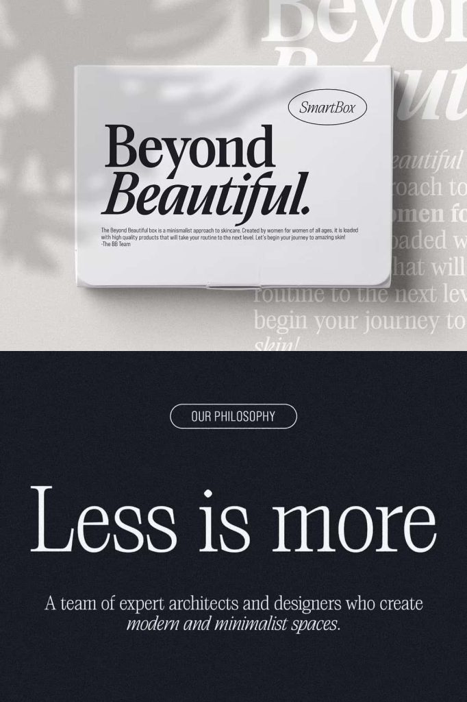
Saigon Minimalist Condensed Serif Font
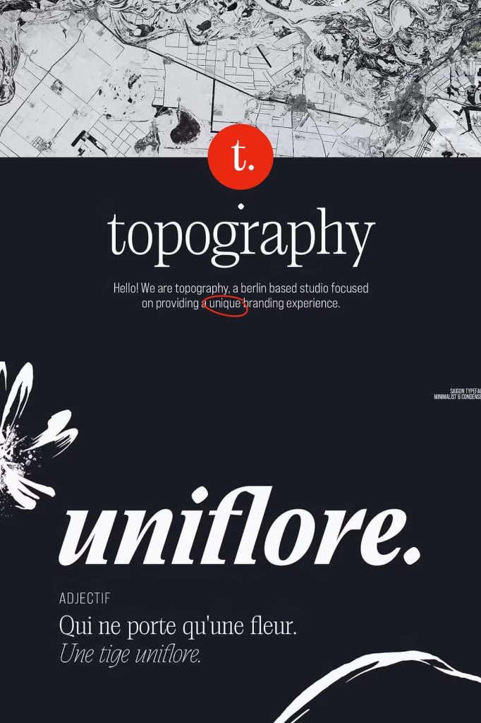
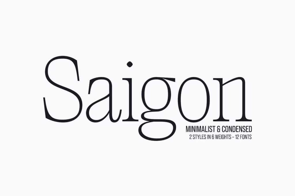
Saigon is a minimalist condensed serif font that transforms simplicity into a refined typographic experience. With clean lines, tight curves, and carefully balanced proportions, this typeface creates a sophisticated visual identity without relying on excessive decoration. Its understated personality makes it an excellent choice for designers who want to communicate elegance, clarity, and modernity through typography.
Inspired by the timeless qualities of editorial typography, Saigon combines a condensed structure with refined serif details to create a distinctive appearance. Its narrow proportions allow designers to fit strong headlines into compact spaces while maintaining an elegant visual rhythm. The result is a typeface that feels both contemporary and enduring, making it suitable for projects that need a sophisticated design language.
Minimalist Design with Timeless Character
Saigon builds its identity around simplicity. Every letterform uses clean lines and controlled curves to create a polished and harmonious appearance. Rather than adding unnecessary ornamentation, the font allows its structure to communicate personality. This restrained approach makes Saigon especially effective for modern editorial projects where typography needs to complement imagery and layout rather than compete with them.
The condensed proportions add another layer of versatility. Designers can use longer words and headlines without requiring excessive horizontal space. This makes Saigon particularly valuable for magazine covers, posters, website headings, packaging, and other layouts where space matters. Its narrow silhouette also creates an elegant vertical rhythm when several lines of text appear together.
A Refined Editorial Typeface
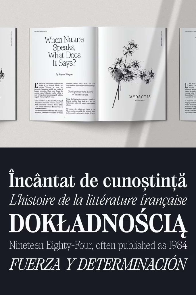
Saigon naturally fits editorial design because it combines strong readability with a sophisticated visual character. Its serif details create a sense of tradition, while the minimalist construction keeps the overall appearance fresh and contemporary. This balance allows designers to create layouts that feel established without appearing outdated.
Use Saigon for magazine titles, feature headlines, section headings, book covers, fashion editorials, photography publications, brochures, catalogs, and lifestyle layouts. Large typography can showcase the carefully shaped curves and refined serif details, while smaller applications can provide a subtle touch of elegance throughout a design system.
Perfect for Fashion and Lifestyle Editorials
Saigon works particularly well in fashion and lifestyle environments where typography plays an important role in communicating sophistication. Its condensed silhouette can create dramatic headlines, while its clean construction supports minimalist compositions. Pair the font with high-quality photography, generous whitespace, and restrained graphic elements to create a premium editorial atmosphere.
Fashion brands can use Saigon for campaign titles, lookbooks, collection names, magazine advertisements, and promotional materials. Lifestyle brands can also use the typeface to create a calm and sophisticated visual identity across catalogs, brochures, packaging, and digital campaigns.
Elegant Upright and Italic Styles
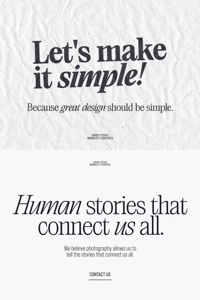
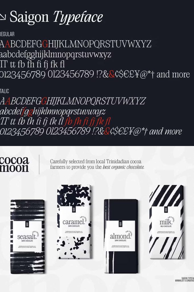
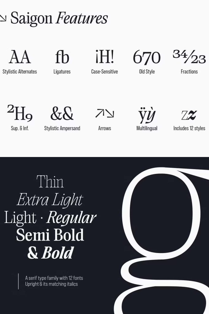
One of the strongest features of Saigon is the relationship between its upright and italic styles. The italic treatment moves away from traditional strokes and introduces a more modest, contemporary interpretation. This variation creates visual contrast while maintaining the core personality of the typeface.
The italic style can work alongside the upright version to create a harmonious typographic rhythm. Use the upright style for primary headlines and switch to italic for emphasis, secondary phrases, captions, or selected words. This simple contrast can add movement to a layout without disrupting the minimalist aesthetic.
Creating Contrast with Italic Typography
The italic version gives designers another way to introduce personality into their compositions. Its softer movement can highlight specific words or create a subtle distinction between different levels of information. Because it shares the same overall design language as the upright style, the two variations work together naturally.
Try combining upright and italic words within a headline to create a sophisticated editorial treatment. You can also use italic text for subtitles or short supporting phrases while keeping the main title in the upright style. This approach helps establish hierarchy while preserving visual consistency.
Ideal for Modern Branding
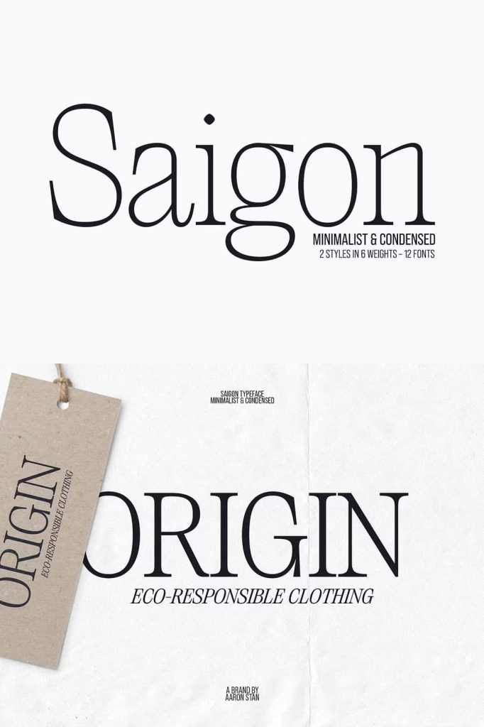
Saigon provides a strong foundation for minimalist brand identities. Its condensed serif construction gives logos and wordmarks a distinctive appearance, while its clean details maintain a professional and polished character. The font can help brands communicate sophistication, confidence, creativity, and timeless style.
Use Saigon for fashion labels, creative studios, architecture firms, publishing companies, boutique businesses, lifestyle brands, restaurants, hospitality projects, and premium product identities. Its restrained appearance allows the brand name to remain the primary focus while the serif details add a memorable visual signature.
Packaging and Product Design
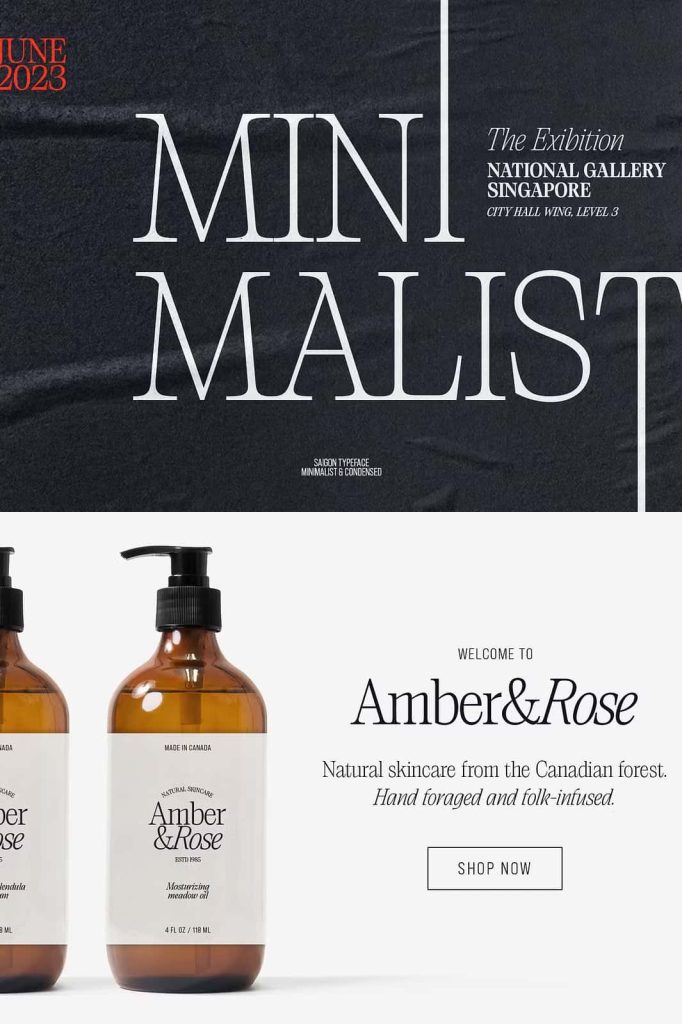
Minimalist packaging often depends on typography to establish a premium impression, and Saigon works exceptionally well in this environment. Its condensed structure allows product names and collection titles to occupy less horizontal space while maintaining strong visual impact.
Use Saigon for cosmetic packaging, perfume labels, skincare products, specialty foods, beverages, candles, fashion accessories, stationery, and boutique merchandise. Combine the font with generous whitespace, subtle colors, and carefully selected imagery to create packaging that feels sophisticated and intentional.
Posters and Compact Layouts
Saigon’s condensed proportions make it especially useful for posters and layouts that need to communicate a lot of information without sacrificing visual quality. Large headlines can occupy narrow spaces while maintaining their presence, giving designers greater freedom when arranging text and graphic elements.
Use the typeface for event posters, cultural programs, exhibitions, advertisements, promotional campaigns, and creative announcements. Its minimalist character allows designers to experiment with scale, alignment, overlapping text, and whitespace while keeping the overall composition organized.
Creative Uses for Saigon
- Editorial magazine design
- Fashion magazine headlines
- Minimalist logo and wordmark design
- Brand identity systems
- Book and publication covers
- Photography portfolios
- Fashion lookbooks
- Luxury packaging
- Cosmetic and skincare branding
- Poster and advertising design
- Website headlines
- Editorial websites
- Brochures and catalogs
- Restaurant and hospitality branding
- Social media campaign graphics
- Creative presentations
- Event and exhibition graphics
- Lifestyle branding projects
Build a Harmonious Typographic System
Saigon allows designers to build a cohesive typographic system by combining its upright and italic styles. Use the upright version to establish structure and authority, then introduce the italic style to add movement and emphasis. This relationship creates a natural hierarchy without requiring multiple unrelated typefaces.
You can also experiment with generous tracking to emphasize the font’s refined editorial qualities. Alternatively, tighter spacing can create a more compact and contemporary appearance. Because the typeface already has a distinctive condensed structure, small adjustments to spacing can significantly influence the mood of the final composition.
Designed for Sophisticated Minimalism
Saigon proves that minimalist typography does not need to feel plain. Its personality emerges through carefully controlled curves, serif details, narrow proportions, and the relationship between upright and italic forms. These subtle characteristics give designers enough visual interest to create memorable work while preserving a clean and restrained aesthetic.
This makes Saigon an excellent choice for projects that prioritize simplicity, balance, and sophistication. Rather than overwhelming the viewer, the font communicates through proportion and detail. Every letter contributes to a cohesive visual rhythm that supports the overall design.
Why Choose Saigon Font?
Choose Saigon when you need a condensed serif typeface that combines minimalist structure with timeless editorial elegance. Its clean lines and tight curves create a sophisticated appearance, while its italic style adds a contemporary alternative to the upright form.
The font’s versatility makes it useful across branding, editorial design, packaging, posters, fashion campaigns, websites, and promotional materials. It can create dramatic headlines, elegant logos, refined packaging, and consistent visual identities without relying on excessive decorative elements.
Final Thoughts
Saigon is a minimalist condensed serif font that demonstrates how powerful simplicity can become when designers carefully balance proportion, curves, and typography. Its clean lines and refined serif details create a timeless foundation, while its narrow structure gives modern layouts a distinctive visual rhythm.
The relationship between its upright and italic styles adds further versatility, allowing designers to introduce contrast while maintaining a harmonious identity. From editorial layouts and fashion branding to packaging, posters, logos, and digital campaigns, Saigon brings understated sophistication to every project.
If you want a condensed serif font that combines modern simplicity with timeless editorial character, Saigon provides an elegant and versatile solution. Its refined forms allow your typography to communicate with confidence while keeping the overall design clean, balanced, and memorable.