Neo Forma Font Duo
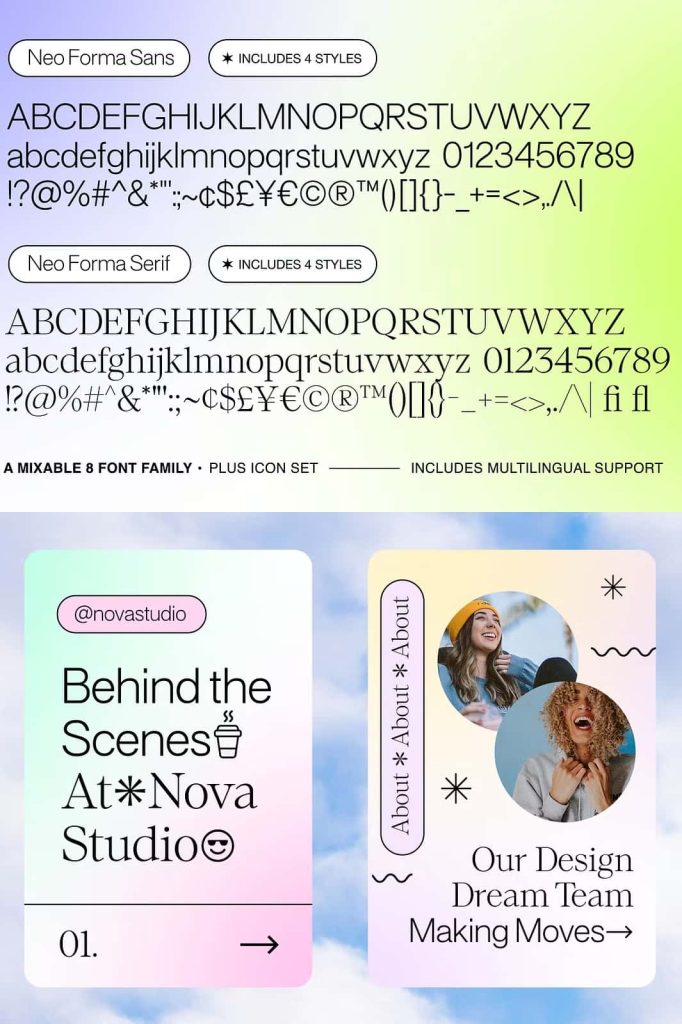
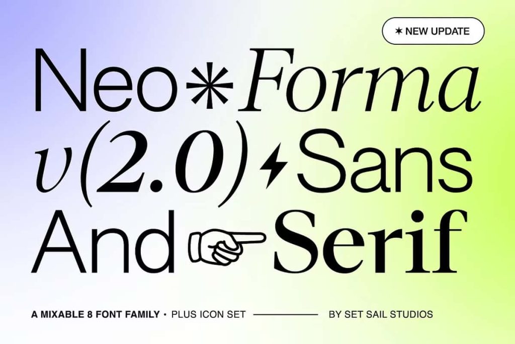
Neo Forma Font Duo is a complete typography solution that combines the versatility of a modern sans serif typeface with the sophistication of a contemporary serif font. Carefully designed as a perfectly matched pair, Neo Forma eliminates the challenge of finding fonts that work harmoniously together. Every detail has been crafted to ensure seamless compatibility, allowing designers to build visually balanced layouts with confidence and consistency.
Whether you are creating a modern brand identity, designing a professional website, producing editorial content, or developing social media campaigns, Neo Forma provides the flexibility needed to achieve polished and engaging results. The collection includes a clean sans serif font, an elegant serif font, and a bonus icon font featuring 67 carefully designed symbols. Together, these elements create an all-inclusive typography package suitable for a wide variety of creative and commercial applications.
Neo Forma is ideal for designers who value efficiency, consistency, and creative freedom. By combining complementary typefaces within a single package, it enables users to focus on design without spending hours searching for compatible font pairings.
A Perfectly Matched Sans and Serif Combination
One of the biggest challenges in typography is selecting fonts that complement one another without creating visual conflict. Neo Forma solves this problem by offering two professionally designed typefaces that were developed side by side from the very beginning.
The sans serif font delivers a clean, modern appearance that works beautifully for digital interfaces, branding, and contemporary layouts. Its streamlined structure communicates clarity, professionalism, and confidence. The serif companion introduces elegance, refinement, and visual contrast, making it perfect for headlines, editorial content, and premium branding projects.
Because both fonts share matching proportions, metrics, and weight systems, they work together effortlessly. Designers can confidently combine them within a single project to create balanced visual hierarchies and sophisticated typographic compositions.
Designed for Contemporary and Creative Layouts
Neo Forma has been built with modern design requirements in mind. The pairing of sans serif and serif styles gives designers the freedom to create layouts that feel fresh, dynamic, and professional. The fonts can be used independently or combined to establish strong visual contrast and clear content organization.
For contemporary branding projects, designers can use the sans serif font for body text and supporting information while highlighting key messages with the serif font. This contrast creates a polished and engaging visual experience that enhances readability and strengthens brand communication.
For more experimental projects, Neo Forma allows designers to mix both styles creatively, resulting in unique layouts that feel innovative and expressive while maintaining a cohesive appearance.
Matching Weights and Metrics for Seamless Integration
Unlike many font pairings that require extensive adjustments to achieve consistency, Neo Forma has been engineered with matching weights and metrics. This means that both the serif and sans serif fonts align naturally when used together, reducing the need for manual corrections and saving valuable design time.
The consistent proportions help establish visual harmony across headlines, subheadings, body text, and supporting content. Designers can switch between the two typefaces without disrupting the overall flow of a layout, making the font duo particularly valuable for branding systems, editorial publications, and digital experiences.
This thoughtful approach to typography ensures that every project feels cohesive, professional, and visually balanced.
Features Included in Neo Forma Font Duo
- Modern sans serif typeface
- Elegant serif typeface
- Matching weights and font metrics
- Seamless font pairing for professional layouts
- Bonus icon font with 67 symbols
- Stars, arrows, decorative icons, and graphic elements
- Perfect for print and digital applications
- Ideal for branding, editorial, and web design
- Consistent typography system for creative projects
- Professional-quality design with versatile usability
Bonus Icon Font with 67 Creative Symbols
Neo Forma goes beyond traditional typography by including a dedicated icon font featuring 67 unique symbols. This collection includes stars, arrows, decorative elements, and other graphic icons designed to complement both the sans serif and serif fonts.
These icons provide designers with additional creative tools for enhancing layouts, highlighting information, and adding visual interest to branding materials. They can be used as decorative accents, navigation elements, section dividers, social media graphics, or background design components.
Because the icons were developed alongside the typography, they integrate naturally into projects without feeling disconnected or inconsistent. This creates a unified visual language that strengthens overall design quality.
Perfect for Branding and Identity Design
Strong branding requires typography that communicates professionalism while remaining distinctive and memorable. Neo Forma delivers both qualities by providing a complete type system capable of supporting every aspect of a brand identity.
The sans serif font creates a modern and approachable appearance, while the serif counterpart introduces sophistication and authority. Together, they help brands establish clear communication and consistent visual recognition across multiple platforms.
Whether designing logos, business stationery, packaging, marketing materials, or digital assets, Neo Forma provides the flexibility needed to maintain a cohesive brand presence.
Optimized for Websites and Digital Experiences
Modern websites require typography that performs effectively across different screen sizes and devices. Neo Forma has been designed with readability and functionality in mind, ensuring excellent performance in digital environments.
The clean sans serif style works exceptionally well for user interfaces, navigation menus, and body text, while the serif font adds visual distinction to headlines and featured content. This combination allows designers to create websites that feel professional, engaging, and easy to navigate.
The included icon font further enhances digital projects by providing decorative and functional elements that improve user experience and visual consistency.
Excellent for Editorial and Print Design
Editorial projects benefit greatly from typography that offers contrast, hierarchy, and readability. Neo Forma delivers all three through its carefully balanced serif and sans serif pairing. Magazine layouts, brochures, reports, books, and promotional materials all benefit from the font duo’s versatility and professional appearance.
Designers can use the serif font to create impactful headlines and feature articles while relying on the sans serif font for supporting content and detailed information. This combination creates visually engaging layouts that guide readers naturally through the content.
Why Choose Neo Forma Font Duo?
Neo Forma Font Duo offers a complete typography system designed to simplify the creative process while delivering exceptional design quality. By combining a modern sans serif font, an elegant serif font, and a bonus icon font into a single package, it provides everything needed to build cohesive and professional visual identities.
The carefully matched weights and metrics eliminate the guesswork often associated with font pairing, allowing designers to create harmonious layouts quickly and efficiently. The included icon collection adds further creative possibilities, making Neo Forma an incredibly versatile solution for branding, websites, social media content, editorial publications, and print design.
For designers seeking a flexible, contemporary, and professionally crafted typography package, Neo Forma Font Duo is an outstanding choice. Its combination of functionality, elegance, and creative versatility makes it a valuable addition to any design toolkit, helping projects achieve clarity, consistency, and lasting visual impact.