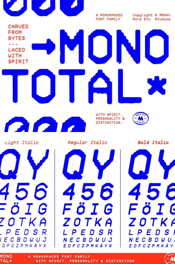
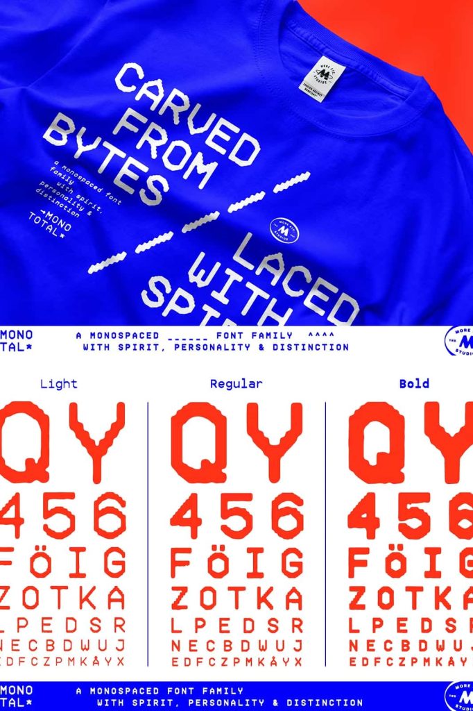
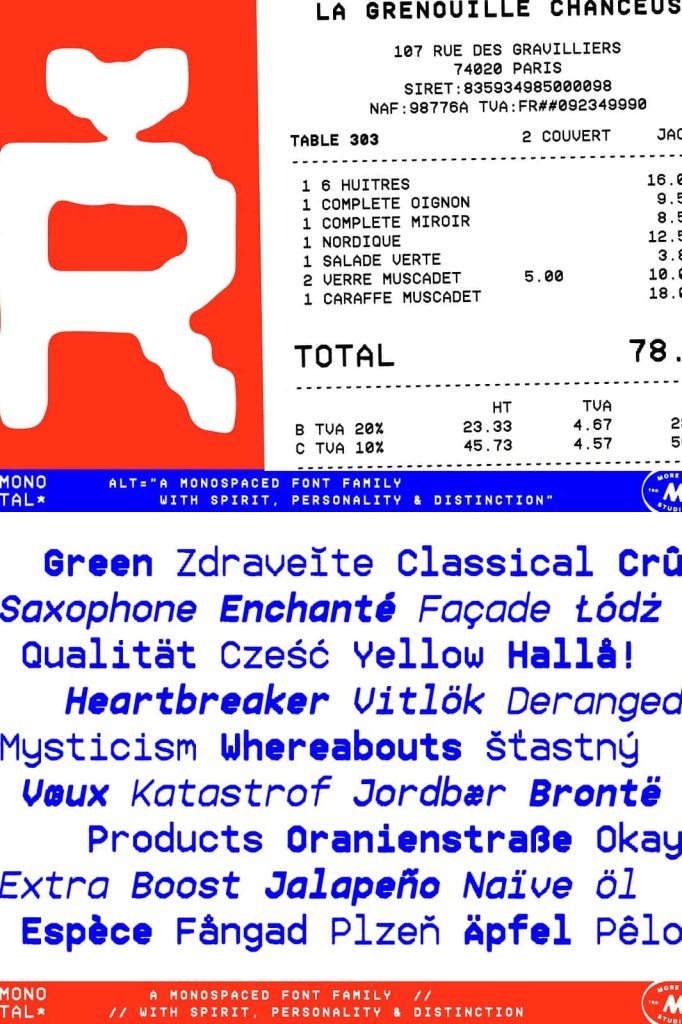
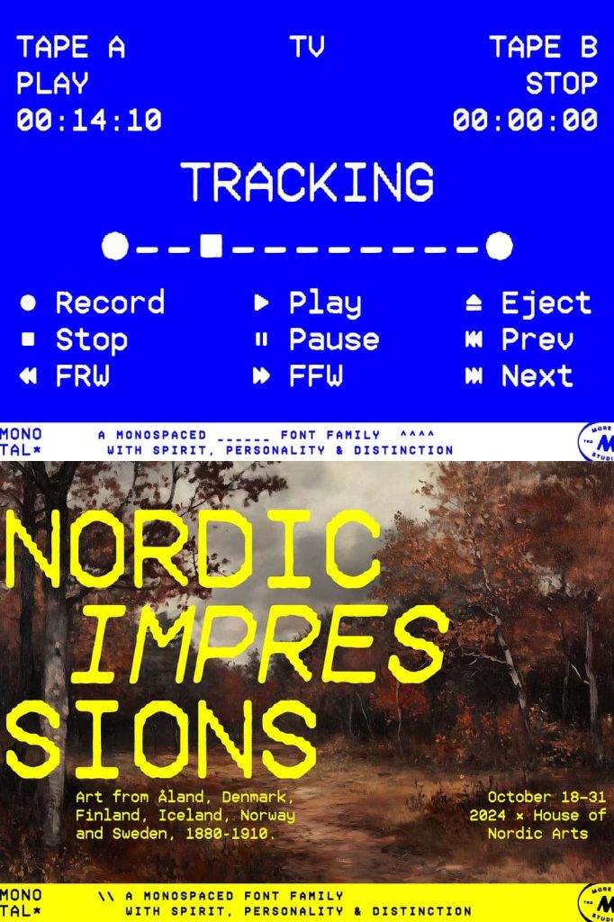
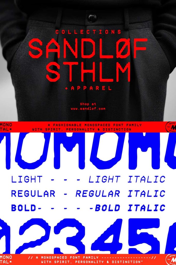
Mono Total Monospaced Font Family – A Characterful Typeface That Blends Digital Precision with Analog Warmth
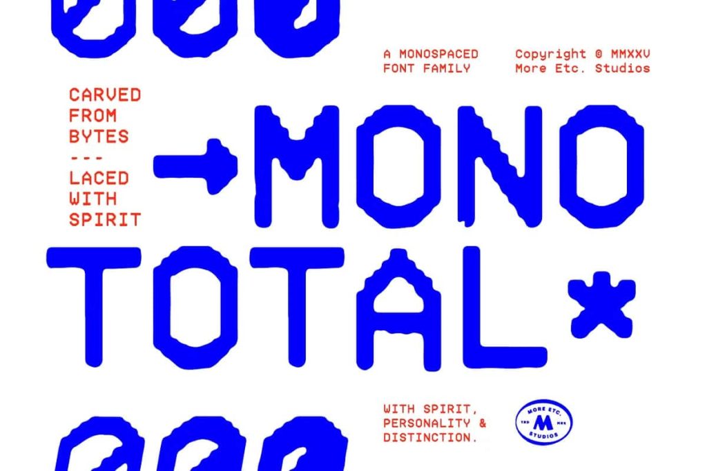
Mono Total is a thoughtfully designed monospaced font family that combines technical precision with a rich and expressive personality. Created to move beyond the limitations of conventional monospaced typography, this unique typeface family transforms strict geometric structures into visually engaging letterforms that feel warm, human, and timeless.
While many monospaced fonts focus solely on functionality, Mono Total introduces a refreshing balance between digital accuracy and handcrafted character. Its design reflects meticulous craftsmanship, turning a traditionally technical style into a versatile typography system suitable for modern branding, editorial design, digital products, creative communication, and professional applications.
The result is a font family that resists sterile perfection and embraces individuality. Mono Total delivers the precision expected from monospaced typography while introducing subtle details that add depth, warmth, and visual distinction. Whether used in technology-focused projects or creative branding, the typeface creates a memorable impression that sets designs apart from the ordinary.
A Monospaced Typeface with Distinctive Personality
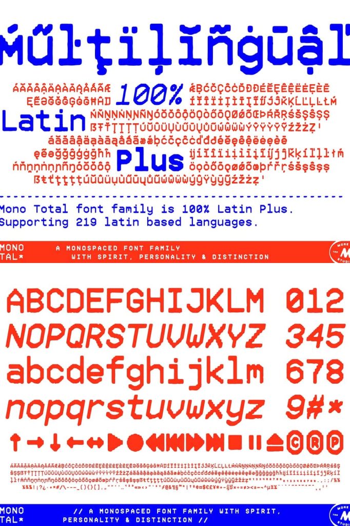
Monospaced fonts have long been associated with coding environments, technical documentation, and digital interfaces. Mono Total takes this foundation and reimagines it with a more expressive and approachable design language. Every character retains the consistent spacing that defines monospaced typography while introducing refined details that create a more engaging visual experience.
This unique combination allows designers to maintain the structure and functionality of a monospaced typeface without sacrificing creativity or aesthetic appeal. The font family feels modern and professional while preserving a human touch that makes it suitable for a wide variety of applications.
By combining technical discipline with artistic expression, Mono Total offers a fresh perspective on monospaced typography and expands the possibilities for how these fonts can be used in contemporary design.
Inspired by Digital Origins, Refined Through Craftsmanship
Mono Total draws inspiration from the digital world, where monospaced fonts have played a critical role in communication and technology. However, rather than simply replicating traditional coding fonts, the typeface introduces a refined design approach that enhances both functionality and visual appeal.
Its geometric foundations provide clarity and consistency, while subtle analog influences soften the overall appearance. This careful balance transforms rigid structures into letterforms that feel more natural and approachable.
The craftsmanship behind Mono Total demonstrates a commitment to quality typography. Every curve, line, and proportion has been carefully considered to ensure the typeface remains readable, versatile, and visually distinctive across different mediums and environments.
Key Features of Mono Total
- Professionally designed monospaced font family
- Combines digital precision with analog warmth
- Distinctive geometric letterforms
- Consistent character spacing for technical accuracy
- Strong readability across digital and print formats
- Unique personality and timeless appeal
- Versatile for branding, editorial, and technology projects
Warm Analog Expression in a Modern Typeface
One of the most remarkable qualities of Mono Total is its ability to introduce warmth into a category of typography often associated with mechanical precision. The typeface avoids feeling cold or overly technical by incorporating subtle characteristics that create a more inviting visual tone.
These analog influences help the font feel authentic and approachable while maintaining the reliability expected from a monospaced design. The result is typography that communicates professionalism without appearing distant or impersonal.
This warmth makes Mono Total especially effective for brands and designers seeking a balance between innovation and human connection. It allows projects to communicate technical expertise while remaining accessible and engaging.
Perfect for Modern Branding and Identity Design
Typography is one of the most important elements of a brand identity, and Mono Total offers a distinctive voice that helps businesses stand out. Its combination of precision and personality creates a memorable visual language that feels contemporary, confident, and original.
The font family works exceptionally well for technology companies, creative agencies, digital products, startups, architecture firms, design studios, and modern lifestyle brands. Its structured appearance communicates professionalism, while its expressive details add individuality and character.
Designers can use Mono Total to create logos, brand guidelines, packaging, marketing materials, and visual systems that remain consistent across multiple platforms and applications.
Excellent for Editorial and Publishing Projects
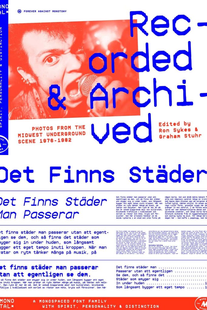
Mono Total performs beautifully in editorial environments where typography plays a significant role in shaping the reader experience. Its monospaced structure creates a distinctive rhythm that adds visual interest to layouts while maintaining readability.
Magazines, books, reports, catalogs, and creative publications can benefit from the font’s unique character. Designers can use it for headlines, subheadings, pull quotes, captions, and body text to create editorial compositions that feel modern and sophisticated.
Its timeless appearance ensures that content remains visually relevant while supporting strong communication and information hierarchy.
Ideal for Technology, Coding, and Digital Interfaces
As a monospaced typeface, Mono Total naturally excels in technology-focused applications. Developers, software companies, and digital product teams can use the font in coding environments, dashboards, user interfaces, technical documentation, and data visualization projects.
The consistent spacing of monospaced typography improves alignment and readability, making information easier to scan and interpret. At the same time, Mono Total’s unique character helps digital products feel more polished and distinctive.
This balance of functionality and design makes the font an excellent choice for modern technology projects that require both precision and visual appeal.
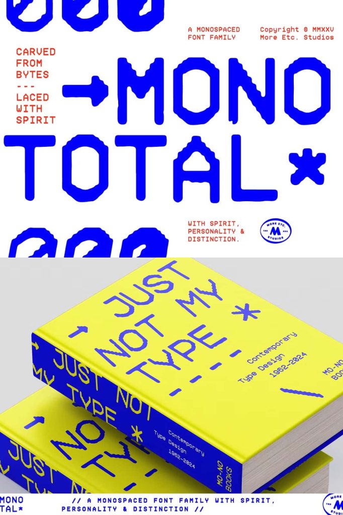
Create Impactful Packaging and Marketing Materials
Mono Total’s distinctive personality allows it to stand out in packaging and marketing applications. Its combination of geometric structure and analog warmth creates typography that captures attention while reinforcing brand identity.
The font works effectively on product packaging, labels, promotional materials, advertisements, and campaign assets. Designers can use its unique visual style to create memorable customer experiences and strengthen brand recognition.
Whether used as a primary typeface or paired with complementary fonts, Mono Total adds character and sophistication to marketing communications.
Popular Design Applications
- Branding and visual identity design
- Technology and software projects
- Coding and developer interfaces
- Editorial and publishing layouts
- Website and app design
- Packaging and product labels
- Advertising campaigns
- Creative agency projects
- Corporate presentations
- Digital marketing materials
Timeless Design That Resists Trends
Many contemporary fonts follow short-lived design trends that quickly become outdated. Mono Total takes a different approach by focusing on timeless principles of typography and craftsmanship. Its balanced design allows it to remain relevant across changing styles and evolving creative landscapes.
The font’s distinctive identity ensures that it continues to feel fresh and modern without relying on temporary visual trends. This longevity makes it a valuable investment for designers and brands seeking typography that can support long-term creative strategies.
Its ability to adapt across industries and mediums further reinforces its status as a dependable and versatile design resource.
Why Choose Mono Total Monospaced Font Family?
Mono Total stands apart from traditional monospaced typefaces by combining technical precision with expressive character and analog warmth. Its carefully crafted design transforms strict geometry into typography that feels engaging, memorable, and highly versatile.
From branding and editorial design to technology products and marketing campaigns, the font family adapts seamlessly to a wide range of professional applications. Its monospaced structure provides clarity and consistency, while its unique personality ensures that designs remain distinctive and impactful.
For designers, developers, and creative professionals seeking a monospaced font that delivers both functionality and visual sophistication, Mono Total offers an exceptional solution. Its timeless appeal, strong craftsmanship, and versatile nature make it an invaluable addition to any modern font library.