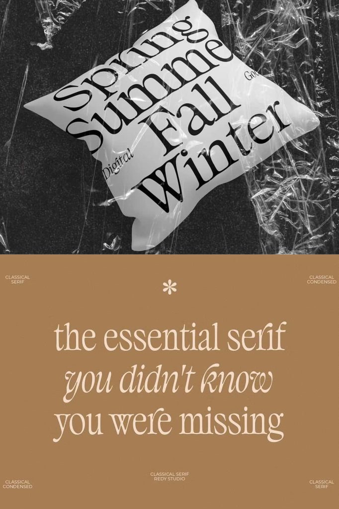
Classical Serif Fonts: Timeless Elegance Through Balanced Imperfection
Classical serif fonts represent one of the most enduring styles in typography. Designers continue to rely on these typefaces because they communicate elegance, tradition, and sophistication with remarkable consistency. Unlike modern typefaces that emphasize strict uniformity, classical serif fonts embrace subtle irregularities in their structure. These variations create a unique visual rhythm that enhances both readability and aesthetic appeal.
The defining characteristic of classical serif fonts lies in their unbalanced proportions. The ascender height, descender depth, and x-height do not follow a perfectly equal system. Instead, they vary intentionally, giving each letter a distinct presence. This imbalance does not weaken the design—it strengthens it by adding character and depth. Designers use this quality to create compositions that feel refined, expressive, and visually engaging.
Understanding the Structure of Classical Serif Fonts
Classical serif fonts rely on a combination of structural elements that work together to form their distinctive look. The ascenders, which extend above the main body of the letters, often vary in height. Similarly, descenders extend below the baseline with differing lengths, creating a dynamic vertical flow. The x-height, which defines the height of lowercase letters, also differs from modern standards, contributing to the overall imbalance.
This variation introduces a natural rhythm into the text. Instead of appearing rigid or mechanical, the letters interact with each other in a more organic way. This quality improves readability over longer passages, as the eye moves more comfortably across the text. Designers often choose classical serif fonts for projects that require both clarity and elegance.
The Beauty of Unequal Proportions
The unequal proportions found in classical serif fonts create a sense of visual harmony through contrast. While the term “imbalance” might suggest inconsistency, it actually reflects a carefully controlled design approach. Each variation serves a purpose, contributing to the overall aesthetic and functionality of the typeface.
This controlled imbalance gives classical serif fonts their timeless appeal. The slight differences in letter height and spacing make the text feel more human and less mechanical. As a result, these fonts convey a sense of craftsmanship and attention to detail that modern designs often strive to replicate.
Why Imbalance Enhances Elegance
Imbalance in classical serif fonts enhances elegance by introducing subtle complexity. Perfect symmetry can sometimes feel static, while controlled variation adds movement and interest. This dynamic quality allows the text to feel alive, engaging the reader more effectively.
Designers use this principle to create layouts that feel sophisticated and intentional. The interplay between different letter heights and proportions adds depth, making the typography more visually appealing. This is why classical serif fonts remain a popular choice for high-end design projects.
Applications in Modern Design
Despite their historical origins, classical serif fonts continue to play a significant role in modern design. They adapt well to a variety of applications, from editorial layouts to branding and digital content. Their elegant appearance makes them particularly suitable for projects that require a sense of tradition and credibility.
In editorial design, classical serif fonts enhance readability while adding a refined aesthetic. Books, magazines, and long-form articles benefit from their structured yet expressive style. The natural rhythm created by their unbalanced proportions helps readers stay engaged over extended periods.
For branding, these fonts communicate trust, authority, and sophistication. Businesses in industries such as finance, law, and luxury goods often use classical serif fonts to establish a strong and credible identity. The timeless nature of these typefaces ensures that brands remain relevant over time.
Combining Tradition with Contemporary Style
Designers often pair classical serif fonts with modern elements to create a balanced and contemporary look. This combination allows them to maintain the elegance of traditional typography while introducing a fresh and updated feel. The contrast between old and new creates a dynamic visual experience that appeals to a wide audience.
By integrating classical serif fonts into modern layouts, designers can achieve a unique blend of history and innovation. This approach ensures that the typography remains both functional and visually compelling.
Why Classical Serif Fonts Remain Relevant
Classical serif fonts continue to thrive because they offer more than just visual appeal. They provide a proven framework for effective communication, combining readability with aesthetic sophistication. Their unbalanced character shapes create a distinctive identity that sets them apart from more uniform typefaces.
Designers value these fonts for their versatility and reliability. They perform well across different mediums, from print to digital platforms, without losing their character. This adaptability ensures that classical serif fonts remain a valuable tool in any designer’s collection.
Elevate Your Designs with Timeless Typography
Classical serif fonts empower designers to create work that feels elegant, structured, and meaningful. Their unique proportions and refined details allow typography to become a central element of the design rather than just a supporting feature. By choosing this style, designers can produce compositions that stand the test of time.
These fonts transform simple text into a sophisticated visual experience. They communicate tradition, quality, and attention to detail, helping designs leave a lasting impression. For anyone seeking to achieve elegance through typography, classical serif fonts remain an essential and reliable choice.