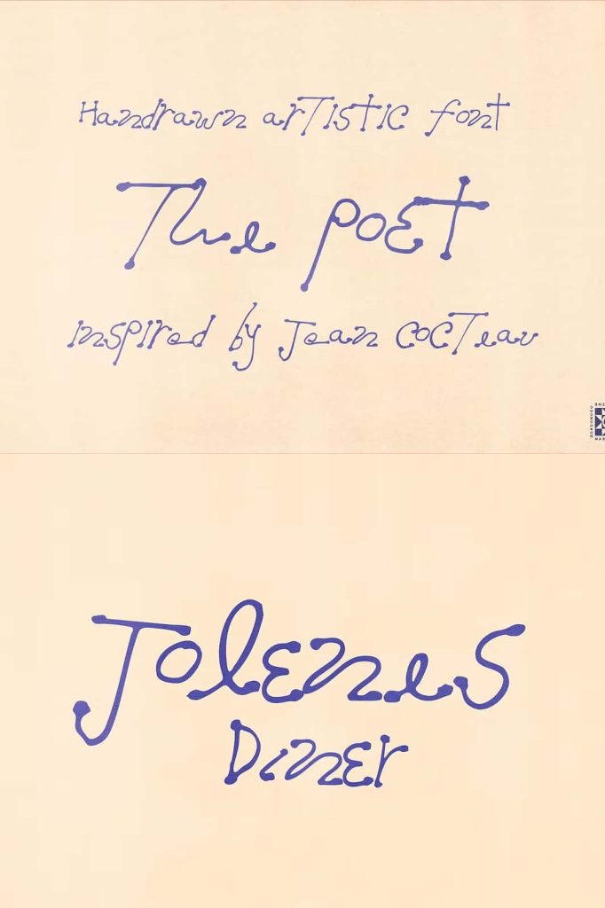
The Poet Handwritten Font: Expressive Imperfection with Artistic Character
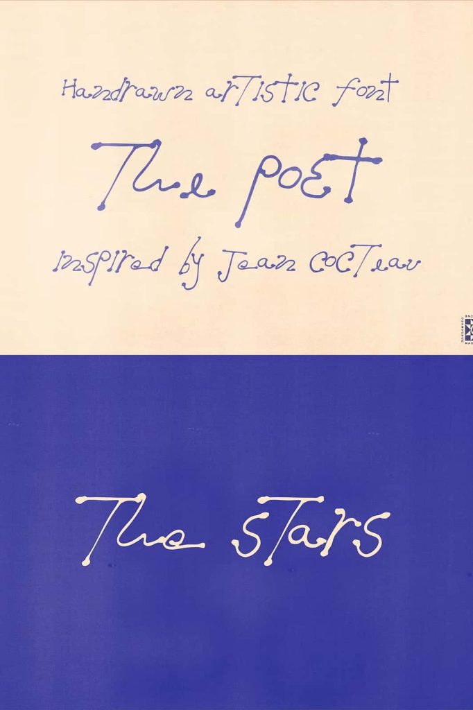
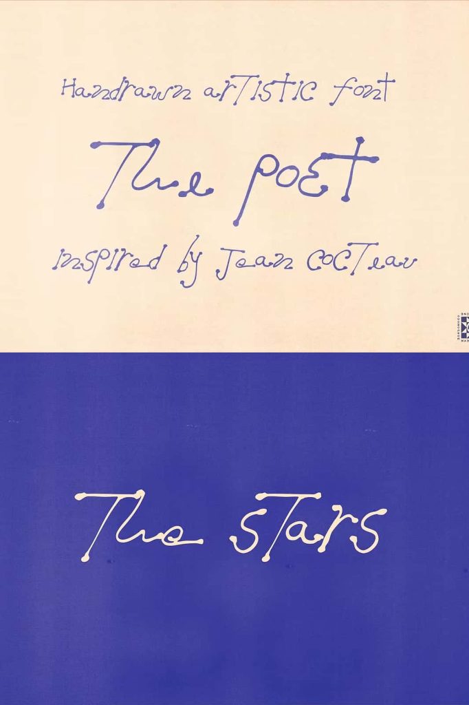
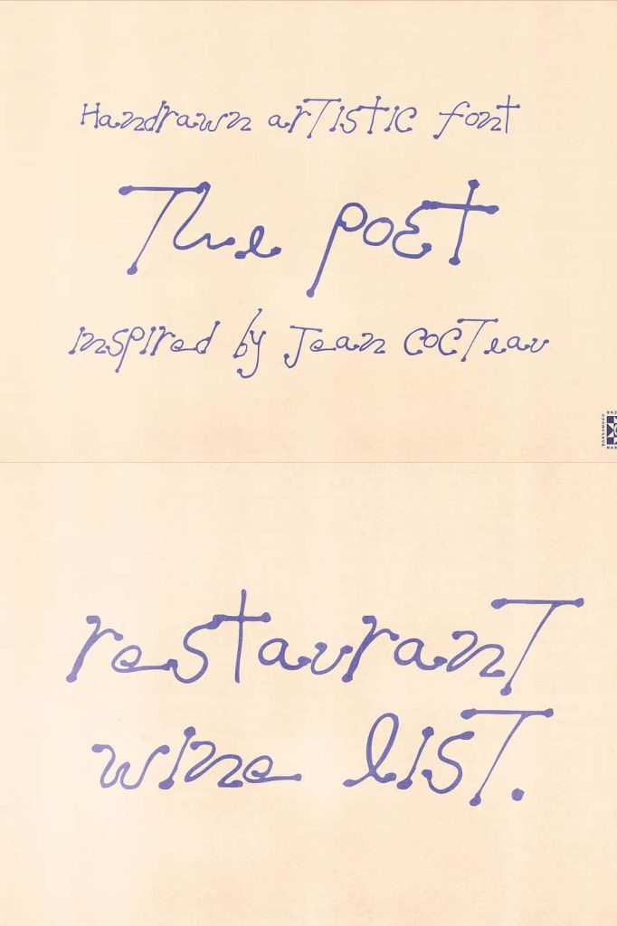
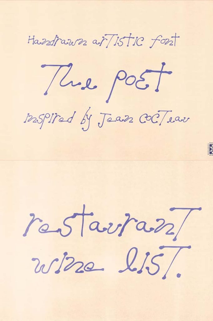
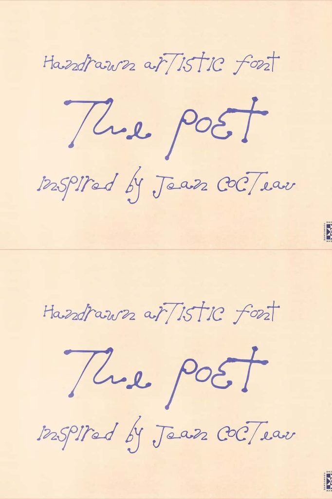
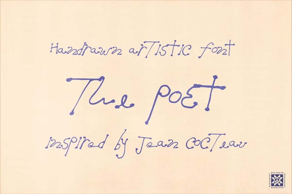
The Poet is a hand drawn handwritten font that embraces the beauty of imperfection and transforms it into a powerful design asset. This typeface captures the raw essence of true handwriting, where every stroke carries emotion, movement, and individuality. Instead of striving for mechanical precision, The Poet celebrates irregularity, allowing designers to create work that feels authentic, human, and deeply expressive.
Each letterform reflects a natural writing process, complete with subtle inconsistencies that make the font feel alive. The Poet does not attempt to hide its imperfections—it highlights them as a core strength. This approach gives designers the freedom to move beyond rigid typography and explore a more organic and artistic direction in their projects.
Inspired by the Beauty of Real Handwriting
The Poet draws inspiration from genuine handwritten notes, where every word carries a personal touch. The font mirrors the unpredictable rhythm of handwriting, with uneven baselines and varied letter shapes that create a dynamic flow. This natural variation adds depth and character, making text feel more engaging and relatable.
Unlike conventional fonts that rely on uniformity, The Poet introduces controlled irregularity to achieve a more authentic appearance. The sketch-like textures enhance this effect, giving each character a hand-crafted quality that stands out in both print and digital formats. Designers can use this feature to evoke emotion and create a stronger connection with their audience.
Sketch-Like Textures and Inky Details
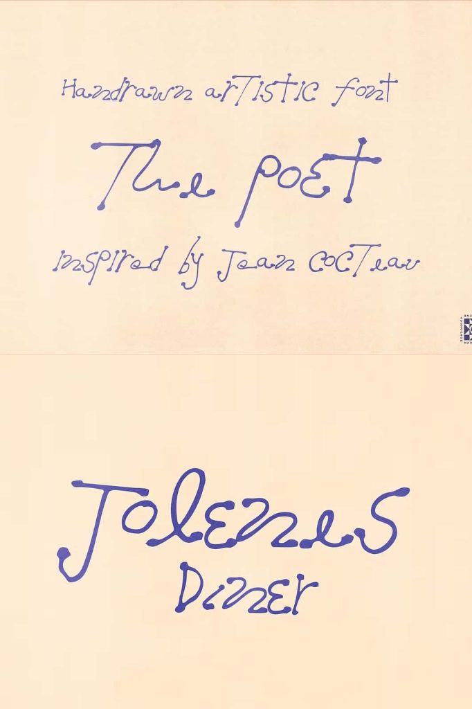
One of the defining features of The Poet is its sketch-inspired texture. The strokes appear slightly rough and organic, as if they were drawn directly onto paper with ink. This textured approach adds visual richness and makes the font feel tactile, even in digital environments.
Inky blots and subtle imperfections further enhance the font’s personality. These details introduce an element of spontaneity, making each composition feel unique. Instead of appearing overly polished, The Poet delivers a raw and artistic aesthetic that captures attention and invites closer inspection.
Uneven Baselines That Add Movement
The uneven baseline is another key characteristic that sets The Poet apart. Letters do not sit perfectly aligned, which creates a sense of motion and rhythm within the text. This feature mimics the natural flow of handwriting, where words shift slightly as they are written.
This dynamic quality allows designers to create layouts that feel more fluid and less constrained. It works particularly well in creative compositions where energy and expression play a central role. The Poet encourages designers to embrace this movement and use it to enhance the overall visual impact.
Perfect for Artistic and Creative Projects
The Poet adapts beautifully to a wide range of design applications. In artistic projects, it adds depth and emotion, making it ideal for posters, illustrations, and creative compositions. Its expressive style helps transform simple text into a meaningful visual element.
For branding, The Poet creates a strong and memorable identity. It works especially well for brands that want to communicate authenticity, creativity, and individuality. The font’s handcrafted appearance helps establish a personal connection with audiences, making it suitable for lifestyle brands, creative businesses, and independent creators.
In editorial design, The Poet enhances storytelling by adding a human touch to typography. It works effectively for quotes, headings, and decorative text, where its unique character can shine without overwhelming readability. Designers can use it to create layouts that feel intimate and engaging.
A Typeface That Feels Alive
The Poet stands out because it feels alive. Its irregular forms, textured strokes, and expressive details create a sense of movement and personality that few fonts achieve. It invites designers to step away from perfection and explore a more authentic approach to typography.
This font does more than display words—it conveys emotion and intention. By choosing The Poet, designers gain access to a typeface that enhances storytelling, strengthens visual identity, and brings a unique artistic voice to every project.
With its combination of raw beauty and creative flexibility, The Poet becomes an essential tool for anyone seeking to create designs that feel genuine, expressive, and unforgettable.