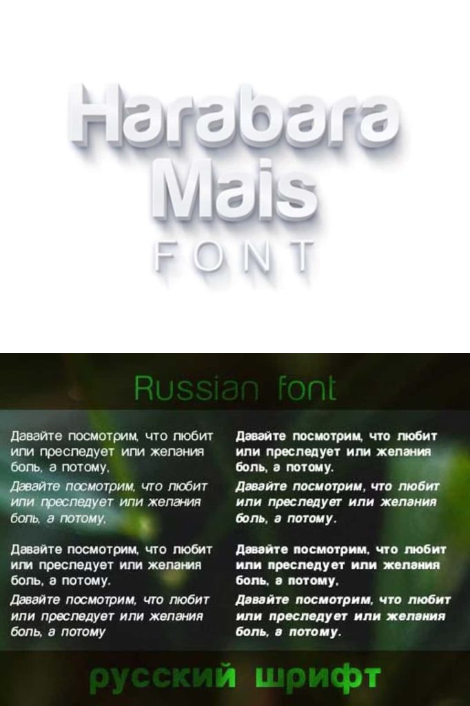
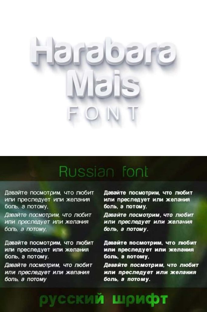
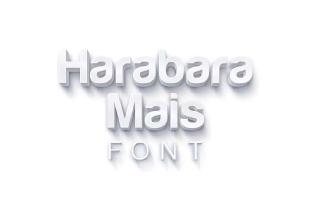
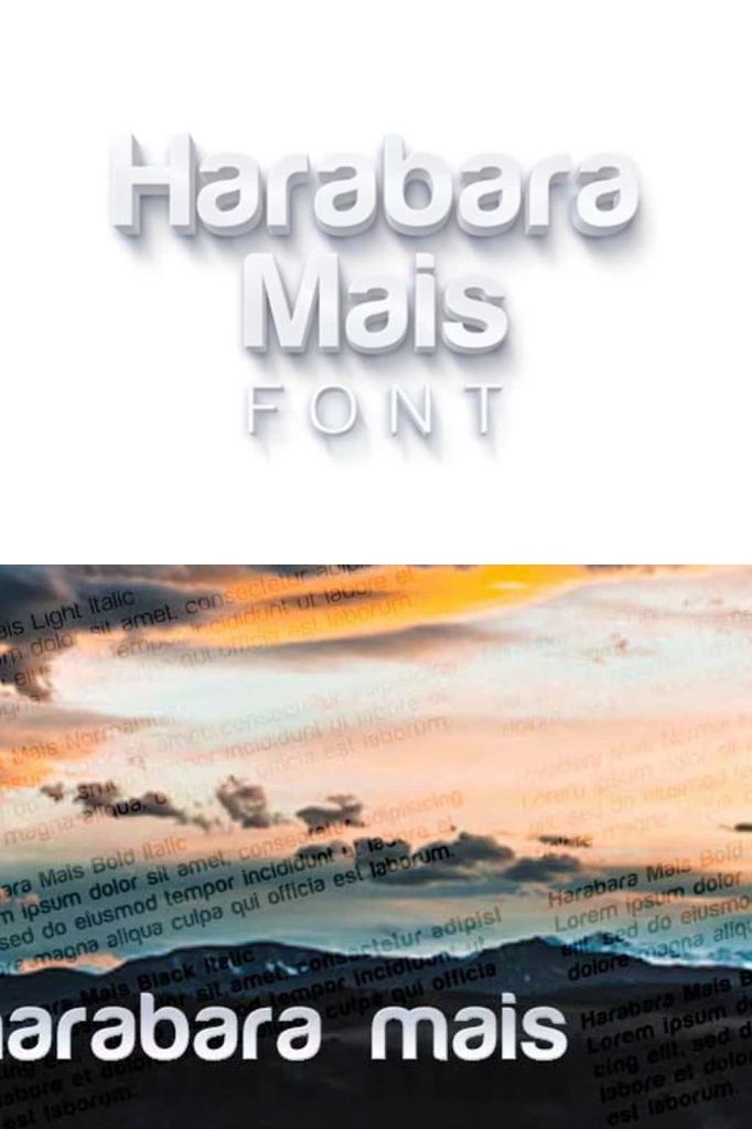
Harabara Mais Font Family: A Refined Evolution of a Classic Typeface
Harabara Mais is a modern font family that builds upon the foundation of the original Harabara typeface. First introduced in 2009, the initial Harabara font gained attention for its bold presence and distinctive style. However, it featured only a single weight and included several imperfections that limited its flexibility. Recognizing the potential of the design, the creator revisited the concept and developed Harabara Mais in 2013 as a more complete and refined version.
This updated font family transforms the original idea into a versatile and professional tool for designers. By correcting earlier inconsistencies and expanding the range of styles, Harabara Mais delivers improved usability while maintaining the unique character that made the original font appealing. It offers a balanced combination of structure, clarity, and stylistic expression that suits a wide variety of creative projects.
From a Single Bold Style to a Complete Typeface Family
The original Harabara font was known for its bold weight, which gave it a strong and confident visual presence. While this made it effective for certain applications, it limited its use in more complex design systems. Harabara Mais addresses this limitation by introducing a full family of weights and styles, allowing designers to create more dynamic and cohesive compositions.
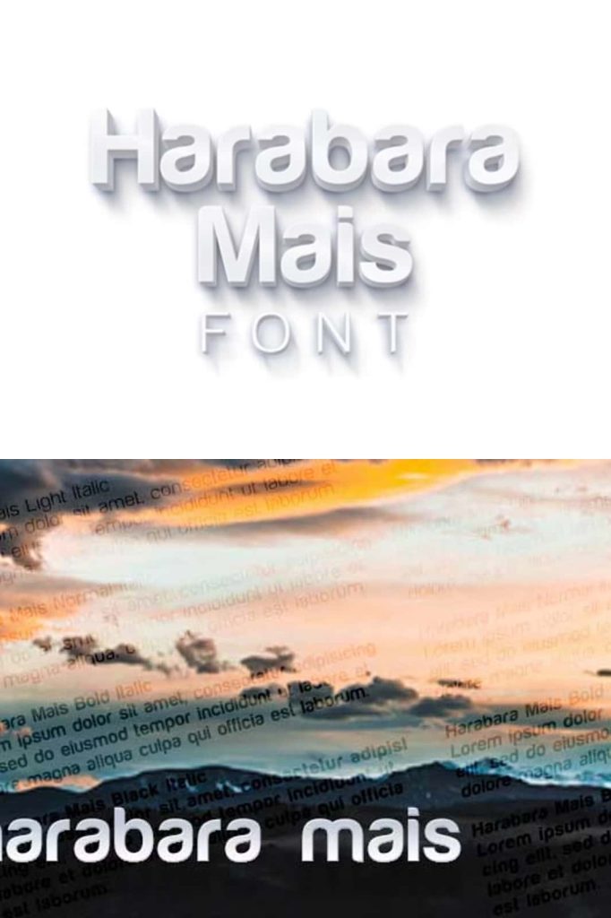
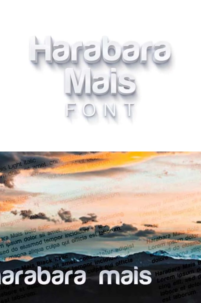
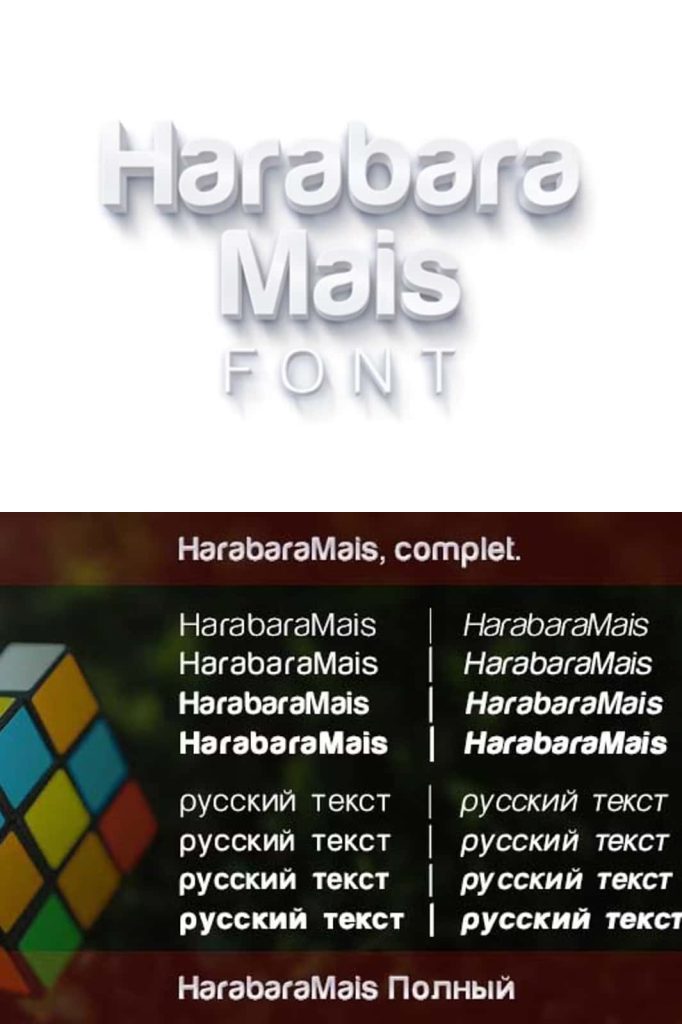
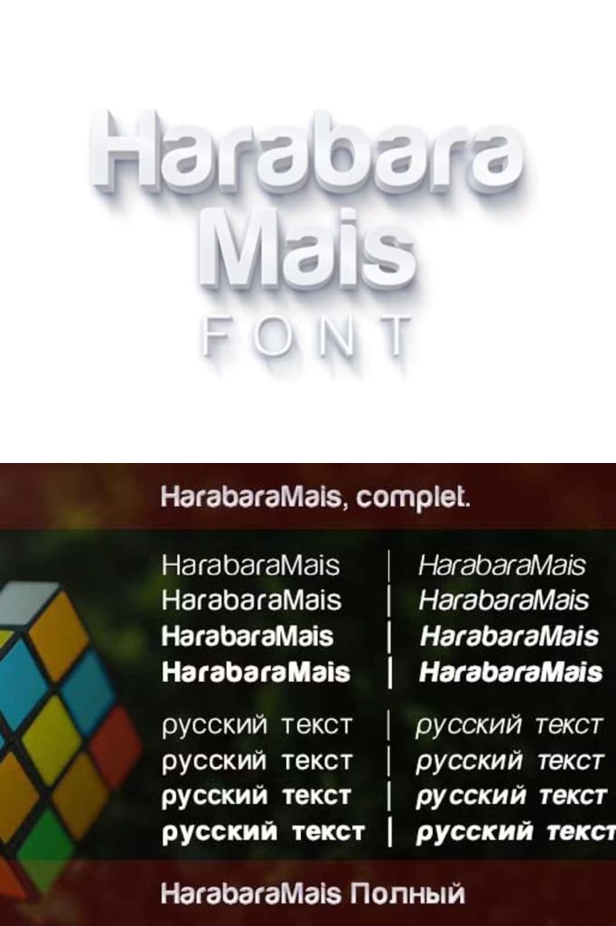
The expanded family includes light, light italic, normal, normal italic, bold, bold italic, black, and black italic. This wide range enables designers to establish clear visual hierarchies and maintain consistency across different elements of a project. Whether working on digital interfaces, print materials, or branding systems, Harabara Mais provides the flexibility needed to achieve professional results.
Improved Design and Refined Details
One of the key goals behind Harabara Mais was to correct the imperfections present in the original version. The updated typeface features cleaner lines, more consistent spacing, and improved proportions. These refinements enhance readability and ensure that the font performs well across various sizes and contexts.
The smoother curves and balanced letterforms give Harabara Mais a polished and modern appearance. While it retains the bold personality of the original, it introduces a level of precision that makes it suitable for more demanding design applications. This combination of character and refinement allows the font to stand out without sacrificing functionality.
Versatility Across Different Design Needs
Harabara Mais adapts easily to a wide range of creative uses. In branding, it helps establish a strong and recognizable identity through its clean yet expressive style. Designers can use different weights to create contrast and emphasize key elements, ensuring that the brand message remains clear and impactful.
For editorial design, the font offers excellent readability and structure. The availability of multiple weights and italics allows for effective text organization, making it suitable for headlines, subheadings, and body text. This versatility ensures that content remains engaging and visually appealing.
In digital design, Harabara Mais performs reliably across screens of different sizes. Its clarity and consistency make it a practical choice for websites, applications, and user interfaces. Designers can use the font to create layouts that feel modern, organized, and easy to navigate.
A Typeface Built for Creative Flexibility
Harabara Mais empowers designers to explore different visual directions without being limited by a single style. The range of weights and italics encourages experimentation, allowing creatives to develop unique compositions that suit their specific needs. This flexibility makes the font a valuable asset for both simple and complex projects.
The typeface also maintains a cohesive identity across all its variations. Despite the differences in weight and style, each version of Harabara Mais feels connected, ensuring that designs remain consistent and professional. This consistency is essential for projects that require a unified visual language.
Why Choose Harabara Mais for Your Projects
Designers choose Harabara Mais because it combines the strengths of its original version with modern improvements. It offers the bold character that made Harabara popular while addressing its limitations through refinement and expansion. This makes it a reliable choice for professionals who need both style and functionality.
By incorporating Harabara Mais into your work, you gain access to a versatile font family that supports creativity and precision. It enhances visual communication, strengthens design structure, and helps create impactful results across different mediums. With its refined design and expanded capabilities, Harabara Mais stands as a strong example of how a classic concept can evolve into a powerful modern typeface.