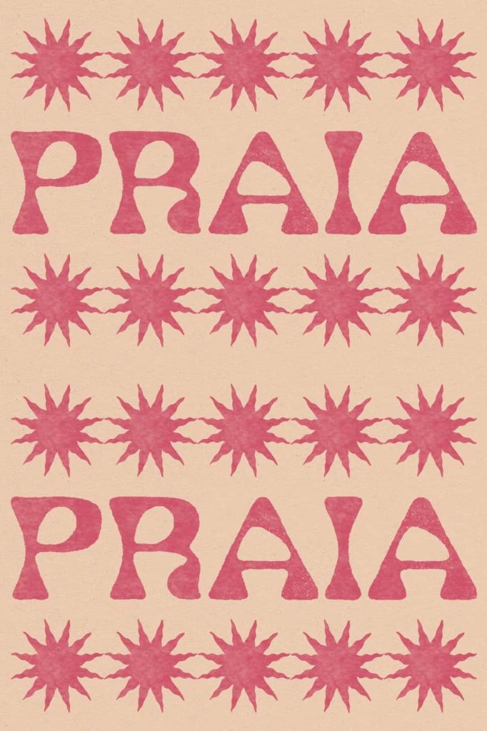
Praia Typeface: A Wavy Display Font Inspired by the Ocean
Praia Typeface captures the rhythm, movement, and calm beauty of the sea through its fluid and wavy letterforms. Inspired by the gentle ripples of water on a perfect beach day, this typeface brings a relaxed yet expressive energy into typography. Designers can use Praia to create visuals that feel light, natural, and effortlessly stylish.
This font does more than present text. It evokes a mood. Each letter reflects the motion of waves, creating a sense of flow that feels both organic and visually engaging. Praia transforms simple words into a design element that carries atmosphere and emotion.
What Makes Praia Typeface Unique?
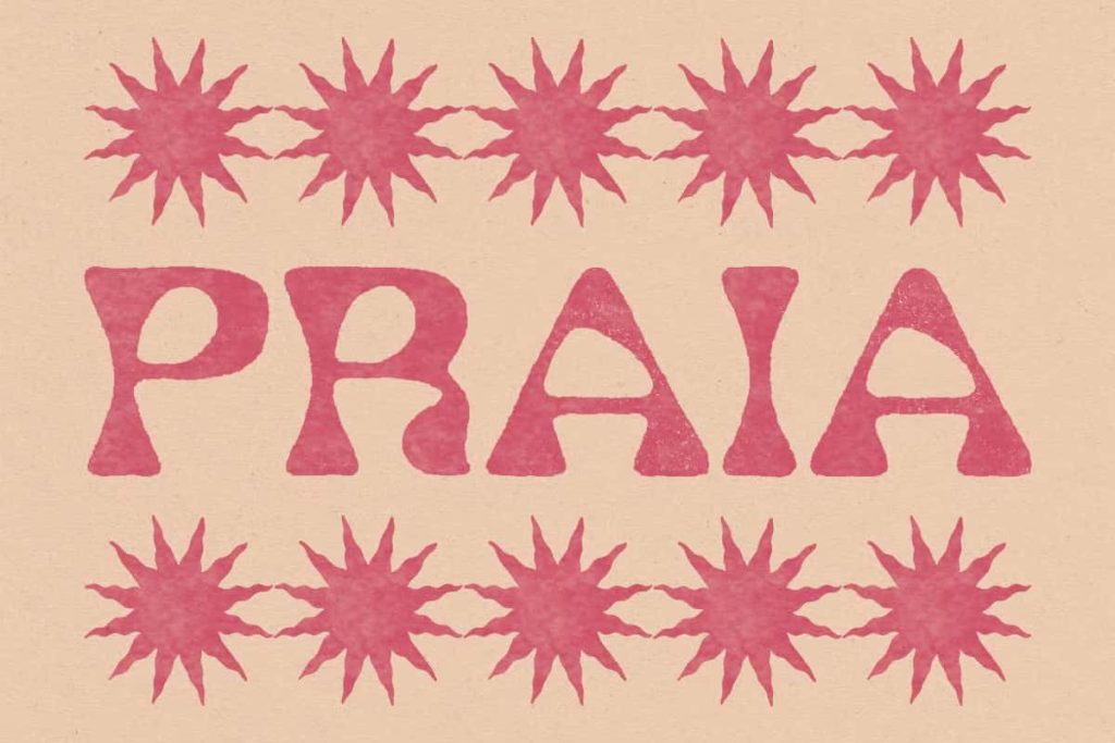
Praia stands out because it embraces movement and contrast. The letterforms do not follow rigid lines. Instead, they curve and shift in a way that mimics the natural rhythm of water. This approach creates a dynamic visual effect that immediately draws attention.
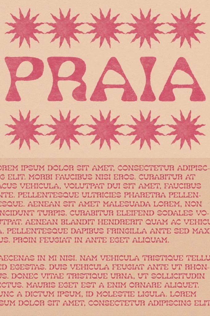
The typeface also balances playfulness with structure. While the shapes feel free and fluid, they remain readable and cohesive. This combination allows designers to use Praia in a wide range of creative projects without sacrificing clarity.
Key Characteristics
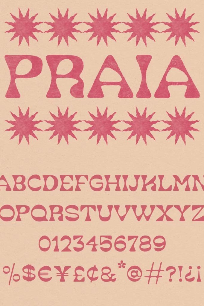
- Wavy letterforms inspired by ocean ripples
- Fluid and organic shapes with natural movement
- Balanced contrast for readability and style
- Relaxed and playful visual tone
- Strong display presence for creative typography
A Typeface Inspired by Coastal Life
Praia reflects the feeling of spending time by the sea, where time slows down and creativity flows freely. The design captures the essence of beach culture, from sunlit afternoons to quiet moments by the shore. It invites designers to create work that feels open, relaxed, and full of character.
You can imagine this typeface on the sign of a small beach café, tucked away in a remote location. A place that opens when it feels right and serves whatever is fresh and available. This imagery adds personality to the font and makes it ideal for storytelling through design.
Why Beach-Inspired Fonts Work
- Evokes calm, freedom, and creativity
- Adds personality and atmosphere to designs
- Creates a connection with natural elements
- Enhances visual storytelling through mood
Best Use Cases for Praia Typeface
Praia works best in projects that aim to capture attention while maintaining a relaxed and artistic tone. Its unique shapes make it ideal for display purposes, where the goal is to create a memorable visual impression.
Ideal Applications
- Branding for beach cafés, resorts, and lifestyle brands
- Posters and promotional materials with a creative edge
- Social media graphics with a fresh and modern vibe
- Packaging designs that emphasize natural or coastal themes
- Editorial layouts that require expressive headlines
How to Use Praia Typeface Effectively
To get the most out of Praia, designers should focus on layout and spacing. The wavy shapes need room to breathe, so avoid overcrowding the design. Use the typeface in larger sizes to highlight its fluid details and movement.
Pair Praia with simple and clean fonts to create contrast. This combination allows the display font to stand out while maintaining overall readability. Thoughtful use of color and background can also enhance the ocean-inspired feel.
Design Tips
- Use large sizes to emphasize the wavy letterforms
- Combine with minimalist fonts for balance
- Apply soft or coastal color palettes for added mood
- Keep layouts open and uncluttered
Conclusion
Praia Typeface delivers a unique blend of movement, creativity, and coastal inspiration. Its wavy design and fluid structure make it an excellent choice for designers who want to create expressive and memorable visuals. This typeface transforms typography into an experience that reflects the rhythm and beauty of the sea.
By incorporating Praia into your projects, you can introduce a sense of calm, freedom, and artistic energy. It allows your designs to stand out while telling a story that feels natural, relaxed, and visually compelling.