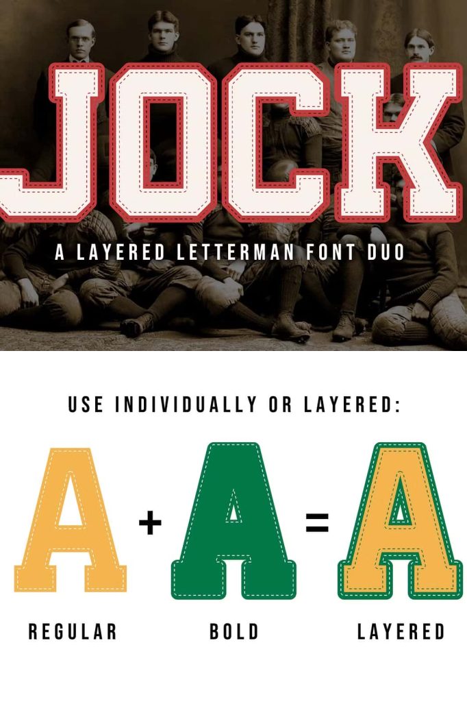
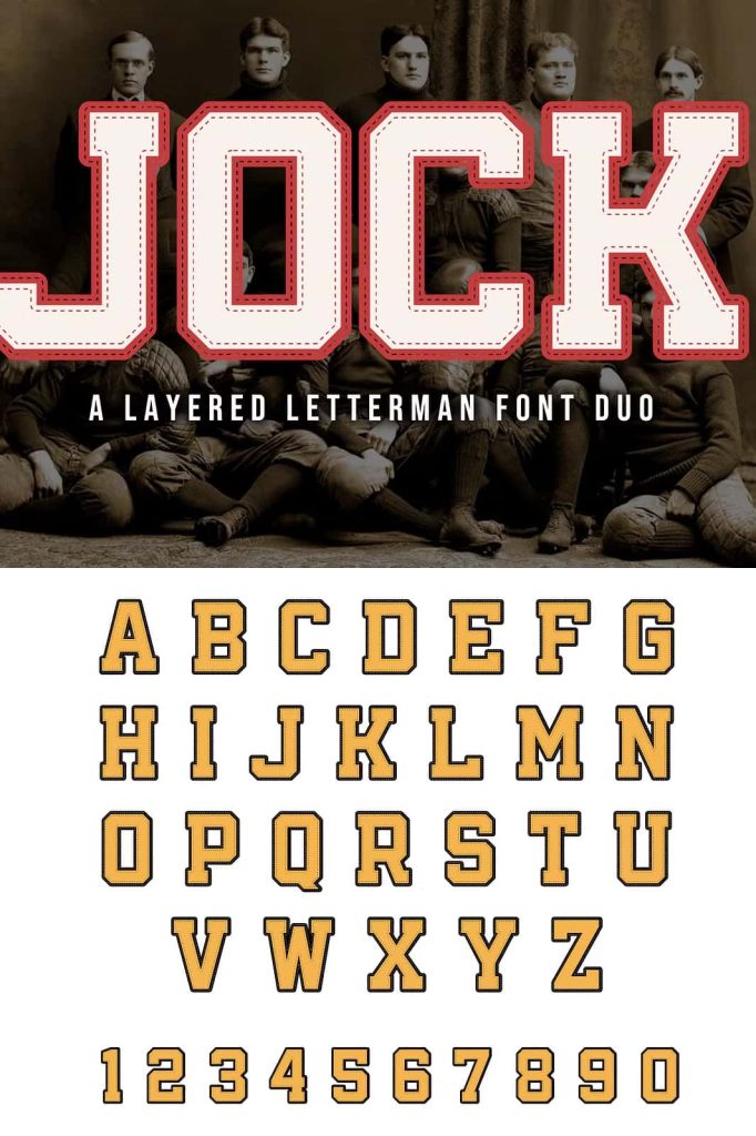
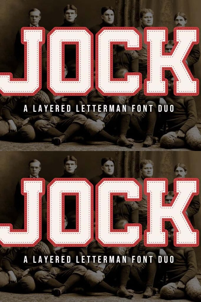
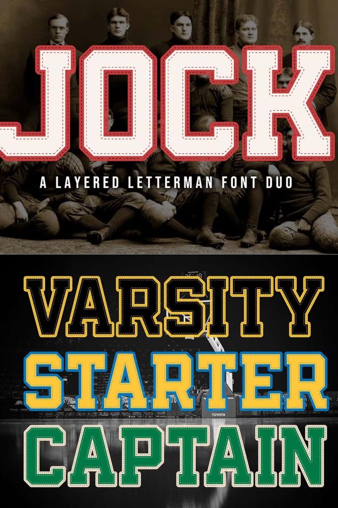
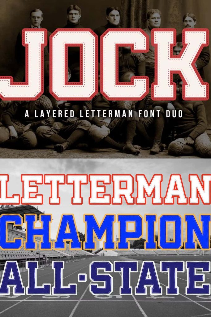
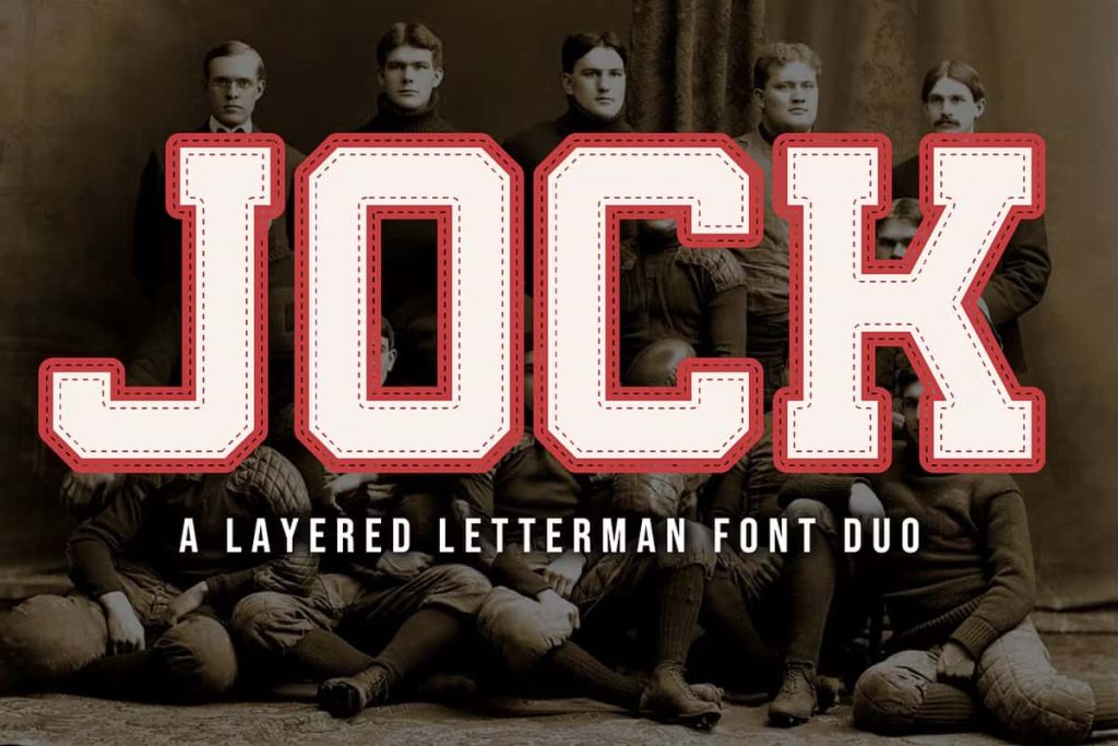
JOCK Font: A Classic Letterman Typeface with Varsity Style
JOCK captures the bold spirit of traditional American varsity design through its classic letterman style. Inspired by the iconic typography seen on letterman jackets, this font brings a strong and confident presence to any project. Designers can use JOCK to create authentic sports-themed visuals, retro-inspired branding, and standout typography that feels both nostalgic and powerful.
This font does more than replicate a style. It channels the energy of school pride, athletic culture, and vintage Americana. With its bold structure and clean lines, JOCK allows designers to communicate strength, unity, and identity through typography.
What Makes JOCK a True Letterman Font?
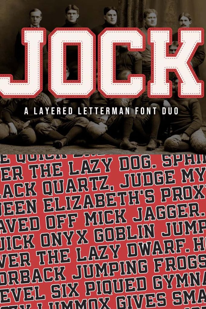
JOCK stands out because it stays true to the roots of varsity lettering. It features bold, block-style characters that emphasize clarity and impact. These letterforms reflect the traditional design used in sports uniforms and school apparel, making the font instantly recognizable.
The consistent stroke weight and strong geometry ensure readability, even at large sizes. This makes JOCK an excellent choice for designs that require clear and confident messaging.
Key Characteristics
- Bold letterman style inspired by varsity jackets
- Clean and structured letterforms for strong readability
- Classic all-American design aesthetic
- High impact for headlines and display typography
- Versatile for both modern and retro projects
The Appeal of Varsity Typography
Varsity fonts like JOCK carry a strong cultural identity. They represent teamwork, achievement, and tradition. Designers often use this style to evoke feelings of nostalgia and pride, especially in sports-related and school-themed designs.
JOCK builds on this tradition while adapting to modern design needs. It allows creatives to recreate vintage looks or blend them with contemporary elements for a fresh and dynamic result.
Why Choose a Letterman Font?
- Creates a bold and recognizable visual identity
- Evokes nostalgia and classic American culture
- Works well for sports and team-related designs
- Enhances branding with strong, confident typography
Best Use Cases for JOCK Font
JOCK performs exceptionally well in projects that require boldness and clarity. Its varsity style makes it ideal for designs that need to communicate energy, strength, and tradition. Designers can use this font to create visuals that stand out and connect with audiences instantly.
Ideal Applications
- Sports branding and team logos
- School merchandise such as hoodies and jackets
- Posters and event promotions
- Retro-themed designs and apparel graphics
- Typography for athletic campaigns and media
How to Use JOCK Effectively
To maximize the impact of JOCK, designers should focus on bold layouts and strong composition. Use this font for headlines, titles, and key visual elements where clarity and presence matter most. Pair it with simple sans serif fonts to maintain balance and readability.
Spacing plays an important role in enhancing the overall look. Allow enough room between letters and lines to keep the design clean and structured. This approach ensures that the bold letterforms remain clear and visually appealing.
Design Tips
- Use large sizes to emphasize the bold structure
- Combine with minimal fonts for contrast
- Apply classic color schemes for a varsity feel
- Keep layouts clean to highlight the typography
Conclusion
JOCK delivers a powerful and authentic letterman font experience. Its bold varsity style, clean structure, and nostalgic influence make it an excellent choice for designers who want to create impactful and memorable designs. Whether used for sports branding, school merchandise, or retro projects, JOCK provides the tools needed to build strong visual identities.
By incorporating JOCK into your work, you can capture the essence of classic varsity design while creating modern and engaging typography. This font transforms simple text into a statement of strength, pride, and style.