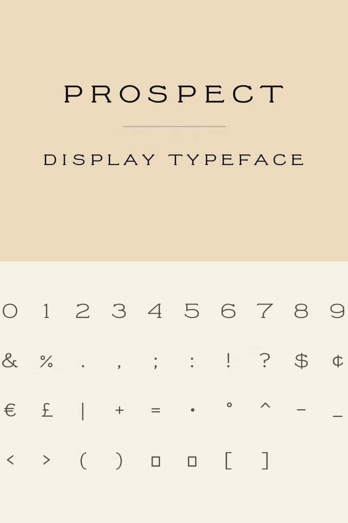
Prospect Display Font: A Bold Antique All-Caps Typeface
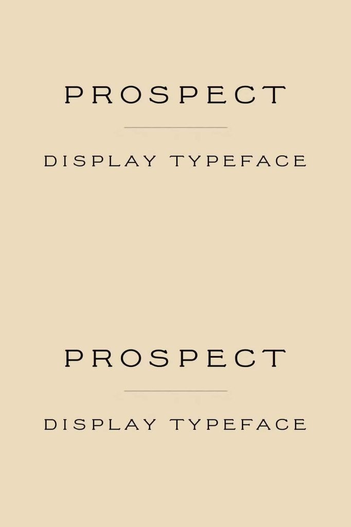
Prospect stands out as a distinctive antique-style display font that uses strong, all-caps lettering to deliver a timeless and commanding visual presence. Designers choose this typeface to create bold headlines, vintage-inspired branding, and striking visual identities that demand attention. With its classic structure and historical influence, Prospect adds depth and authenticity to modern and retro design projects alike.
What Makes Prospect a Unique Display Font?
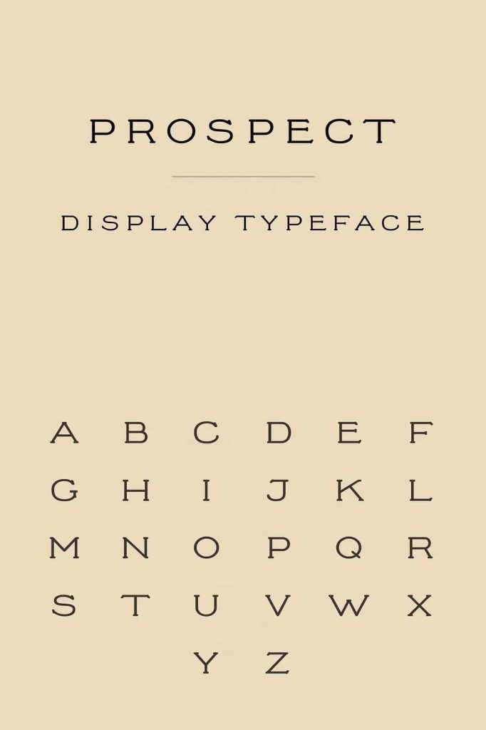
Prospect embraces the essence of antique typography while maintaining a clean and structured appearance. The all-caps format enhances readability and ensures consistency across large-format text such as posters, banners, and logos. Designers rely on Prospect to create visual impact without sacrificing elegance.
This font captures the charm of historical print styles while adapting to contemporary needs. It blends decorative elements with solid letterforms, making it suitable for both artistic and professional applications.
Key Characteristics of Prospect
- All-caps lettering for strong and consistent typography
- Antique-inspired design with vintage detailing
- High visual impact for headlines and titles
- Clean structure that supports readability
- Versatile use across print and digital media
Why Designers Choose Antique Display Fonts
Antique display fonts like Prospect offer more than just visual appeal. They tell a story. Designers use these fonts to evoke nostalgia, tradition, and craftsmanship. By incorporating historical design elements, Prospect helps create a deeper emotional connection with audiences.
Unlike modern minimalist fonts, antique display fonts carry personality and texture. They allow designers to break away from generic typography and introduce a unique visual voice into their projects.
Common Use Cases
Prospect works exceptionally well in various creative contexts. Designers often apply it in:
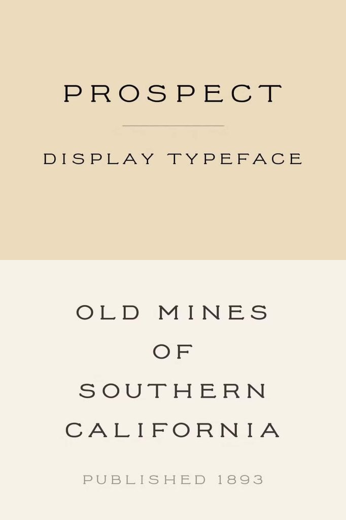
- Brand logos that require a vintage or heritage feel
- Posters and signage that need bold visual hierarchy
- Editorial headlines for magazines and publications
- Packaging designs that emphasize authenticity
- Event promotions with a classic or historical theme
How to Use Prospect Effectively
To maximize the impact of Prospect, designers should focus on contrast, spacing, and layout. Because the font uses all capital letters, it naturally draws attention. Pairing it with a simple body font can create a balanced and readable composition.
Adjust letter spacing to enhance clarity, especially in larger formats. When used in headlines, Prospect performs best with sufficient white space around the text. This approach allows each letter to stand out and strengthens the overall visual presentation.
Best Pairing Strategies
- Combine with clean sans-serif fonts for modern contrast
- Use neutral colors to highlight the font’s structure
- Apply texture or grain effects for added vintage feel
- Limit usage to headings to maintain readability
Conclusion
Prospect delivers a powerful combination of antique charm and bold typography. Its all-caps display style ensures strong visual presence, while its vintage influence adds character and depth. Designers who seek to create memorable and impactful designs will find Prospect a reliable and expressive choice.
By integrating Prospect into your projects, you can elevate your typography, strengthen your branding, and create designs that leave a lasting impression.