Mijo: An Elegant Lightweight Font with Soft Edges and Balanced Form
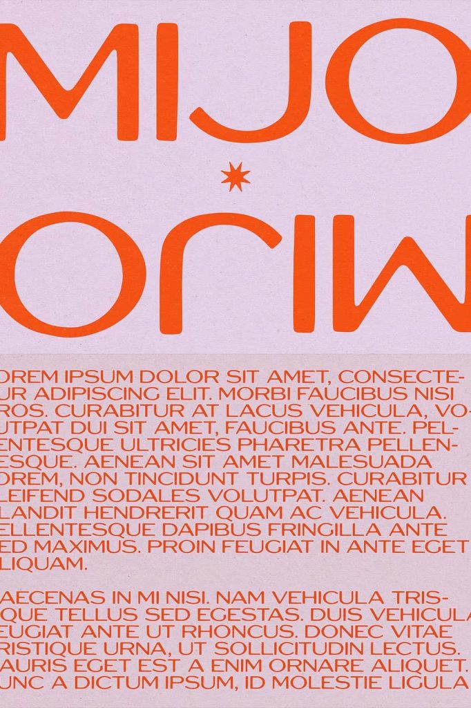
Mijo is an elegant lightweight font designed to bring subtle sophistication and modern clarity into your typography. Built with soft edges and a gentle bleed effect, this typeface redefines the traditional sharpness often found in similar styles. Instead of rigid angles, Mijo introduces smooth transitions and delicate curves that create a more natural and approachable appearance.
This font focuses on balance and refinement. Its square proportions provide structure, while the slight contrast in stroke weight adds depth and visual interest. As a result, Mijo offers a harmonious combination of precision and softness, making it suitable for a wide range of creative applications.
Soft Edges with a Unique Bleed Effect
One of Mijo’s most distinctive qualities lies in its softened edges. Rather than relying on sharp, geometric corners, the font features gently rounded forms that create a smoother visual flow. This design choice makes your text feel more organic and less mechanical, which enhances readability and aesthetic appeal.
The subtle bleed effect adds another layer of character. It mimics the slight ink spread you might see in print, giving the font a tactile and realistic quality. This detail introduces warmth into the design while maintaining a clean and professional look.
Key Design Features
- Lightweight structure for elegant presentation
- Soft edges that reduce harsh visual contrast
- Subtle bleed effect for added texture
- Clean and modern overall appearance
Balanced Square Proportions for Versatility
Mijo uses square proportions to create a stable and balanced foundation. This structure ensures consistency across all characters, helping your typography feel organized and visually aligned. The even spacing and proportional design allow the font to perform well in both large and small sizes.
The slight contrast in stroke weight enhances this balance by adding just enough variation to keep the text engaging. It avoids extremes, ensuring that your designs remain clean and readable while still offering subtle visual dynamics.
Advantages of Balanced Proportions
- Improved readability across different formats
- Consistent visual rhythm in text layouts
- Adaptability for both print and digital media
- Professional and polished appearance
Perfect for Modern and Minimalist Design
Mijo fits naturally into modern and minimalist design styles. Its lightweight structure allows your content to breathe, making it ideal for layouts that prioritize simplicity and clarity. Whether you are designing a website, editorial spread, or branding material, this font supports a clean and refined aesthetic.
The soft edges also help reduce visual tension, making it easier to create calm and inviting compositions. This makes Mijo especially effective for projects that require a subtle and elegant tone.
Recommended Use Cases
- Website typography and user interface design
- Editorial layouts and magazine design
- Minimalist branding and logos
- Presentation and portfolio design
Flexible Across a Wide Range of Projects
Mijo’s versatility makes it a valuable tool for designers working across multiple disciplines. Its clean structure allows it to function well as both a headline and body font. You can use it to create strong titles or to support longer text without sacrificing readability.
The font adapts easily to different moods and styles. Pair it with bold display fonts for contrast, or use it on its own for a cohesive and understated design. Its flexibility ensures that it remains effective in a variety of creative contexts.
Creative Applications
- Brand identity systems
- Social media graphics
- Print materials such as brochures and posters
- Digital products and mobile interfaces
Refined Typography with a Human Touch
Mijo stands out by combining precision with softness. Its design avoids overly rigid geometry while maintaining a structured and modern feel. This balance gives your typography a human touch, making it more engaging and approachable.
The font’s subtle details, from its softened corners to its gentle bleed effect, create a unique visual identity. These elements work together to produce typography that feels thoughtful, refined, and carefully crafted.
Why Choose Mijo
- Elegant and lightweight for modern design
- Soft details that enhance readability and style
- Versatile across multiple design applications
- Distinctive yet subtle visual character
Create Clean and Elegant Designs with Mijo
Mijo offers a fresh perspective on modern typography. It combines clean structure with gentle detailing to create a font that feels both contemporary and timeless. Whether you are designing for digital or print, Mijo helps you achieve a polished and professional result.
Choose Mijo when you want your designs to feel balanced, elegant, and approachable. Its refined features and versatile nature make it an excellent addition to any designer’s toolkit.