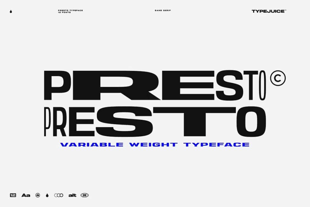
Presto Variable Sans Serif Typeface
Presto is a powerful variable sans serif typeface designed to give designers exceptional flexibility and creative control. This modern type system includes twelve distinct font styles that range from thin and condensed to wide and bold. With this wide typographic spectrum, Presto allows designers to build strong visual hierarchies, craft expressive layouts, and adapt typography to many different design needs.
In addition to its broad weight range, Presto also includes more than 500 alternate glyphs that allow deep customization. These alternates help designers create unique typography that stands out from standard typefaces. Whether you work on branding, editorial layouts, digital interfaces, or creative marketing materials, Presto provides the tools needed to shape typography with precision and personality.
The typeface was carefully constructed to deliver clarity, versatility, and visual impact. Its clean sans serif structure ensures readability while still offering expressive flexibility through its many styles and alternate characters. Designers can explore endless combinations while maintaining a cohesive visual identity.
A Complete Variable Sans Serif System
Presto functions as a complete variable type system rather than a single static font. The collection includes twelve fonts that span a wide range of weights and widths. Designers can move smoothly from thin and condensed styles to wide and bold variations, giving them the freedom to adapt typography to different visual contexts.
Thin and condensed styles work well for elegant titles, minimalist layouts, and editorial typography. These lighter weights introduce a refined appearance that suits modern magazines, design portfolios, and high-end branding materials. On the other end of the spectrum, the wide and bold styles deliver powerful visual presence. Designers can use them for strong headlines, posters, and large display text that demands attention.
This flexibility allows the typeface to support both subtle and dramatic typography. Instead of switching between unrelated fonts, designers can rely on Presto’s unified design system to maintain consistency across their projects.
Extensive Weight Range from Thin to Bold
One of the most valuable features of Presto is its extensive weight range. Each weight provides a distinct typographic voice while still maintaining the same design DNA. This consistency helps designers create balanced layouts that feel cohesive and professional.
The thin and light styles introduce elegance and delicacy. These styles are ideal for editorial headlines, modern branding, and stylish promotional graphics. Their clean strokes help create airy compositions that feel sophisticated and contemporary.
The medium and regular weights offer versatility for everyday design tasks. These styles maintain strong readability and can function effectively in both headlines and supporting text. Designers can rely on these balanced weights when they need clarity and structure.
At the heavier end of the spectrum, bold and wide styles create powerful visual impact. These fonts shine in poster design, advertising graphics, packaging labels, and large-scale typography where boldness becomes the primary design element.
Over 500 Alternate Glyphs for Creative Customization
Presto goes beyond standard typography by including more than 500 alternate glyphs. These additional characters allow designers to customize letterforms and experiment with stylistic variations. By switching between alternates, designers can transform the personality of a word or headline without changing the overall typeface.
Alternate glyphs open up creative opportunities for logo design, branding systems, and expressive typography. Designers can craft distinctive wordmarks, adjust stylistic details, and build visual identities that feel unique and original. Instead of repeating common letter shapes, the alternates provide the freedom to refine typography according to the project’s visual direction.
These glyph options also help designers create dynamic typography systems where certain characters stand out through subtle stylistic changes. This feature proves especially useful in editorial design, advertising, and digital media where creative typography enhances storytelling.
Perfect for Branding and Visual Identity Design
Presto performs exceptionally well in branding projects where versatility and consistency are essential. A brand identity often requires multiple typographic styles for logos, headlines, supporting text, and marketing materials. Presto’s wide weight range allows designers to create all of these elements within a single type system.
Designers can use bold styles for logo marks and primary brand headlines, while lighter styles support secondary text and informational content. Because every weight belongs to the same type family, the final design maintains visual harmony across all brand assets.
The alternate glyph collection further strengthens branding potential. Unique letterforms help businesses establish distinctive visual identities that stand apart from competitors.
Excellent for Editorial, Digital, and Poster Design
Presto also excels in editorial layouts, digital interfaces, and large display typography. Magazine designers and editorial teams often require fonts that can adapt to many different typographic roles. With twelve styles and variable options, Presto easily fulfills those needs.
In digital design, the clean sans serif structure ensures readability on screens of all sizes. Designers can use lighter weights for subtle UI elements and stronger weights for section titles and navigation components. This flexibility improves user experience while maintaining visual style.
Poster and advertising designers will appreciate the bold styles that create dramatic visual impact. Wide and heavy letterforms help messages stand out in busy visual environments such as city posters, event announcements, and promotional graphics.
Designed for Creative Typography Exploration
Presto encourages designers to explore typography in creative ways. The variable design, wide weight spectrum, and large glyph library create a playground for experimentation. Designers can adjust weight, spacing, and alternate characters to build typography that perfectly fits the mood of a project.
This creative flexibility makes the typeface useful for both professional and artistic design work. Whether you are crafting minimal editorial layouts or vibrant marketing graphics, Presto provides the typographic tools needed to express your ideas clearly and confidently.
Build Dynamic and Flexible Typography
Presto empowers designers to create typography that adapts to any design environment. Its variable structure, twelve font styles, and extensive alternate glyph collection provide a level of flexibility rarely found in a single typeface. Designers can move effortlessly between subtle elegance and bold visual impact without leaving the font family.
From branding and editorial design to posters, digital interfaces, and advertising campaigns, Presto delivers a versatile typographic foundation for modern creative projects. Designers who value flexibility, customization, and clean contemporary style will find Presto to be an essential addition to their typography toolkit.