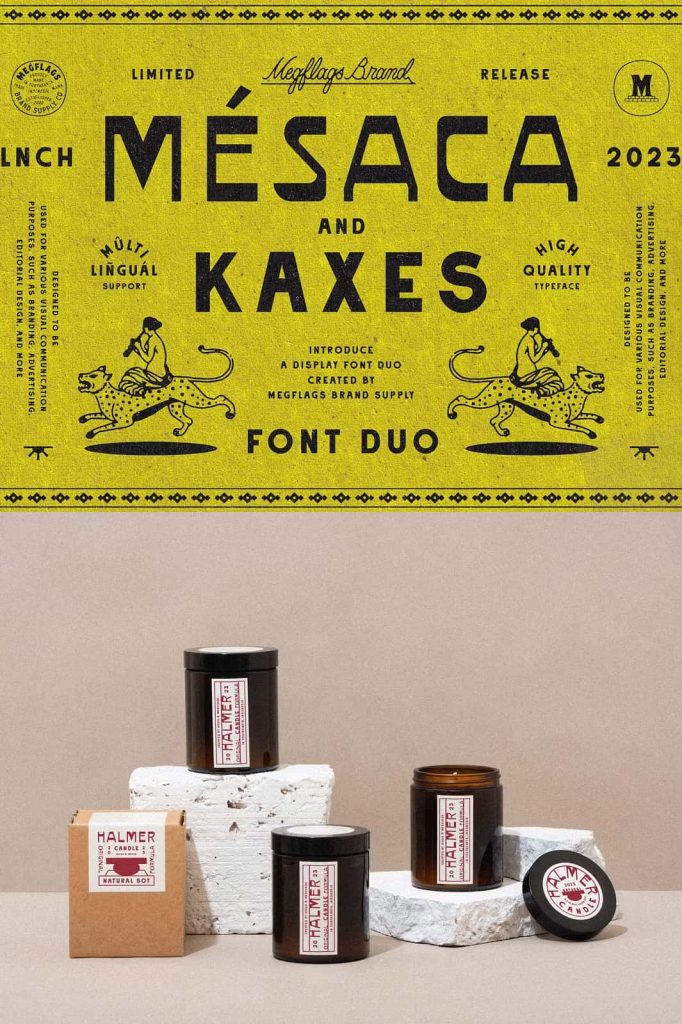
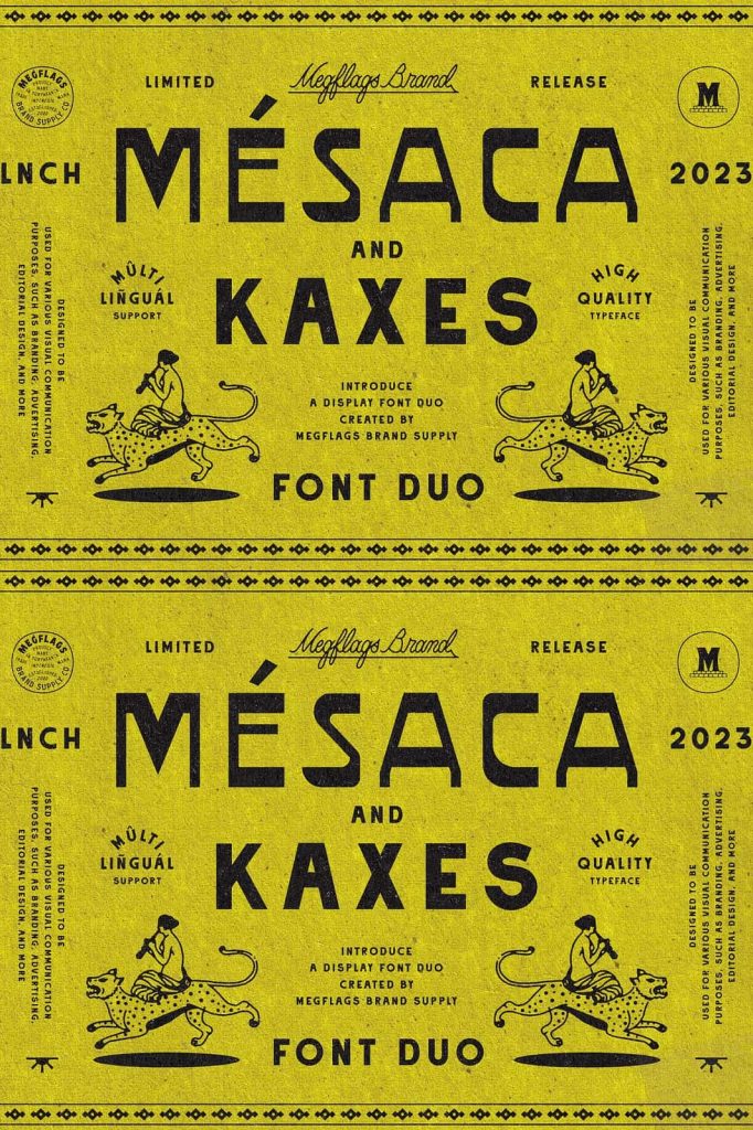
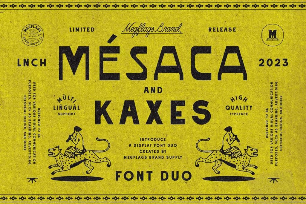
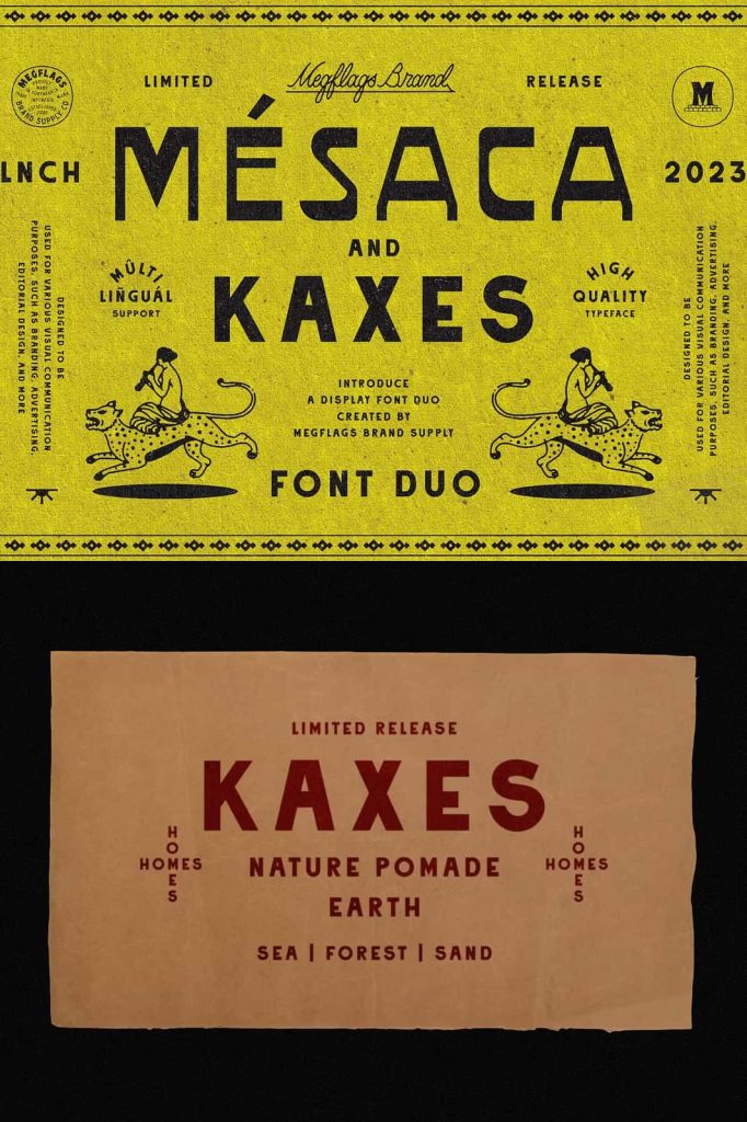
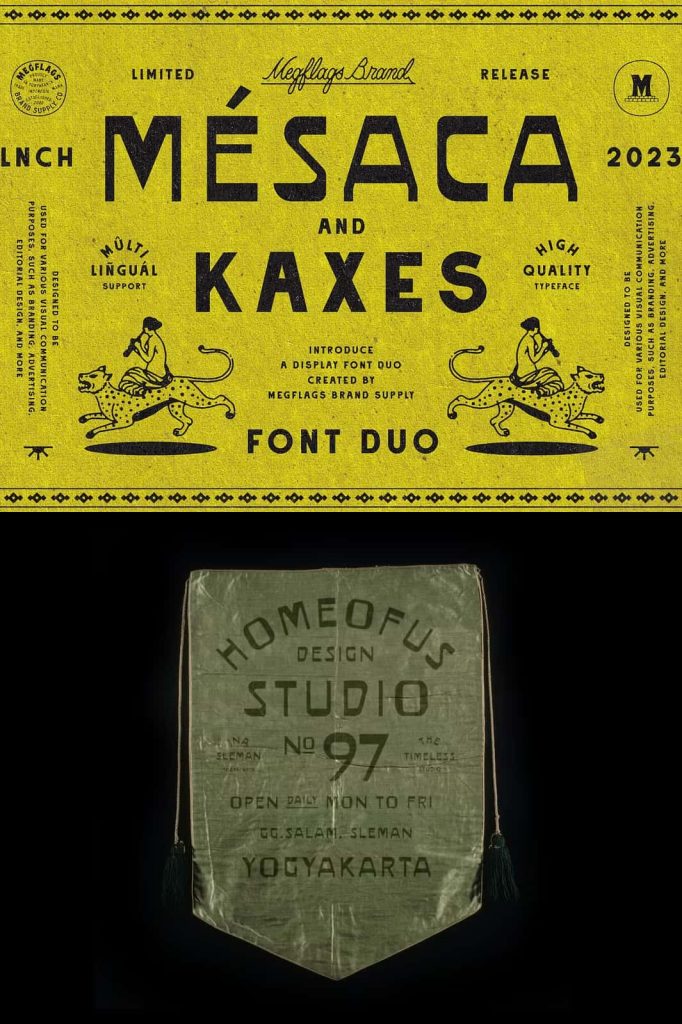
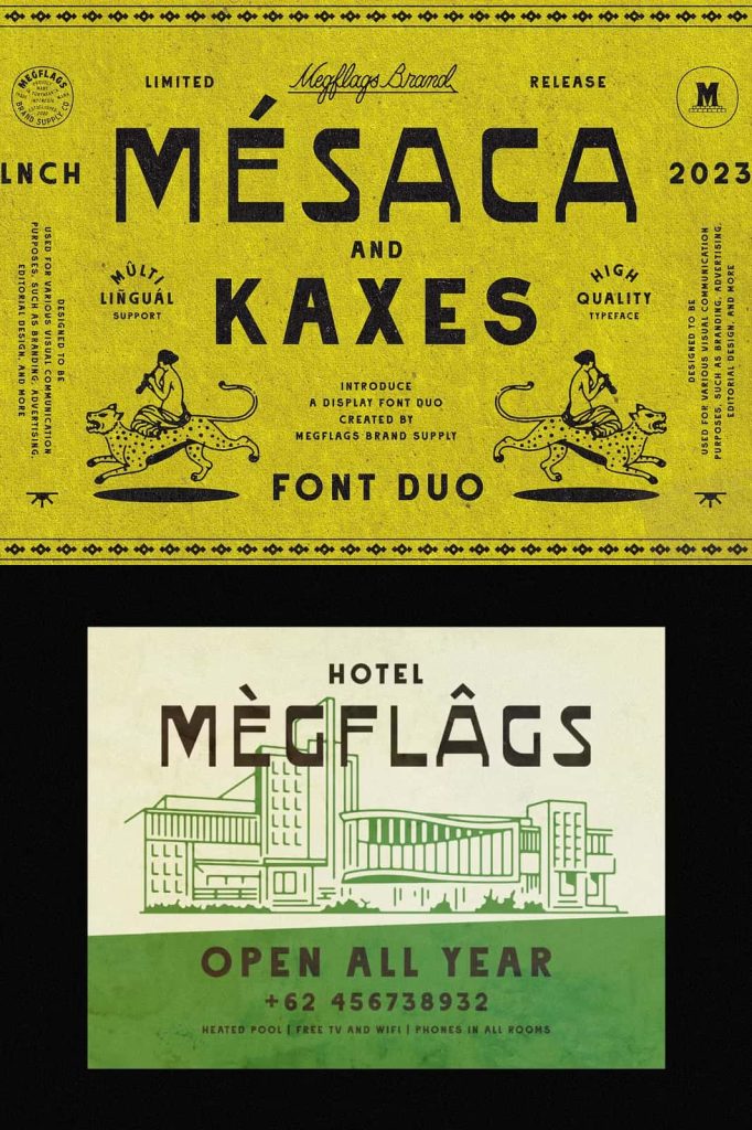
Mesaca and Kaxes Font Duo
A Vintage Western Mexico Inspired Typography Pair
Mesaca and Kaxes is a distinctive font duo inspired by the vibrant visual culture of vintage western Mexico signage and traditional storefront lettering. This carefully designed typographic pair captures the bold spirit and rustic charm often found in historic Mexican markets, hand-painted shop signs, and classic street graphics. By blending authentic vintage inspiration with modern usability, Mesaca and Kaxes offer designers a unique tool for creating memorable and character-rich typography.
Typography from western Mexico often carries a strong visual identity. Bold letterforms, decorative shapes, and expressive styles help businesses attract attention and communicate personality. Mesaca and Kaxes draw directly from this tradition, transforming those influences into a versatile font combination that works beautifully in contemporary design projects.
The two fonts complement each other perfectly. Mesaca brings structure, confidence, and bold presence, while Kaxes introduces a playful rhythm and organic personality. Together they form a harmonious balance that allows designers to experiment with layered typography, engaging headlines, and dynamic visual compositions.
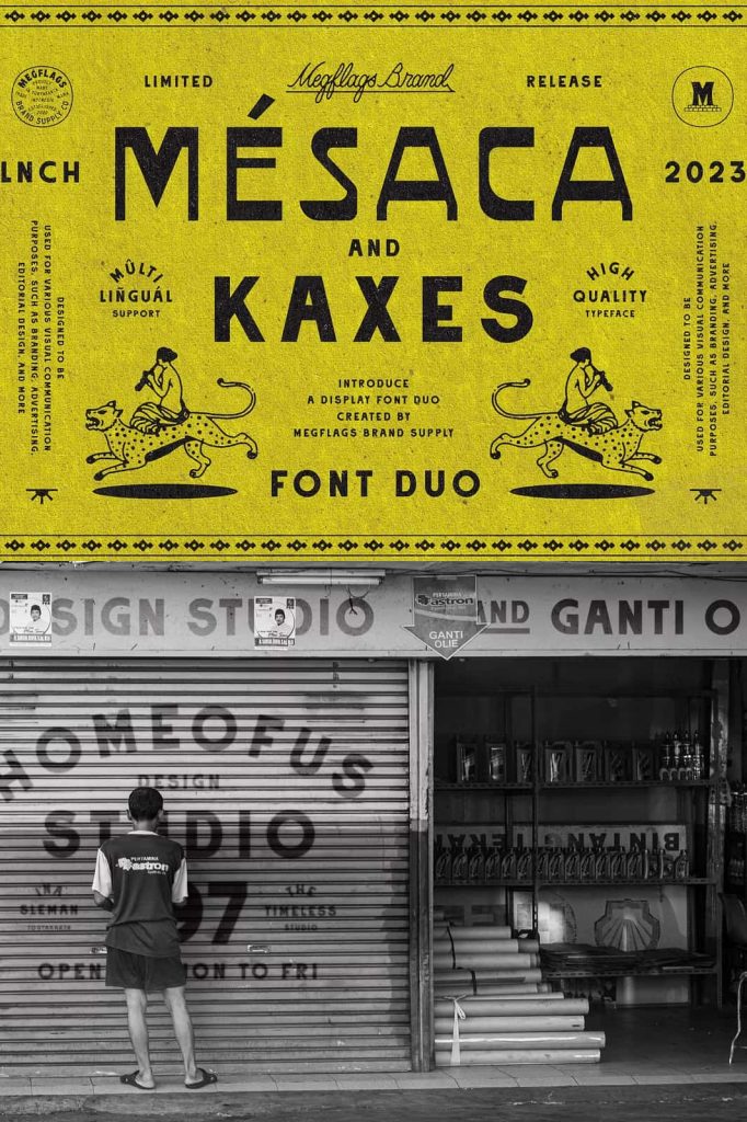
Inspired by Traditional Mexican Signage
Throughout many towns and cities in western Mexico, storefront signs and street lettering display vibrant personality. These signs often feature bold shapes, handcrafted details, and expressive character styles that stand out in busy urban environments. The creators of Mesaca and Kaxes studied these visual traditions and translated them into a digital font duo that preserves the warmth and authenticity of handcrafted lettering.
Rather than producing rigid or overly polished characters, this font pair embraces the natural irregularities and visual energy of traditional sign painting. The result is a typographic system that feels alive, authentic, and deeply rooted in cultural inspiration. Designers who want to capture the spirit of vintage Mexican design will find this duo especially valuable.
A Balanced Combination of Strength and Playfulness
One of the most appealing aspects of Mesaca and Kaxes is the contrast between their personalities. Mesaca delivers strong and confident letterforms that anchor the composition and provide visual stability. Its bold structure makes it perfect for titles, brand names, and large display text.
Kaxes introduces a more relaxed and playful character. Its shapes feel dynamic and expressive, which helps soften the overall composition. When paired together, the fonts create a visual conversation between strength and creativity. Designers can use this contrast to build engaging layouts that feel both energetic and balanced.
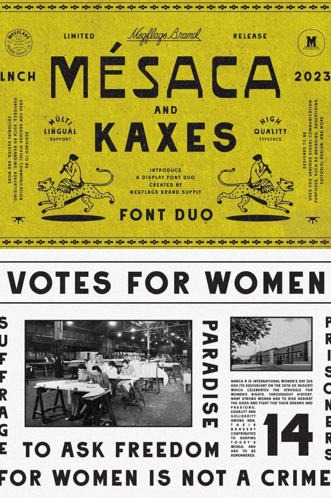
Versatile Typography for Creative Design
Mesaca and Kaxes work well across a wide range of design projects. Because the fonts complement each other, designers can easily create typographic hierarchies that feel cohesive and visually interesting. One font may serve as the primary headline while the other adds supporting details, subtitles, or decorative accents.
This flexibility makes the duo ideal for projects that require personality and strong visual storytelling. The rustic aesthetic evokes authenticity, craftsmanship, and heritage, which helps brands build emotional connections with their audience.
Recommended Uses for Mesaca and Kaxes
Designers frequently choose this font duo for projects that require vintage charm and cultural character. Some of the most popular applications include:
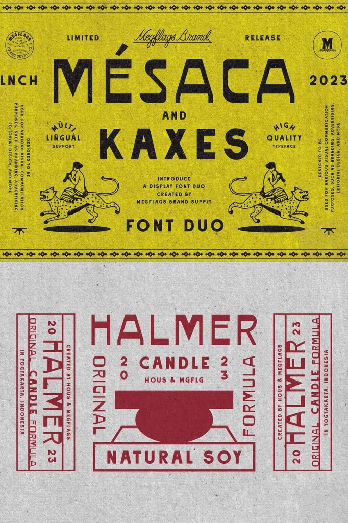
- Branding and logo design for food and beverage businesses
- Product packaging and artisan labels
- Restaurant menus and café branding
- Vintage inspired signage and storefront graphics
- Poster design and promotional materials
- Editorial titles and creative magazine layouts
These applications allow the fonts to showcase their expressive character while reinforcing the nostalgic atmosphere of the design.
Authentic Rustic Style for Modern Branding
In modern branding, authenticity plays an important role in capturing attention and building trust with audiences. Mesaca and Kaxes help designers communicate that authenticity through typography that feels handcrafted and culturally inspired. The rustic edges and distinctive shapes give designs a human touch that feels genuine rather than overly corporate.
This quality makes the font duo particularly effective for businesses that celebrate tradition, craftsmanship, and heritage. Restaurants, coffee shops, craft beverage brands, and boutique retailers can use these fonts to create identities that feel warm, inviting, and memorable.
Because the fonts maintain strong readability, they also function well in digital environments such as websites and social media graphics. Designers can confidently integrate them into modern design systems without sacrificing clarity or usability.
Create Bold and Memorable Typography
Mesaca and Kaxes offer designers the opportunity to explore expressive typography inspired by real-world cultural influences. Their combination of bold structure and playful personality encourages creative experimentation while maintaining a cohesive visual identity.
Whether used together as a dynamic pair or individually as standalone fonts, Mesaca and Kaxes provide a rich typographic experience. Designers can create striking headlines, engaging brand identities, and eye-catching promotional graphics that capture the charm of vintage western Mexico design traditions.
For creative professionals searching for typography that blends cultural inspiration with modern versatility, Mesaca and Kaxes deliver a compelling solution. This font duo transforms ordinary text into expressive visual storytelling, helping design projects stand out with authentic character and timeless appeal.