Mon Amour Retro Typeface
A Cheerful Typeface Inspired by the Charm of 70s Lettering
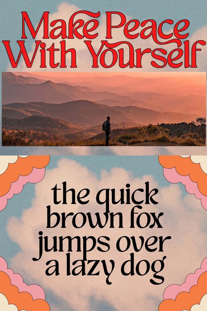
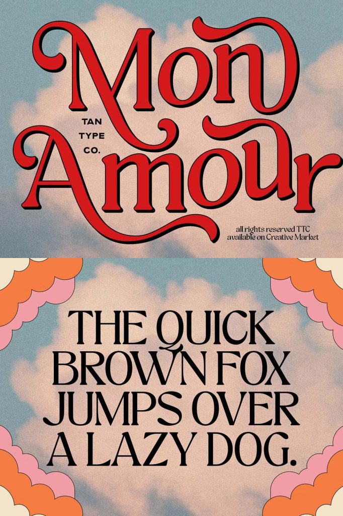
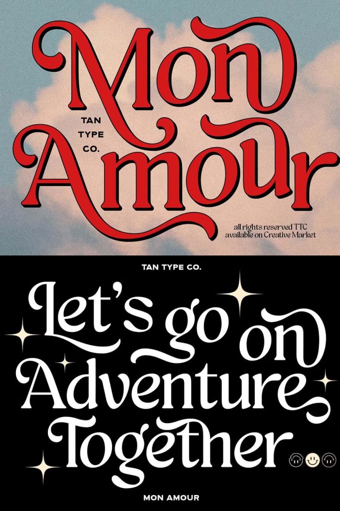
Mon Amour is a vibrant retro typeface that celebrates the joyful spirit of 1970s lettering. Designers often search for fonts that instantly add personality and nostalgic character to their projects, and Mon Amour delivers exactly that. With playful curves, smooth swirls, and soft rounded shapes, this typeface captures the warmth and optimism of vintage design while remaining versatile enough for modern creative work.
The design draws inspiration from classic retro signage, vintage posters, and expressive lettering styles that defined the golden era of graphic design in the 1970s. Each character flows naturally into the next, creating a rhythmic visual harmony that makes words feel lively and inviting. Mon Amour does not simply imitate retro aesthetics—it reinterprets them with fresh energy so designers can easily incorporate nostalgic charm into contemporary branding and editorial layouts.
Playful Curves and Expressive Letterforms
One of the defining features of Mon Amour is its beautifully curved structure. The letters move with a graceful rhythm, producing a sense of motion and friendliness. The strokes feel soft and organic, which allows the typeface to communicate warmth and approachability in any design environment.
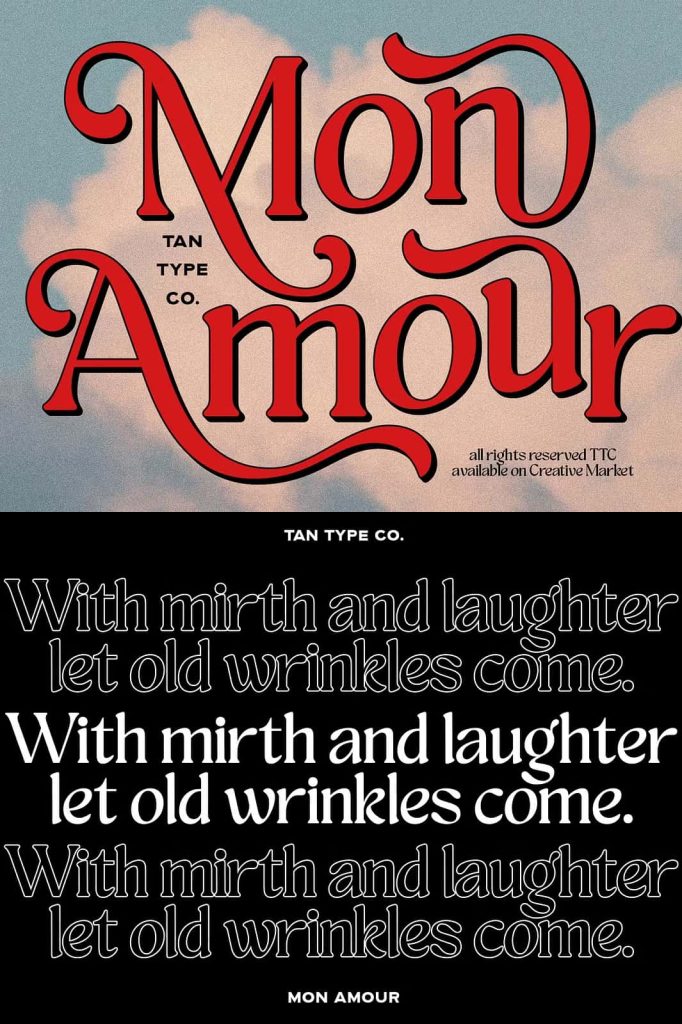
Designers often struggle to find a retro typeface that balances personality with readability. Mon Amour solves that challenge by maintaining clear letterforms while still embracing decorative elements. Its rounded shapes and flowing style help headlines stand out without becoming difficult to read. As a result, the font performs exceptionally well in large display sizes where its details can truly shine.
Retro Details That Create Personality
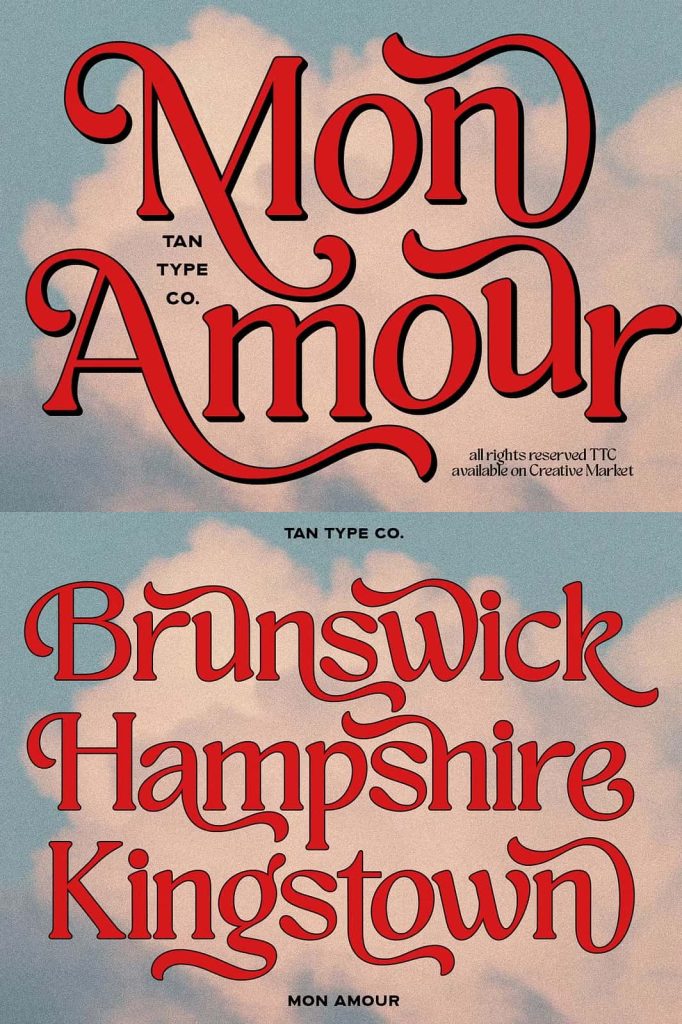
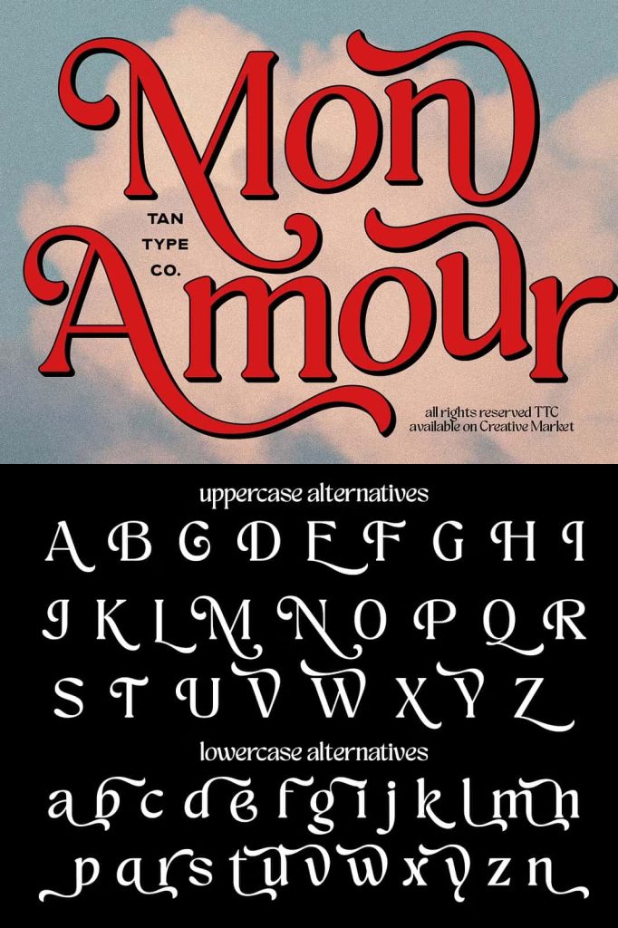
Every character in Mon Amour features subtle design decisions that enhance its nostalgic appeal. Curved terminals, smooth transitions, and charming alternates give the typeface a hand-crafted feel. These details echo the expressive lettering techniques that were widely used in vintage advertising, packaging, and magazine covers.
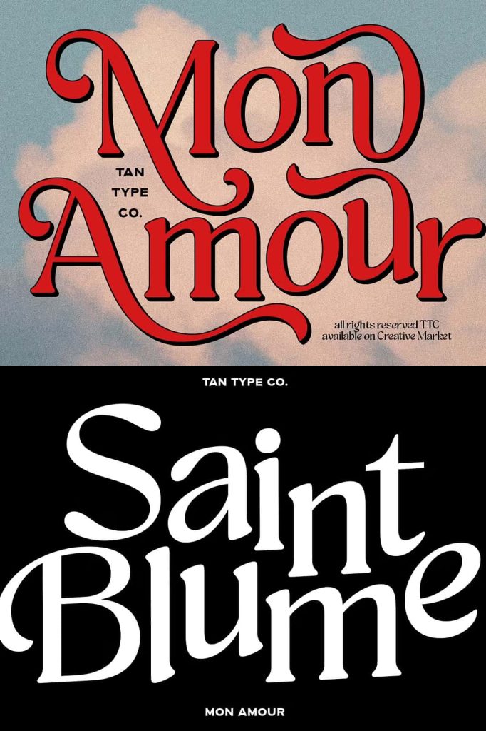
The flowing alternates allow designers to experiment with creative word compositions. By switching between alternate characters, you can craft unique lettering combinations that feel custom-made for each project. This flexibility adds an extra layer of creativity that modern designers appreciate when building strong visual identities.
Perfect for Vintage Branding and Creative Projects
Mon Amour adapts easily to a wide variety of design projects. Its nostalgic tone makes it a natural choice for vintage branding, retro-inspired packaging, and bold poster designs. At the same time, the friendly shapes and smooth strokes make it equally suitable for lifestyle brands, cafés, fashion labels, and boutique businesses.
When used in branding projects, Mon Amour immediately communicates personality. The playful style feels welcoming and expressive, helping brands create an emotional connection with their audience. Designers can use it for logos, packaging labels, social media graphics, and promotional materials that require a memorable visual voice.
Ideal Uses for Mon Amour
Because of its expressive personality, Mon Amour performs best in display environments where its curves and decorative elements remain clearly visible. Designers often choose this font for projects such as:
- Vintage and retro branding projects
- Product packaging and label design
- Poster and promotional artwork
- Magazine and editorial headlines
- Creative social media graphics
- Fashion and lifestyle branding
These applications allow the font’s playful energy to take center stage, helping designs feel distinctive and memorable.
A Typeface That Blends Nostalgia With Modern Creativity
Many retro fonts lean heavily on nostalgia but struggle to integrate smoothly into modern design systems. Mon Amour avoids that limitation by balancing vintage inspiration with contemporary usability. The letterforms feel expressive without appearing outdated, allowing designers to create projects that feel both timeless and fresh.
This balance makes Mon Amour especially useful for creative professionals who want to explore retro aesthetics without sacrificing clarity or versatility. Whether you design posters, brand identities, or editorial layouts, the typeface offers enough character to transform simple text into a strong visual element.
Create Warm, Friendly, and Memorable Designs
Typography plays a major role in shaping the emotional tone of a design. Mon Amour helps designers communicate joy, friendliness, and creativity through its lively letterforms. The smooth curves and playful swashes give each word a sense of movement, which naturally attracts attention and invites readers to engage with the content.
If your project requires a retro atmosphere that feels cheerful rather than rigid, Mon Amour provides the perfect typographic voice. Its nostalgic charm, balanced readability, and expressive alternates empower designers to craft unique compositions that stand out across branding, packaging, posters, and editorial design.
Mon Amour proves that retro typography can remain relevant in modern design. By combining the playful elegance of 70s lettering with contemporary usability, this typeface becomes a powerful tool for designers who want to bring warmth, personality, and vintage flair into their creative work.