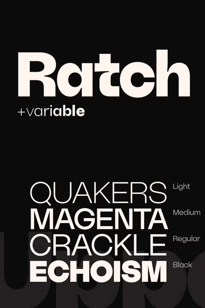
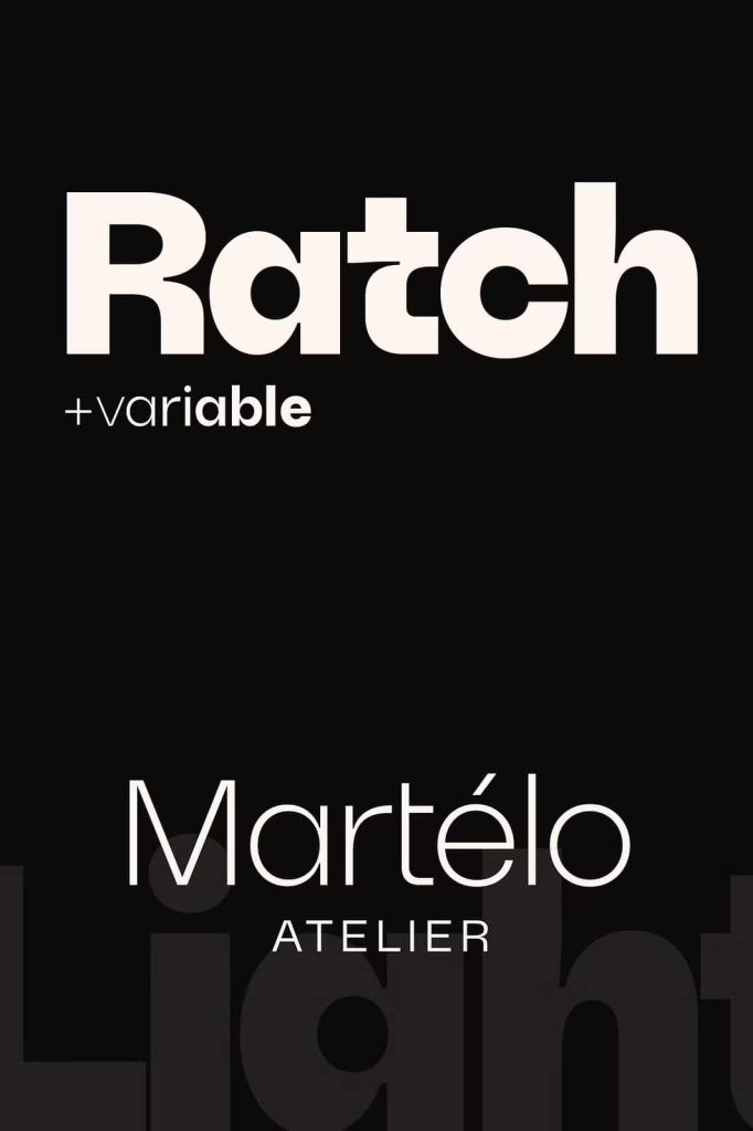
Ratch Geometric Grotesk Typeface Family
Ratch is a modern geometric grotesk typeface family designed to deliver clarity, flexibility, and bold contemporary character. Built with precision and balance, Ratch offers seven carefully engineered weights ranging from Thin to Black, along with a fully functional variable font that gives designers complete creative control. This typeface family empowers you to shape typography with confidence, whether you create branding systems, editorial layouts, or digital interfaces.
Ratch combines the clean logic of geometric construction with the expressive functionality of a versatile font system. Its structured forms create strong visual rhythm, while its extensive weight range allows you to build hierarchy effortlessly. Designers can rely on Ratch to maintain consistency across projects while still offering room for individuality.
Seven Weights for Complete Typographic Control
Ratch provides seven distinct weights, from Thin to Black, ensuring flexibility across every stage of design. The lighter weights deliver elegance and openness, making them perfect for minimal layouts, high-end branding, and spacious editorial spreads. Medium and Regular weights support body text and interface elements with clarity and comfort. Bold and Black weights bring power and emphasis to headlines, posters, and promotional materials.
This broad spectrum of weights allows you to construct strong typographic hierarchy without switching typefaces. You can create contrast, emphasis, and balance within a single cohesive family. Ratch simplifies your workflow while strengthening visual consistency.
From Thin to Black with Precision
Each weight maintains consistent proportions and spacing, preserving harmony across the entire family. The transition from Thin to Black feels smooth and intentional. This careful calibration ensures your layouts remain balanced, whether you design subtle editorial pages or bold advertising campaigns.
By offering reliable weight progression, Ratch supports complex typographic systems in both print and digital formats.
Fully Functional Variable Font
Ratch goes beyond static styles by including a fully functional variable font. This feature allows you to adjust weight seamlessly within supported design software. Instead of selecting fixed styles, you can fine-tune thickness and intensity to match your exact creative vision.
The variable functionality enhances flexibility and efficiency. Designers can experiment with subtle adjustments to achieve the perfect visual tone. This modern approach makes Ratch highly adaptable for responsive web design, interactive platforms, and evolving brand systems.
Optimized for Modern Workflows
Variable font technology supports streamlined file management and dynamic typography. Ratch enables smoother transitions between weights, helping you maintain consistency across digital environments. Whether you build websites, apps, or multimedia presentations, the variable font ensures adaptable and responsive performance.
This forward-thinking design makes Ratch a strong choice for contemporary creative professionals.
Geometric Grotesk with Contemporary Character
Ratch embodies the essence of geometric grotesk design. Its clean shapes and rational structure create a modern aesthetic rooted in simplicity and precision. The letterforms feel balanced and confident, delivering clarity without appearing sterile.
The geometry ensures legibility at various sizes, while subtle detailing prevents the typeface from feeling rigid. This balance makes Ratch suitable for corporate branding, technology startups, fashion labels, and creative agencies.
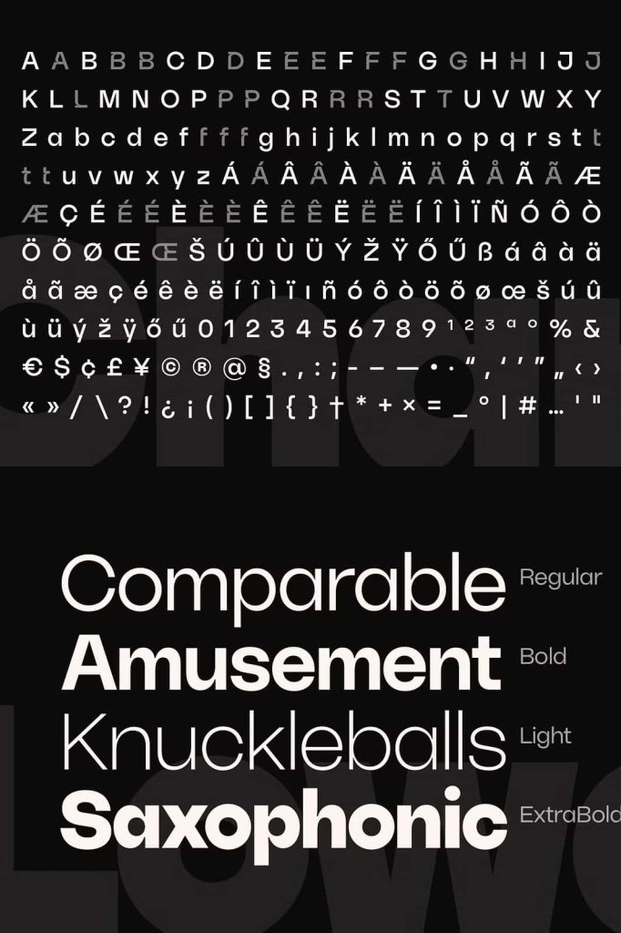
Stylistic Alternates for Personal Expression
Each style within the Ratch geometric grotesk typeface includes a set of stylistic alternates. These alternates allow designers to highlight and personalize specific letters within text. By switching to alternate characters, you can add subtle distinction or bold character to headlines and logos.
This feature gives you creative freedom without compromising cohesion. You can maintain the core identity of the typeface while introducing unique touches that reflect brand personality or design intent.
Ideal for Branding, Editorial, and Digital Design
Ratch performs exceptionally well across multiple applications. In branding, it strengthens logos, wordmarks, and corporate identity systems with clean structure and modern appeal. In editorial design, it supports strong hierarchy and readable layouts. For digital projects, its geometric clarity ensures crisp rendering on screens of all sizes.
The consistent design language across weights and styles allows you to build unified visual systems. Whether you design posters, packaging, websites, or marketing campaigns, Ratch adapts effortlessly to your needs.
Why Choose Ratch Geometric Grotesk Typeface?
- Modern geometric grotesk design with clean structure
- Seven weights from Thin to Black
- Fully functional variable font for maximum flexibility
- Stylistic alternates for personalized typography
- Ideal for branding, editorial, and digital applications
Ratch geometric grotesk typeface family gives designers the tools to create bold, precise, and adaptable typography. Its combination of structured geometry, extensive weight range, and variable font technology ensures both creative freedom and professional consistency. Choose Ratch to build modern visual identities and dynamic layouts with confidence and clarity.