Quipo: A Quirky and Bold Display Font with Contemporary Impact
Quipo is a bold display font that commands attention through playful curves and confident letterforms. Designed to stand out in modern visual environments, this typeface delivers immediate impact while maintaining a contemporary edge. Its distinctive shapes create a strong visual rhythm, making it ideal for designers who want their typography to lead the conversation.
With its combination of thickness and curvature, Quipo breaks away from traditional display fonts. It feels energetic, expressive, and unmistakably modern. Whether used in print or digital media, Quipo ensures your message never goes unnoticed.
Curved Letterforms with a Bold Personality
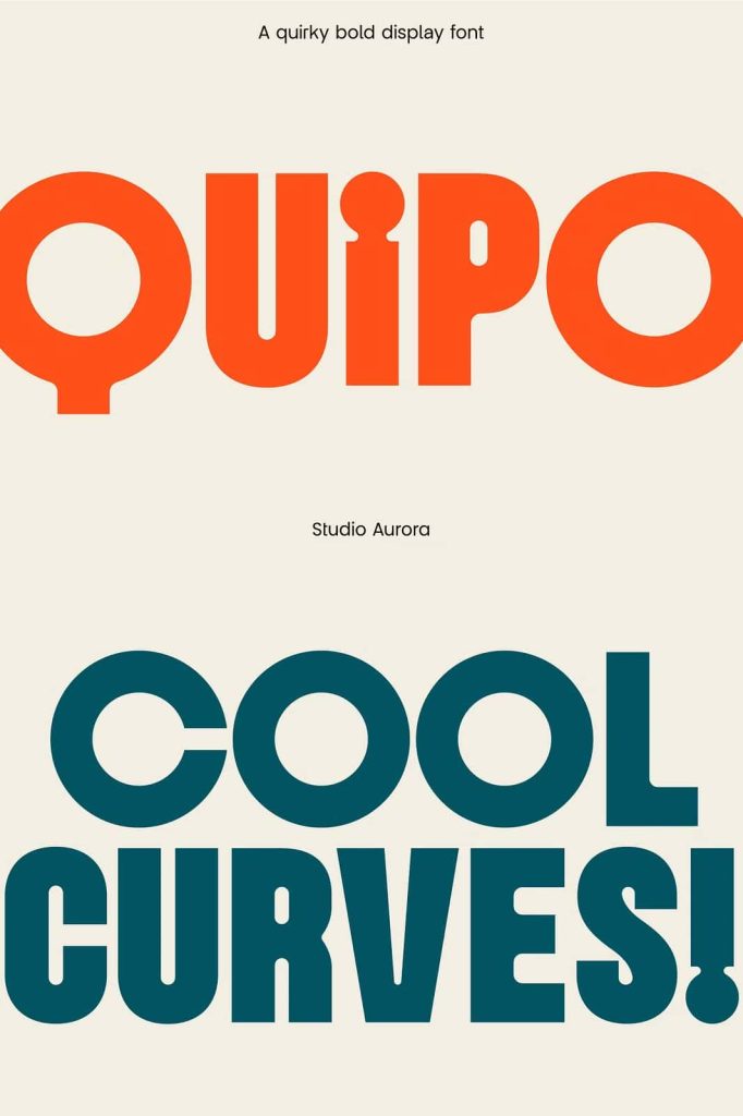
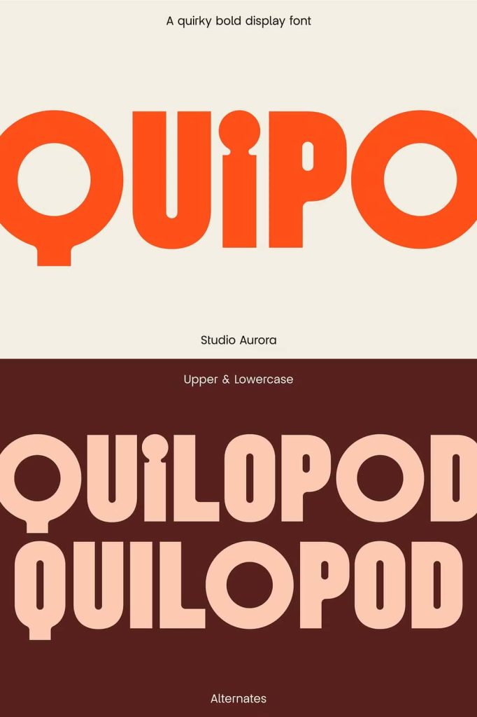
The defining feature of Quipo is its curved, exaggerated letterforms. Each character is designed with smooth arcs and rounded edges that create a friendly yet powerful presence. This balance between softness and strength gives the font its quirky personality.
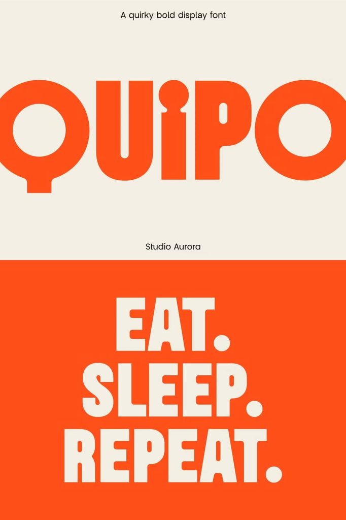
Quipo’s bold weight reinforces readability while enhancing visual impact. The font performs exceptionally well at large sizes, where its unique curves can fully express their character. This makes it perfect for headlines, mastheads, and key messaging elements.
Designed to Capture Attention Instantly
Quipo is built for moments where first impressions matter. The font instantly draws the eye, making it an excellent choice for branding elements that need to stand out in crowded spaces. Its playful curves invite engagement, while its bold structure maintains clarity and confidence.
This combination allows Quipo to feel expressive without becoming overwhelming, ensuring your design remains effective and readable.
Perfect for Logos, Mastheads, and Editorial Design
Quipo excels in logo design, especially for brands that want to communicate creativity, innovation, and personality. Its distinctive letterforms help establish a memorable brand identity that feels modern and approachable.
For magazine mastheads and editorial headlines, Quipo delivers strong visual hierarchy. It anchors layouts with confidence and adds character to covers, feature articles, and promotional spreads. The font works particularly well in fashion, lifestyle, and culture-focused publications.
Effective for Email Marketing and Digital Campaigns
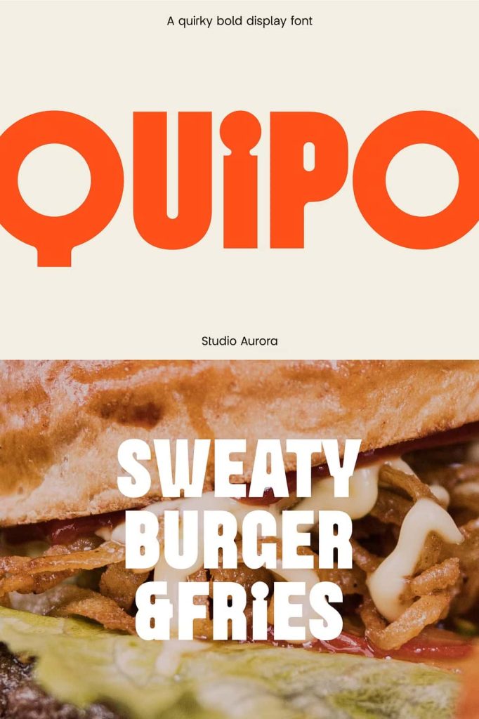
In digital marketing, typography plays a critical role in engagement. Quipo performs exceptionally well in email marketing campaigns, where bold headlines must capture attention quickly. Its readability ensures messages remain clear, even on smaller screens.
The font’s playful tone can soften promotional messaging, making calls to action feel more inviting. This makes Quipo a smart choice for campaigns that aim to connect with audiences through creativity rather than aggressive sales tactics.
Versatile Across Print and Digital Platforms
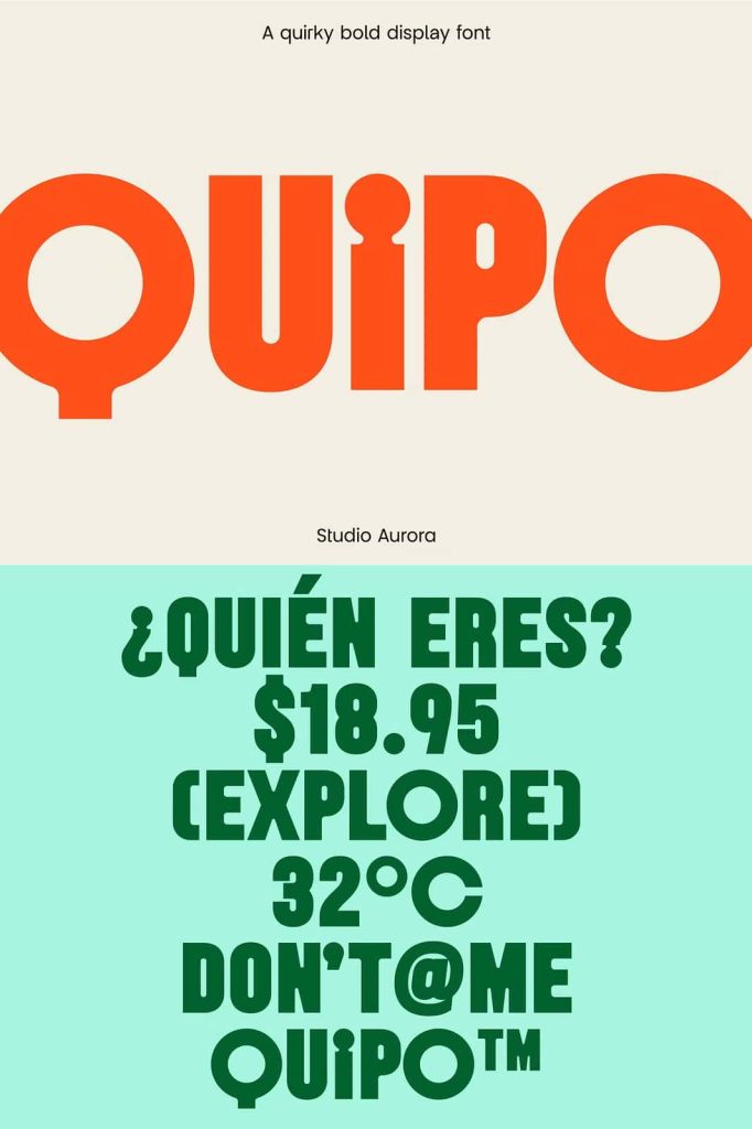
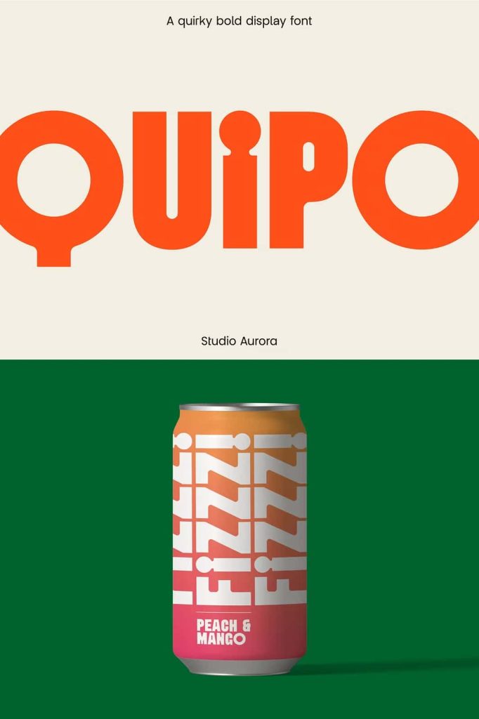
Quipo adapts smoothly across various media formats. It maintains consistency whether printed on posters and packaging or displayed on websites and digital advertisements. This versatility allows designers to use the font confidently across multi-channel campaigns.
The font pairs well with clean sans-serif or minimalist typefaces, allowing Quipo to shine as a display element while supporting text remains simple and structured.
Why Choose Quipo?
Quipo is more than a display font. It is a creative tool designed to help brands and designers express personality, confidence, and modern style. Its quirky curves and bold presence make it ideal for projects that require instant recognition and visual impact.
If your design needs to feel contemporary, expressive, and memorable, Quipo provides the typographic strength to bring your ideas to life with clarity and character.