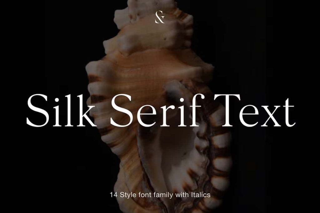
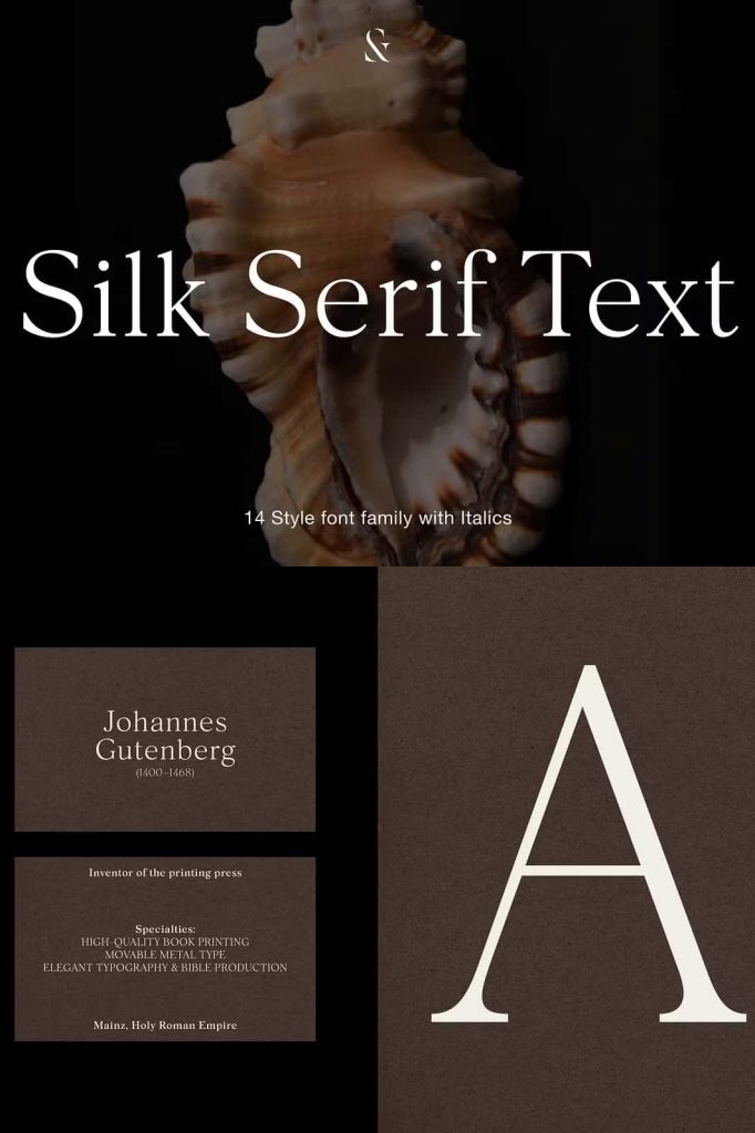
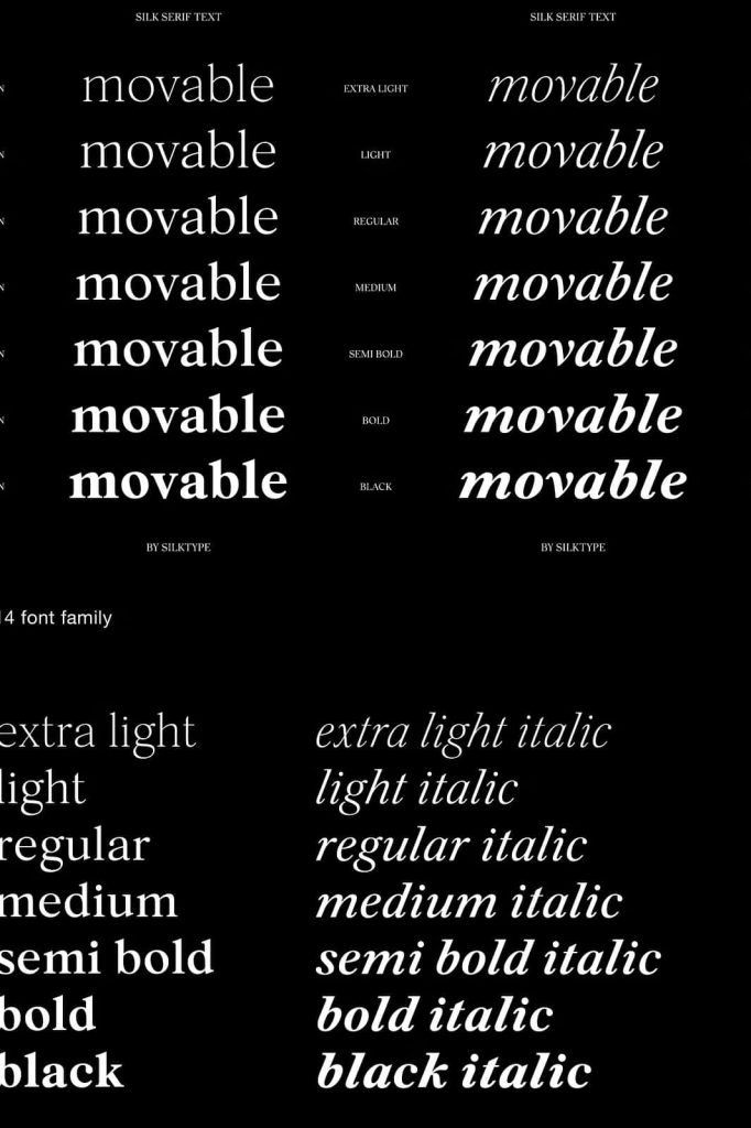
Silk Serif Text: Elegant Serif Typography Optimized for Readability
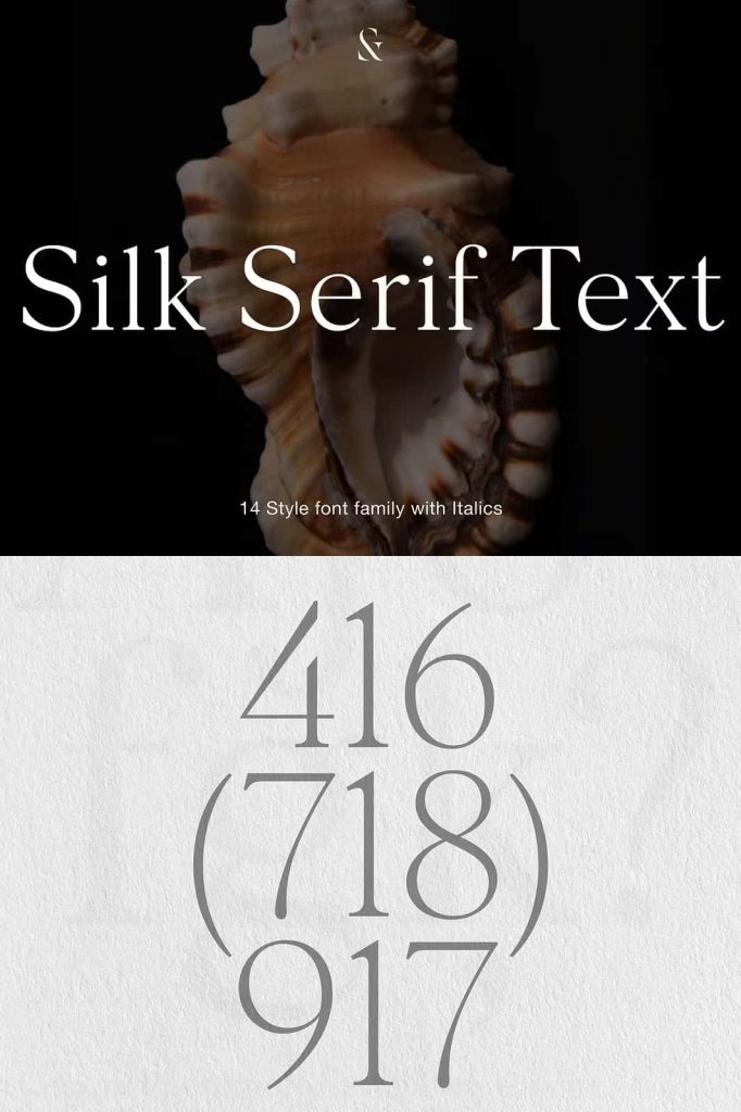
Silk Serif Text is a carefully crafted extension of the original Silk Serif, developed with a clear purpose: to deliver exceptional readability at smaller text sizes without sacrificing elegance or sophistication. While Silk Serif shines in display settings, Silk Serif Text is engineered to perform flawlessly in captions, body text, and long-form reading environments. This font bridges beauty and function, making it an essential choice for editorial, branding, and digital design projects.
By refining proportions, softening contrast, and improving spacing, Silk Serif Text transforms refined serif aesthetics into a practical and highly readable text font. It preserves the visual DNA of Silk Serif while adapting it for sustained reading comfort.
Designed Specifically for Small Text Sizes
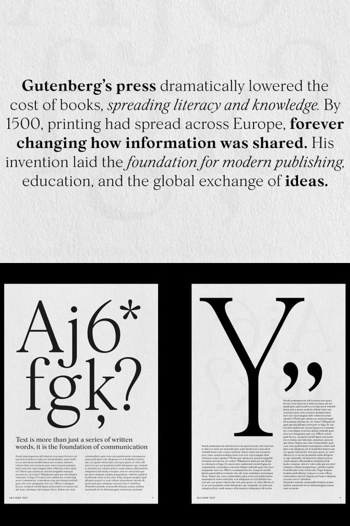
Silk Serif Text is purpose-built for use at small and medium sizes, where clarity and comfort matter most. Unlike display serifs that lose definition when scaled down, this font maintains consistent legibility across paragraphs and dense layouts. Each letterform is carefully adjusted to prevent visual clutter and eye strain.
The font’s construction ensures that characters remain distinct even in tight compositions. This makes Silk Serif Text ideal for books, magazines, websites, user interfaces, and any design that involves extended reading.
Refined Proportions for Smooth Reading Flow
The proportions of Silk Serif Text have been subtly rebalanced to improve rhythm and flow. Wider counters, moderate x-height, and well-defined shapes help guide the reader’s eye naturally from one letter to the next. This creates a comfortable reading experience, even across long passages of text.
Lower Contrast for Improved Legibility
One of the key enhancements in Silk Serif Text is its lower stroke contrast compared to the original Silk Serif. High-contrast serif fonts often look beautiful in headlines but can reduce clarity in small sizes. Silk Serif Text addresses this by softening transitions between thick and thin strokes.
This lower contrast improves letter stability on screens and in print, especially in environments where resolution or lighting may vary. As a result, text remains clear and consistent across devices, paper types, and viewing conditions.
Optimized Spacing for Long-Form Content
Spacing plays a crucial role in text readability, and Silk Serif Text has been carefully spaced to support long-form content. Improved letter spacing and balanced word spacing prevent text from feeling cramped or uneven. This attention to spacing allows paragraphs to breathe, making them easier to scan and read.
Whether used in articles, reports, books, or digital content, Silk Serif Text supports sustained reading without fatigue. Designers can confidently use it for dense layouts without compromising visual comfort.
Perfect for Captions, Body Text, and Editorial Design
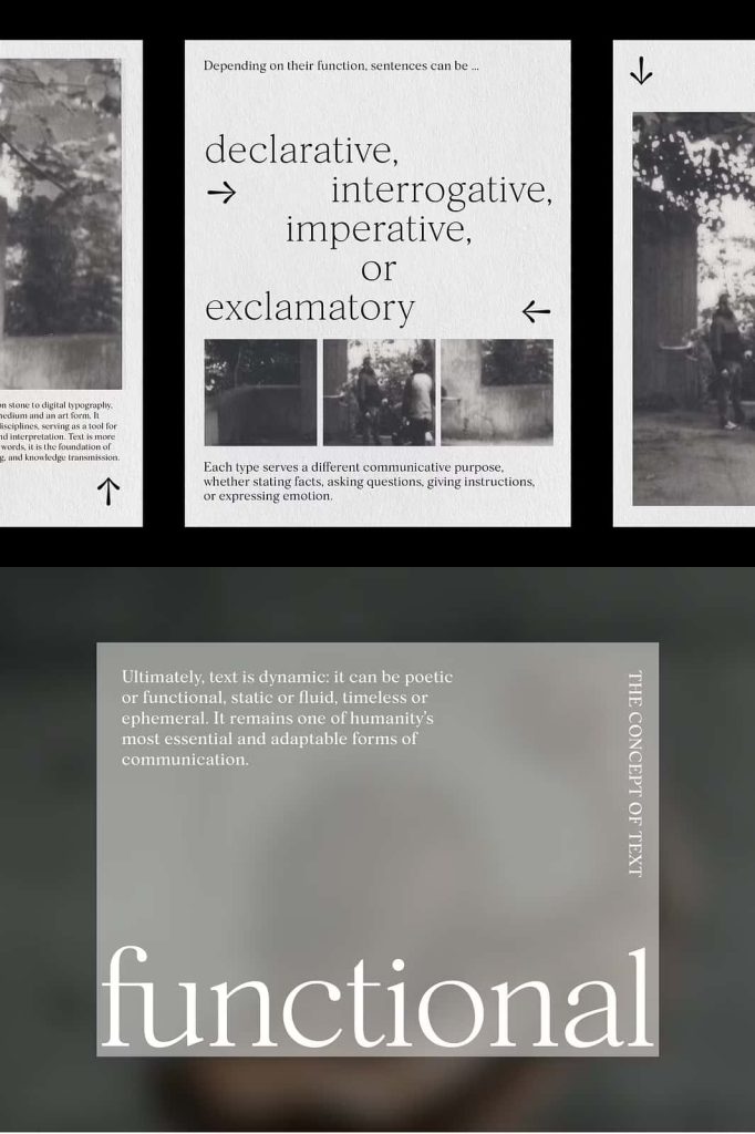
Silk Serif Text excels in captions, footnotes, and body copy where clarity is essential. It also performs beautifully in editorial layouts, such as magazines and newspapers, where typography must balance style and functionality. The font enhances readability while maintaining a refined and professional tone.
Maintaining the Elegance of Silk Serif
While Silk Serif Text focuses on practicality, it never abandons elegance. The font retains the graceful serif details and refined structure of the original Silk Serif. This consistency allows designers to pair Silk Serif Text seamlessly with Silk Serif in the same project.
Using both fonts together creates a cohesive typographic system. Designers can apply Silk Serif to headlines and Silk Serif Text to body copy, achieving visual harmony across all text levels.
Versatile for Print and Digital Applications
Silk Serif Text adapts effortlessly to both print and digital environments. In print, it delivers crisp, readable text with a classic feel. On screens, its balanced proportions and softened contrast ensure clarity across different resolutions and devices.
This versatility makes Silk Serif Text a reliable choice for websites, eBooks, mobile applications, corporate documents, and branding materials that require refined typography at smaller sizes.
A Professional Serif Font for Serious Reading
Silk Serif Text is designed for designers who care deeply about typography and user experience. It proves that readability and elegance can coexist, even in the most text-heavy projects. By combining thoughtful design decisions with timeless serif aesthetics, this font elevates everyday reading into a refined visual experience.
If you are looking for a serif text font that delivers clarity, balance, and sophistication in small sizes, Silk Serif Text offers a dependable and elegant solution for modern long-form typography.