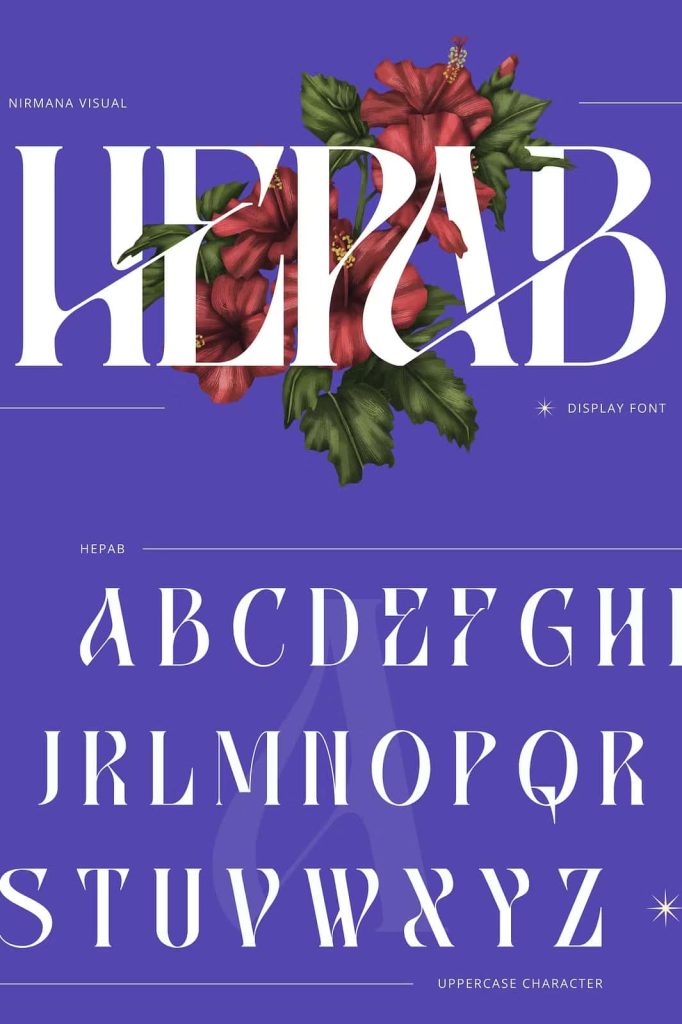
Hepab Branding Logo Font: Modern Serif Elegance for Strong Visual Identity
Hepab is a serif display font crafted specifically for branding and logo design, where first impressions matter and typography defines identity. This typeface blends the timeless authority of traditional serif fonts with a clean, modern aesthetic, resulting in a visual style that feels both sophisticated and current. Hepab does not rely on nostalgia alone; instead, it actively reshapes classic serif principles into a fresh and innovative typographic voice.
Designed to perform at display sizes, Hepab brings clarity, confidence, and refinement to logos, headlines, and titles. Every letterform is carefully structured to communicate professionalism while still allowing room for creativity. This balance makes Hepab a dependable choice for designers who want typography that elevates a brand without overwhelming it.
A Modern Serif Font with Timeless Foundations
Hepab builds upon the strong foundation of classic serif typography. Its sharp, clean serifs provide structure and authority, helping text feel grounded and trustworthy. At the same time, the font introduces modern refinements that prevent it from appearing outdated or overly formal.
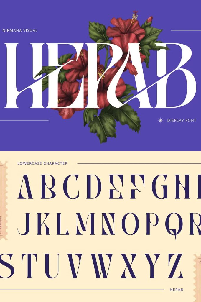
The letterforms feature balanced proportions that improve visual harmony across words and lines. Smooth curves soften the overall appearance, while precise angles add clarity and control. This thoughtful construction allows Hepab to feel elegant without becoming rigid, making it adaptable across a wide range of creative contexts.
Sharp Serifs and Balanced Letterforms
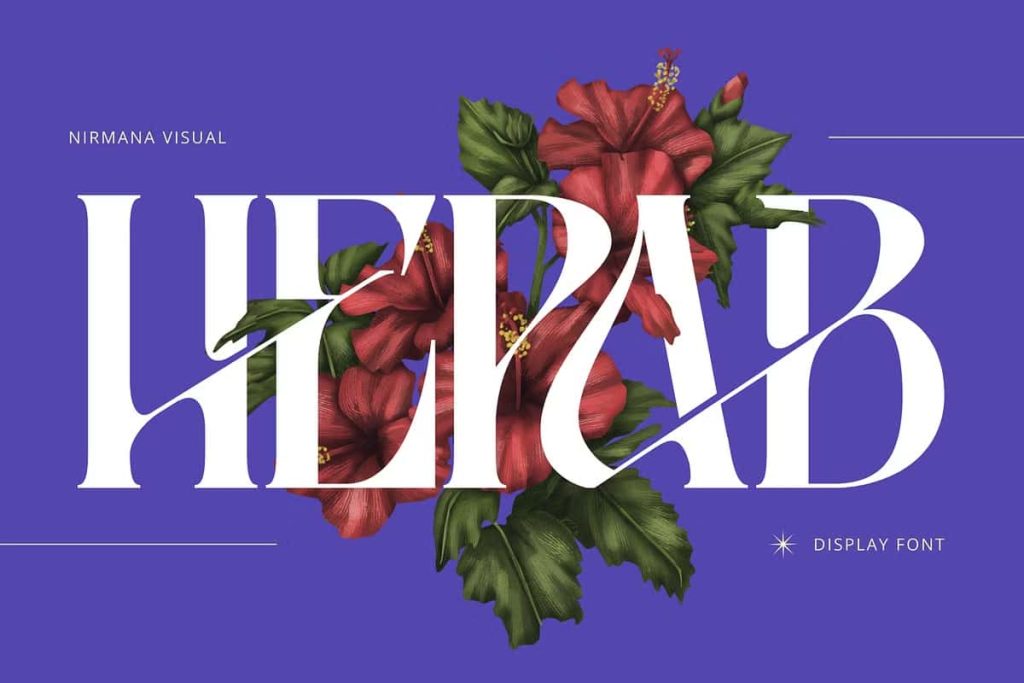
The defining visual trait of Hepab lies in its sharp yet refined serifs. These details add distinction and sophistication, especially in large-scale typography where subtle elements become more visible. The serifs guide the eye naturally across the text, enhancing readability and flow.
Balanced letterforms ensure that no single character dominates the composition. This consistency allows Hepab to perform exceptionally well in logos and wordmarks, where visual balance plays a critical role in brand recognition.
Stylish Ligatures That Add Visual Interest
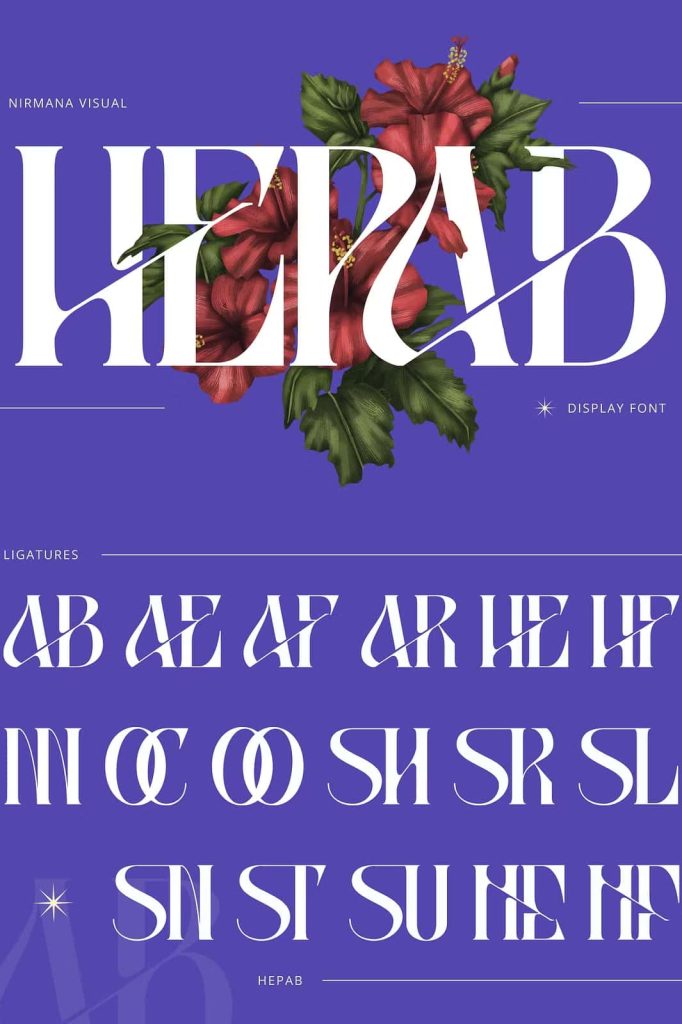
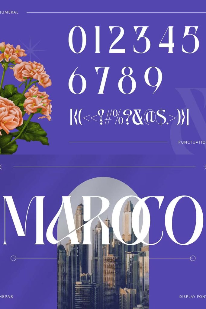
Hepab includes carefully designed ligatures that introduce unique connections between specific letter pairs. These ligatures create visual rhythm and add a sense of craftsmanship to the typography. Rather than feeling decorative for the sake of decoration, they serve a functional role by improving letter spacing and cohesion.
When used in logos or headlines, these ligatures help the text feel custom and intentional. They allow designers to differentiate their work and add subtle personality without sacrificing legibility.
Refined Proportions with a Contemporary Twist
The modern appeal of Hepab comes from its refined proportions and controlled contrast. Stroke thickness varies intentionally, creating visual tension that feels dynamic yet polished. This contrast enhances readability and adds depth, especially in bold titles and large display settings.
These modern proportions allow Hepab to integrate seamlessly into contemporary design systems. Whether paired with minimalist layouts or rich visual elements, the font maintains clarity and impact.
Versatile Applications Across Branding and Editorial Design
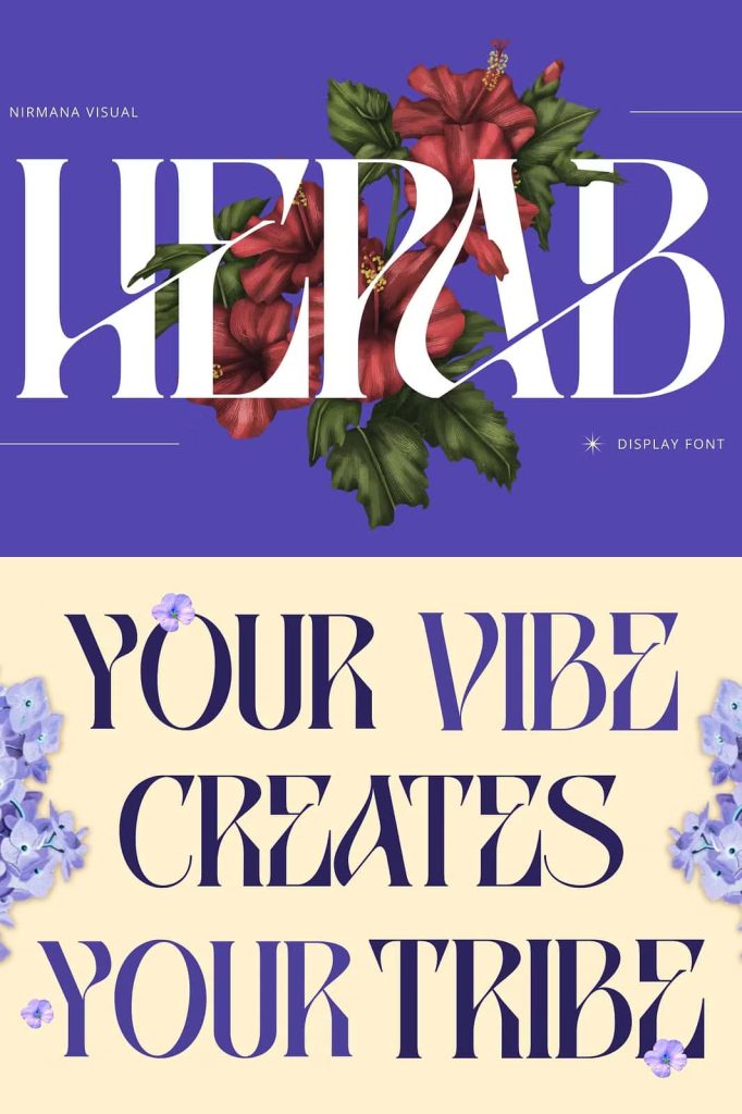
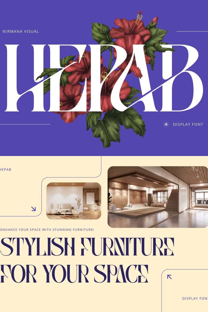
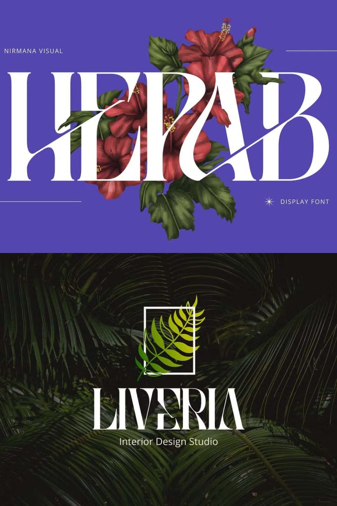
Hepab excels in projects that require a strong typographic presence. Its confident design makes it ideal for branding, editorial layouts, and creative campaigns that rely on typography to communicate value and identity.
Designers frequently choose Hepab for:
- Logos and brand wordmarks
- Headlines and titles
- Editorial and magazine design
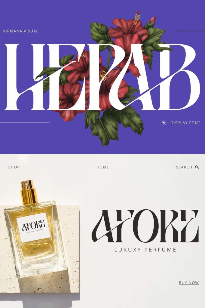
- Packaging and product labels
- Creative advertising and promotional materials
The font’s versatility allows it to adapt across print and digital platforms. It performs equally well on screens and in high-quality print, maintaining its sharpness and elegance in every medium.
Designed for Designers Who Value Sophistication
Hepab speaks to designers and brands that prioritize clarity, refinement, and visual storytelling. It communicates confidence without aggression and elegance without fragility. This makes it especially suitable for fashion brands, creative studios, publishers, and businesses that want to project credibility with a modern edge.
Rather than following short-lived trends, Hepab offers a lasting typographic solution. Its blend of classic serif structure and contemporary design ensures longevity, helping brands remain visually relevant over time.
A Serif Font That Strengthens Brand Identity
Hepab is more than a display font; it is a branding tool designed to shape perception. Through sharp serifs, balanced forms, and stylish ligatures, it transforms text into a visual signature. Every word set in Hepab feels deliberate, polished, and confident.
For designers seeking a modern serif font that delivers sophistication, flexibility, and strong visual identity, Hepab stands as a reliable and inspiring choice. It brings timeless charm and modern innovation together, allowing typography to speak with clarity and authority.