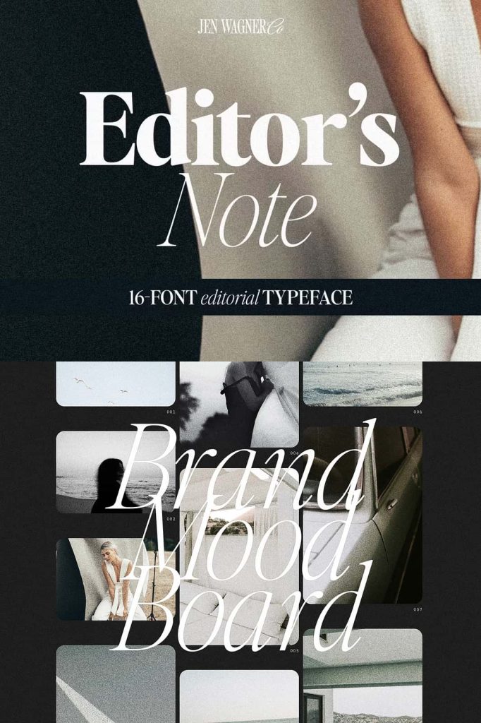
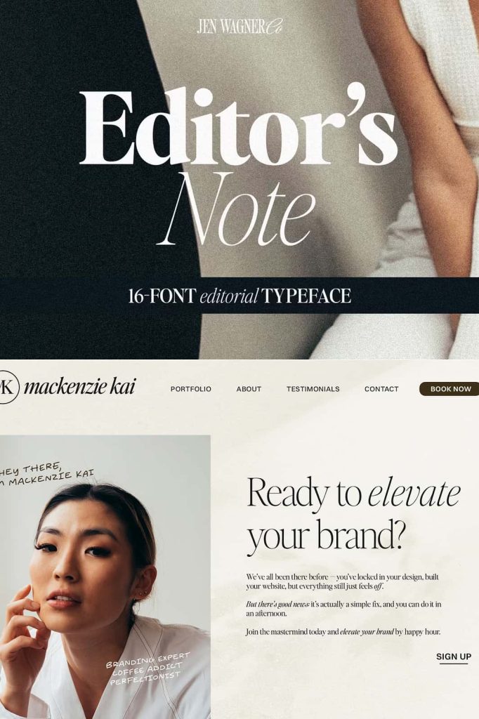
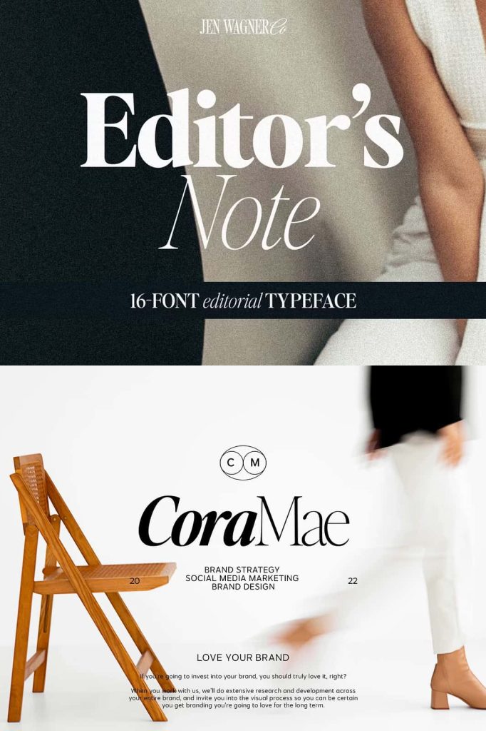
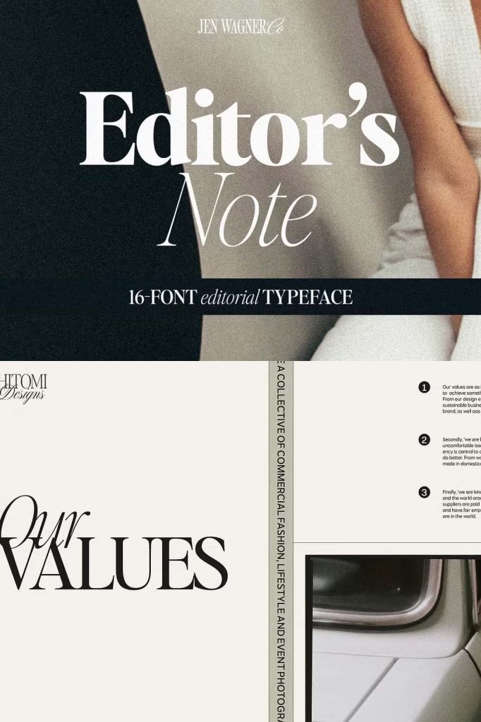
Editor’s Note Font Family – A Modern Minimalist Typeface with Style and Versatility
Editor’s Note Font Family is the expanded version of the popular Editor’s Note typeface, now featuring 16 fonts that include both regular and italic styles. With weights ranging from elegant Hairline to powerful Bold, this collection delivers the perfect combination of clean lines, precise curves, and a trendy minimalist aesthetic. Designed for modern designers and brands that value sophistication, clarity, and flexibility, the Editor’s Note Font Family is built to elevate your creative work to the next level.
A Complete Typeface Family for Modern Design
The Editor’s Note Font Family was crafted to meet the growing demand for a clean, versatile type system that adapts to various design environments. Whether you’re creating a sleek editorial layout, a sophisticated brand identity, or a minimalist website, this family gives you every weight and style you need to achieve visual balance and consistency. With 16 variations—ranging from delicate Hairline for subtle elegance to Bold for impactful headlines—it’s a full toolkit that lets you design with confidence and precision.
Every letterform has been meticulously designed to reflect harmony and readability. The typeface embodies modernity through its balanced proportions, smooth geometry, and refined edges. The italic versions add personality and motion, giving designers creative flexibility for emphasis and contrast. This makes Editor’s Note Font Family an ideal choice for professionals who demand both beauty and functionality in their typography.
Minimalist Aesthetic with Maximum Impact
Minimalism is at the core of Editor’s Note Font Family. The design emphasizes clarity, structure, and a sleek, contemporary look. Each stroke and curve is carefully balanced to ensure visual appeal without unnecessary embellishment. The result is a typeface that feels fresh, elegant, and timeless—perfect for modern branding, editorial spreads, tech startups, fashion labels, and lifestyle publications.
Despite its minimalist nature, the font family is far from bland. The subtle contrasts, tight curves, and clean linework create an inviting rhythm across text blocks and headlines alike. This thoughtful design approach ensures that your message shines through with sophistication and authority, no matter where it appears. Editor’s Note Font Family effortlessly bridges simplicity and expression, making it a must-have for designers who value refined typography.
16 Weights, Endless Possibilities
One of the standout features of Editor’s Note Font Family is its range of 16 styles—eight weights, each with its italic counterpart. From the whisper-thin Hairline to the commanding Bold, every weight serves a unique purpose. The lighter versions are perfect for subtle, airy layouts such as fashion editorials or lifestyle branding, while the heavier styles are ideal for attention-grabbing titles and impactful digital visuals.
This variety empowers designers to maintain visual harmony across different media while still creating hierarchy and emphasis. By mixing weights and styles, you can easily build dynamic compositions that guide the reader’s eye and enhance overall readability. Whether you’re working on web design, printed materials, or product packaging, Editor’s Note Font Family provides the adaptability you need for cohesive and creative typography.
Precision and Readability at Every Size
While Editor’s Note Font Family is undeniably stylish, it also prioritizes legibility. Each glyph has been optimized for balance and spacing, ensuring that your text remains clean and easy to read at any scale. The consistent stroke thickness and modern letter proportions make it a reliable choice for both headlines and body text. From magazine spreads to digital dashboards, this typeface maintains clarity and sophistication across all applications.
The italic variants offer subtle slant and curvature, bringing motion and personality to your compositions. They’re especially useful for adding contrast in editorial layouts or emphasizing key phrases in branding materials. This level of detail and versatility ensures that Editor’s Note Font Family doesn’t just look good—it performs beautifully in every context.
Perfect for a Variety of Design Projects
Because of its clean aesthetic and structural precision, Editor’s Note Font Family adapts seamlessly to a wide range of creative projects. It’s perfect for:
- Branding and Logos – Establish modern, confident visual identities.
- Editorial Design – Enhance magazines, books, and online publications with stylish readability.
- Web and UI Design – Ensure clarity and harmony across digital platforms.
- Corporate Materials – Maintain a professional, minimal aesthetic for presentations and reports.
- Advertising and Marketing – Craft clean, eye-catching campaigns that attract modern audiences.
No matter the application, Editor’s Note Font Family delivers a polished, sophisticated look that resonates with today’s design trends. Its minimalist foundation ensures it pairs well with a variety of color palettes, layouts, and imagery, making it an indispensable addition to your type library.
Why Designers Love the Editor’s Note Font Family
Designers around the world appreciate Editor’s Note Font Family for its balance of simplicity, flexibility, and elegance. Its geometric precision and minimalist flow make it both functional and fashionable—a rare combination in modern typography. With its full weight range and italics, it adapts effortlessly to different tones and moods, from subtle elegance to strong visual impact.
- Comprehensive family of 16 fonts (Regular and Italic)
- Wide range from Hairline to Bold for maximum versatility
- Clean lines, balanced structure, and modern appeal
- Perfect for both print and digital applications
- Minimalist design that complements any creative style
Every project gains a touch of sophistication with Editor’s Note. Its crisp edges and tight spacing make it ideal for layouts that prioritize precision and elegance, while its minimalist aesthetic ensures a timeless, high-end feel.
Conclusion: Define Your Style with Editor’s Note Font Family
Editor’s Note Font Family is more than just a typeface—it’s a modern design solution. With 16 meticulously crafted fonts, it provides the perfect balance of versatility, style, and functionality. Its minimalist lines, smooth curves, and contemporary elegance make it a go-to choice for branding, editorial work, and professional design. From the lightest Hairline to the boldest weight, each variation is a testament to clean design and precision craftsmanship. Choose Editor’s Note Font Family to give your creative projects a polished, modern, and timeless voice.